 |
|
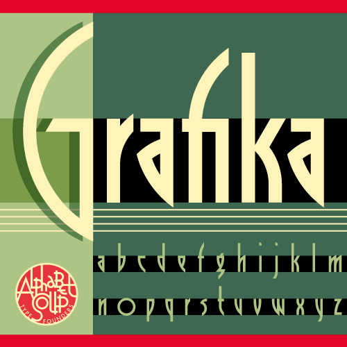
Announcing Grafika: It’s a New “Old” Font . . . (or is it an Old “New” Font?)
September 11, 2009 on 1:59 am | By Michael | In News, Wayback Machine | 3 CommentsI’m very pleased to announce the release of Grafika, a font design that has been “in the making” for many more years than I’d care to remember! It can now be purchased from Alphabet Soup Type Founders.
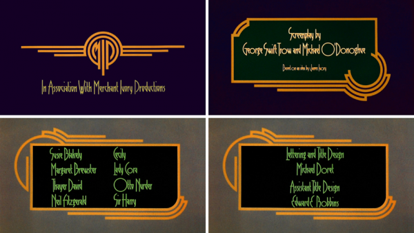
Grafika began its genesis when I received a call to work on a feature film. That phone call came from Ismail Merchant and James Ivory, the reknowned team who have given us such films as “A Room With a View”, “Howard’s End” and “Remains of the Day”. The assignment was to create a title treatment for their upcoming film “Savages“.
The title treatment (above) that I created to reflect the Art Deco sensibility of the film was so well received that it was decided that we would emulate its elegant, elongated look in all the typographic elements of the film. To do that I needed to create what would be my first complete font design. So taking my design cues from the logo I had created, I put pencil to paper and came up with a basic character set. Then I inked it on vellum (which was as hi-tech as it got at that time), and had it photographed and positioned on a roll of Typositor film.
Over the years I had forgotten about this font design. My career became totally about assignment work. I hadn’t gone back to designing fonts until recently when I started doing it again under my foundry name Alphabet Soup. Recently I unearthed a poster for Savages which contained all the credits set in that nameless font I had designed for the film. Looking at it again after all these years I realized that for a young designer this hadn’t been bad. So I decided to revisit it, and to add Grafika to my collection at Alphabet Soup.
To see Grafika in more detail, you can download the PDF brochure I’ve created (3.5 MB). As always, I welcome your comments!
3 Comments
RSS feed for comments on this post. TrackBack URI
Leave a comment
Powered by WordPress and Nifty Cube with Recetas theme design by Pablo Carnaghi.
Entries and comments feeds.
Valid XHTML and CSS.


Hermoso trabajo.
Gracias por compartir el PDF.
Comment by Emilio Martin Schneider — July 16, 2025 #
never seen those titles before michael.
they’re beautiful. great frames and colors.
Comment by norman hathaway — December 10, 2009 #
I love Art Deco and this is quite a remarkable font.
I hope you get all the praise from this one and Fuck them Kiss Nazis! Oops! Sorry, spillover from your last blogging.
Comment by José Cruz — September 12, 2009 #