 |
|
Fonts In Use: Steinweiss Script in Mexico
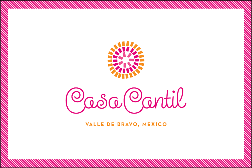
April 6, 2011 on 5:49 pm | By Michael | In News | No CommentsAnother in my series of Alphabet Soup “Fonts In Use” this post highlights Steinweiss Script. I just heard from graphic designer Eric Baker who used the font in a design project for the graphic identity of Casa Cantil, a beautiful villa just a couple of hours outside of Mexico City. Here’s his design in the context of a business card:

What strikes me is that in this context Steinweiss feels quite contemporary—not quite the “vintage” look that one might have expected from such a font. My intention was to create a font that would be kind of like a chameleon – in that it could feel appropriate in many different contexts. Here it seems perfect for the 1960s Mexicana feel I think Eric was going for.
If you’ve used an Alphabet Soup font in an interesting way, email me some images—I’d be happy to post them!
No Comments yet
RSS feed for comments on this post. TrackBack URI
Leave a comment
Powered by WordPress and Nifty Cube with Recetas theme design by Pablo Carnaghi.
Entries and comments feeds.
Valid XHTML and CSS.