 |
|
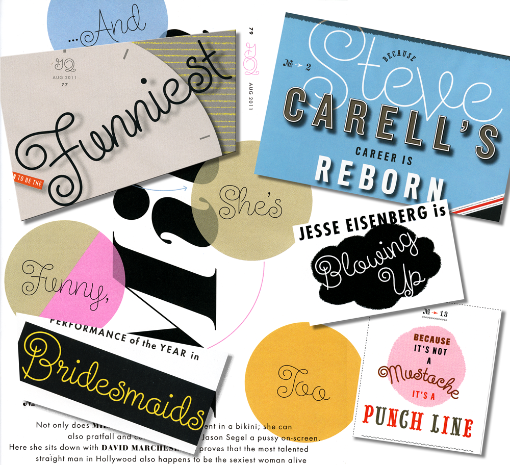
Fonts In Use: GQ Picks Steinweiss Script for their Comedy Issue
July 14, 2011 on 5:34 pm | By Michael | In News, Notes | 3 CommentsI just got a call from my pal Glenn Parsons of Astrolux Design who informed me that my last font release Steinweiss Script was all over the new issue of GQ Magazine. Kudos to GQ Design Director Fred Woodward for making such a smart choice!* Here’s a collage of a few of the pieces taken from different pages in the current issue. I think these demonstrate nicely some of the versatility of this font, such as the ability to set words on curved paths—and still have all letters connect properly.
You can purchase Steinweiss Script (as well as all my other fonts) on my Alphabet Soup website.
3 Comments
RSS feed for comments on this post. TrackBack URI
Leave a comment
Powered by WordPress and Nifty Cube with Recetas theme design by Pablo Carnaghi.
Entries and comments feeds.
Valid XHTML and CSS.

Thank you Jason, I made the correction above, in the posting.
Michael
Comment by Michael — June 7, 2012 #
Hello MIchael, Thanks for posting this! Just want to clarify the decision to use Steinweiss was actually by the Design Director Fred Woodward.
Comment by Jason — June 7, 2012 #
Nice tribute to a Great Designer!
Here is mine on my blog: http://x-factor-e.blogspot.com/2011/07/on-off-record-alex-steinweiss.html
Comment by José Cruz — August 13, 2011 #