 |
|
Dynascript Makes Its 1953 Premiere… In the 21st Century
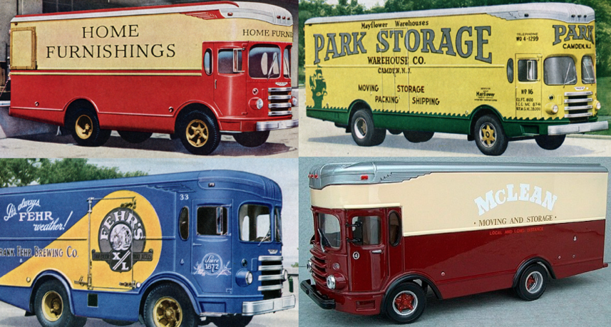
November 12, 2011 on 1:26 pm | By Michael | In Gigs, News | 13 Comments Several months ago I was contacted by David Klein, Vice President of Charles P. Rogers & Co. in NYC (bed manufacturing), about working together with him on a project. He described his company as “a small idiosyncratic company that has been making a quality product for over 150 years”. David had fallen in love with—and purchased—a 1953 Fageol Van that had been housed in The Golden Age of Trucking Museum which had recently closed its doors. The Fageols were beautiful vans that came in various sizes and configurations.

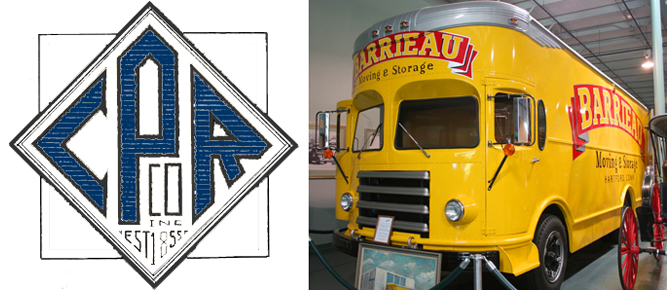
Physically the truck was in good condition, and David loved and wanted to keep the brilliant yellow color that it had been given by the Barrieau family—the van’s original owners. His vision was that this truck would become a moving billboard for CPR & Co, driving around New York, conveying “the Charles P. Rogers Beds message” in a manner that this van might have—had it been theirs back in the ’50s. Wanting to keep as much historical accuracy as I could, I asked about older graphics and logos from the CPR & Co archives but there was very little except for this monogram (which I kind of liked).
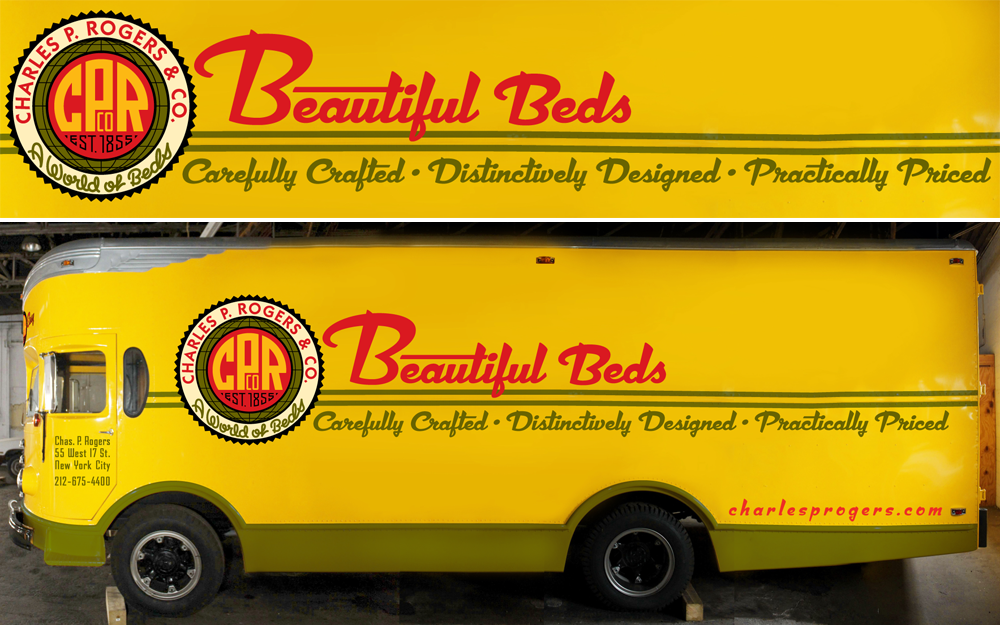
 So, I needed to create graphics that felt appropriate for this 1953 van, and which helped evoke a simpler time. The only concrete thing that I had to work with from Rogers & Co. was the monogram, so I used that design as a basis to create a “medallion” that could be used on the front and sides of the truck. Just prior to the call from David I had begun development of a new font (which became Dynascript over the next few months), and decided that somehow it felt right to use it for the supporting graphics/slogans on the sides of the van.
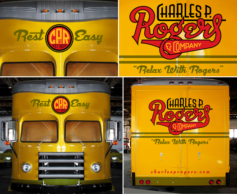
The van is currently in the process of having my graphics applied, so what you’re looking at is a Photoshop assembled composite of the truck with my design work superimposed. 
For the back of the van I created a logo in which I tried to evoke and encompass the over 150 year history of the company. Though it is a bit different from the mid-century vibe that Dynascript had helped give the front and side graphics, I felt it was appropriate and didn’t conflict with them. Also, it might be noteworthy to mention that I used the non-connecting italic version of Dynascript for the URLs on the back and sides of the van.
Not unlike my project with Deliscript and the Canter’s food truck, here was another instance of the influence that assignment work and font design had on each other. Even though they both started out as independent projects, they soon became inextricably entwined. Dynascript is probably a better font for it, because, with this project, I was trying to solve its design both from the point of view of a fontmaker, and from that of a font user.
Soon, when actual photos of the finished truck become available, I will post them here along with my development sketches and more detailed descriptions of the design process.
13 Comments
RSS feed for comments on this post. TrackBack URI
Leave a comment
Powered by WordPress and Nifty Cube with Recetas theme design by Pablo Carnaghi.
Entries and comments feeds.
Valid XHTML and CSS.
Thanks David. Charles P. Rogers is not going to update anything else. This was a one-off project the owner wanted to do because he just loves those old vans. Within the next month or so I hope to post photos of the actual process of fitting the van with the graphics. Stay tuned!
Michael
Comment by Michael — June 9, 2012 #
Great work. Love the bold colors and Dynascript looks great on the van. It really lends itself to motor vehicles. Is the company going to update the rest of their branding to match? It was kind of jarring to visit their website and see such a disconnect from the style shown here
Comment by David — June 8, 2012 #
Yes I did read your article!
The owner of this van tried to buy a Fageol van that I had won on ebay recently, out from under me, by offering more money than the auction had ended at. So I see no reason not to offer to buy his Fageol!
Even according to David’s actions, I guess it never hurts to ask!
Dean
Comment by dean — January 3, 2012 #
How much? I have no idea.
Sell it? Did you read the posting above?
Comment by Michael Doret — January 2, 2012 #
If I may ask how much did he pay for the Fageol?
Any chance he wants to sell it?
Thanks
Comment by dean — January 2, 2012 #
Paul . . . it could easily be adapted. Just sayin’
Comment by Michael Doret — December 27, 2011 #
One of the greatest logos EVER!
Comment by Paul Rogers — December 27, 2011 #
David . . . on the “left” side? Are you sure you don’t mean the right side? Either way it’s not necessary to fill every inch of space. A good designer can make open space work for you—not against you. Many times it’s a good thing to have some relief—but it’s up to the designer when and where to do that.
~M
Comment by Michael Doret — December 5, 2011 #
Great work.
Thanks for posting the pictures, and I look forward to seeing the pictures of the van.
One question–and I am an amateur, an accountant who is thinking about learning sign painting just to learn it, not as a job–and so I don’t want you to think I am criticizing but just asking a question: There seems to be a lot of blank space on the left side of “Beautiful Beds”. I know everything does not have to be centered. If you have any comment, I’d appreciate it.
Comment by david padgett — December 4, 2011 #
Thank you José(s). Your kind words have made my day (week, month?).
Comment by Michael Doret — December 3, 2011 #
Michael,
I have been in the design industry for 20 years and I must say that if I admire a designer that would be you (not licking boots here, just being completely honest). I have the tendency to go to your website to gather some inspirational juices (my wife is worried about this LOL!!!). I will be looking forward to see the final product on this van! And Dynascript will be the next font to buy for sure!
Have a great weekend!
Comment by Jose Luis Romero — December 3, 2011 #
I hope you get a ride on the Big Bed Van!
Comment by José Cruz — November 23, 2011 #
You are the BEST and this proves it! WOW!
Comment by José Cruz — November 19, 2011 #