 |
|
The Dyna-Fonts Winners at Applied Arts
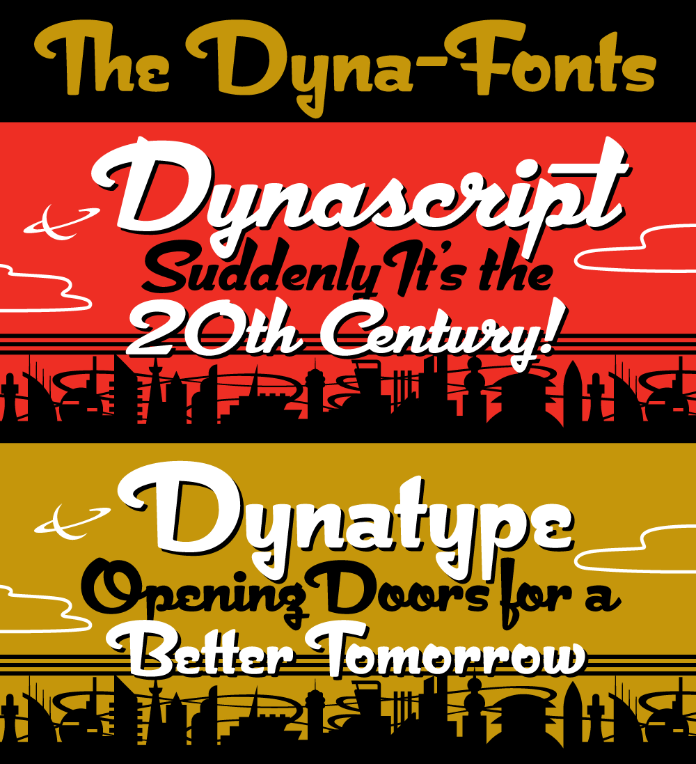
July 8, 2012 on 11:28 pm | By Michael | In News | No CommentsThe judges at this year’s Applied Arts Design Competition, in their first ever Typeface Design category, selected both Dynascript and Dynatype as winners. They were selected as The Dyna-Fonts—a typeface family.
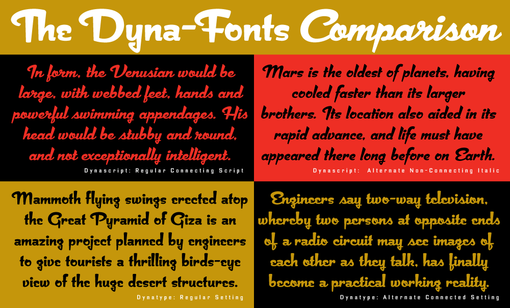
I’m very proud of these fonts, and am pleased that they’ve begun to get the recognition I think they deserve. They work extremely well both together and separately, and in both display and in smaller settings, as you can see from the comparison below (click to enlarge).
I’ve begun to make both Dynascript and Dynatype available together at a reduced price. They can be found under the name “The Dyna-Font Collection” which can be purchased from my Website.
The Dyna-Fonts are now following in the footsteps of some of my other recent fonts that have garnered industry acclaim—most notably Deliscript, which was lauded by the Type Directors Club in their TDC² 2010 competition and also in 2011 by CA’s Typography Annual 1, (the page excerpt of which can be seen HERE), and Steinweiss Script—also recognized in this year’s Typography Annual 2, (the page excerpt of which can be seen HERE). After being named a “Rising Star” Metroscript became “MyFonts’ Brush Script Font of the Year” and was subsequently named as #5 in Smashing Magazine’s “30 Brilliant Typefaces For Corporate Design“. The magazine went on to say about Metroscript: “lettering artist Michael Doret has adapted his trademark hand-lettering style to the computer, creating one of the most sophisticated suites of script fonts on the market.”
No Comments yet
RSS feed for comments on this post. TrackBack URI
Leave a comment
Powered by WordPress and Nifty Cube with Recetas theme design by Pablo Carnaghi.
Entries and comments feeds.
Valid XHTML and CSS.


