 |
|
Writing Dracula: An Anniversary Edition
October 1, 2012 on 12:22 pm | By Michael | In Gigs, News | 4 CommentsBack in 2009 I designed graphics for a pen and business card set for a company named Acme Studios based in Hawaii. I called the design “QWERTY” because I based it on old typewriter keys and the QWERTY keyboard (still in use today on everyone’s computers and phones).
Last year Acme contacted me to see if I’d be interested in designing a logo for “Dracula”. This wasn’t to be Dracula the Movie, or even Dracula the TV show—it was to be for Dracula the Pen. Acme had been contacted by the estate of Bram Stoker to create a limited edition pen set to commemorate in 2012 the 100th anniversary of the death of the author/creator of Dracula, and unacknowledged father of the present day Vampire Empire. It was one of the few times Acme had gone to an outside designer with an assignment—most of the pens created for Acme (like QWERTY) are designer generated ideas. This Dracula logo would be used on the pen itself, and all the packaging—which was to be quite elaborate.
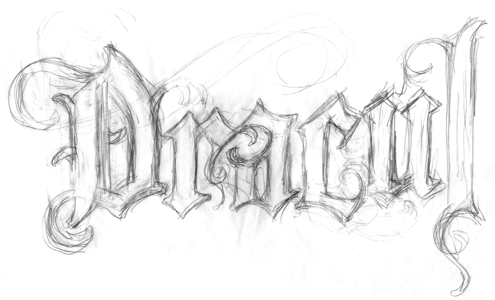
With some projects I start out by creating many small rough pencil sketches to try to discover how I want to solve a problem. Somehow with this project I knew from the start what I wanted to do. In my head I had eliminated all the hackneyed and clichéd solutions that one would come to expect for such a logo. I decided that I wanted to start out with a sort of black-letter, gothic form as a base, and then transform it into something that would communicate what I thought of as a sort of “decayed elegance”. So I just started drawing:
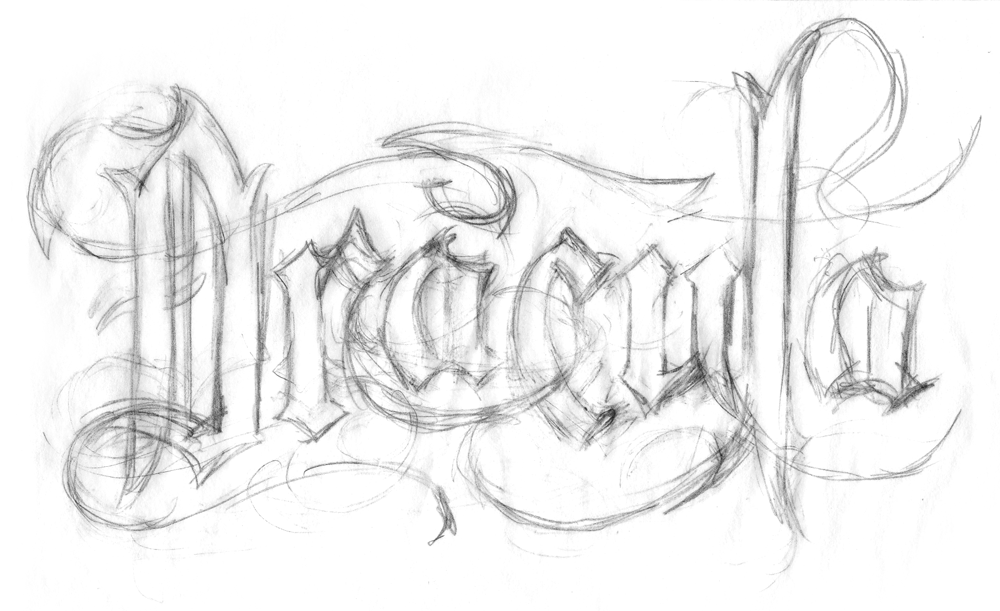
For some reason I stopped before completing the word (guess I knew what another “a” would look like). But I liked a lot of what I was seeing and expanded it into my next rough. This one was a lot more fluid, and I really liked where it was going:
What had started out with gothic, black-letter forms, was turning into something else—but I wasn’t sure how to define it:
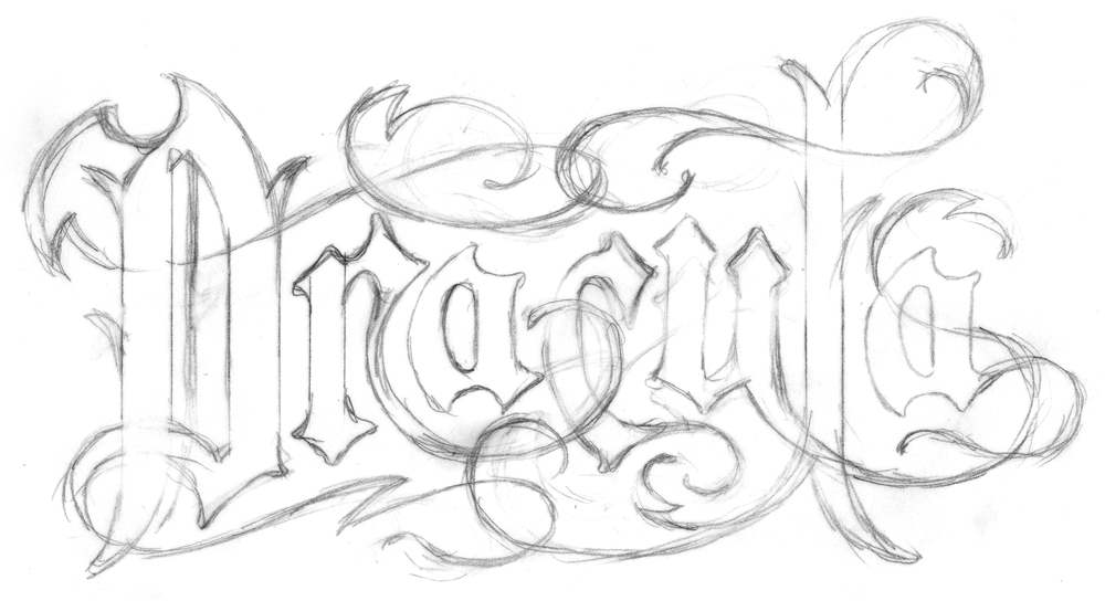
Then, using that pencil rough as a base, I started inking over it on an overlay to start to work out and refine the weights and forms:
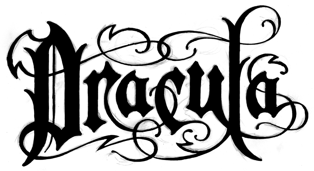
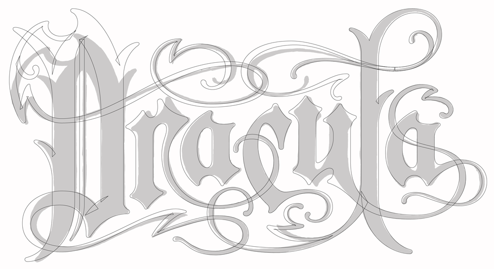
After scanning the inked version, I placed it in Adobe Illustrator as a template, and started creating the final art. As you can see, I ended up deviating from my inking in several places:
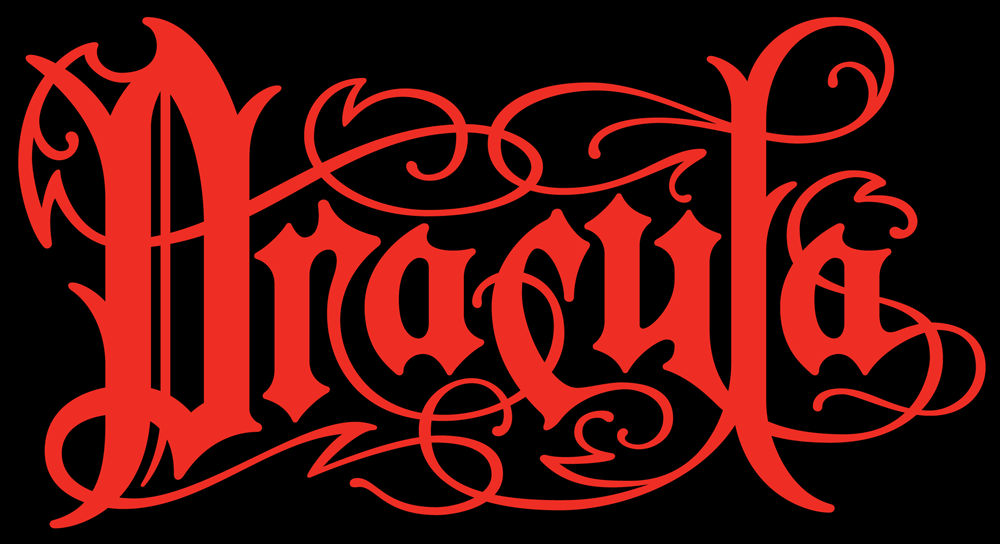
Finally, I was pleased with what I had done . . . I felt it had that feeling of “decayed elegance” that I had been striving for. I rendered it in blood-red against a black background then presented the final art to Acme, who in turn presented it to the Stoker estate. It was approved without a hitch:
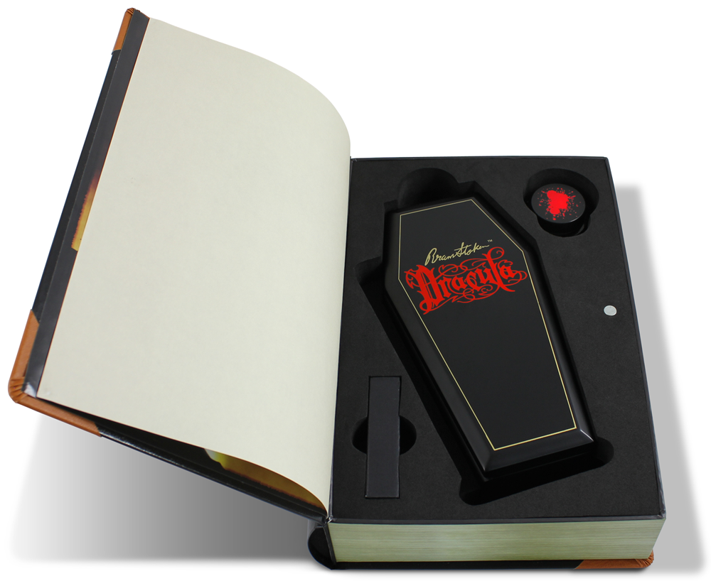
Acme will be releasing this pen set this year in time for Halloween. It will be in a limited edition of 999 fountain pens with blood-red ink and an interchangeable rollerball option. The pen will lay within a coffin shaped box together with a bottle of blood-red ink, and a red rollerball refill:
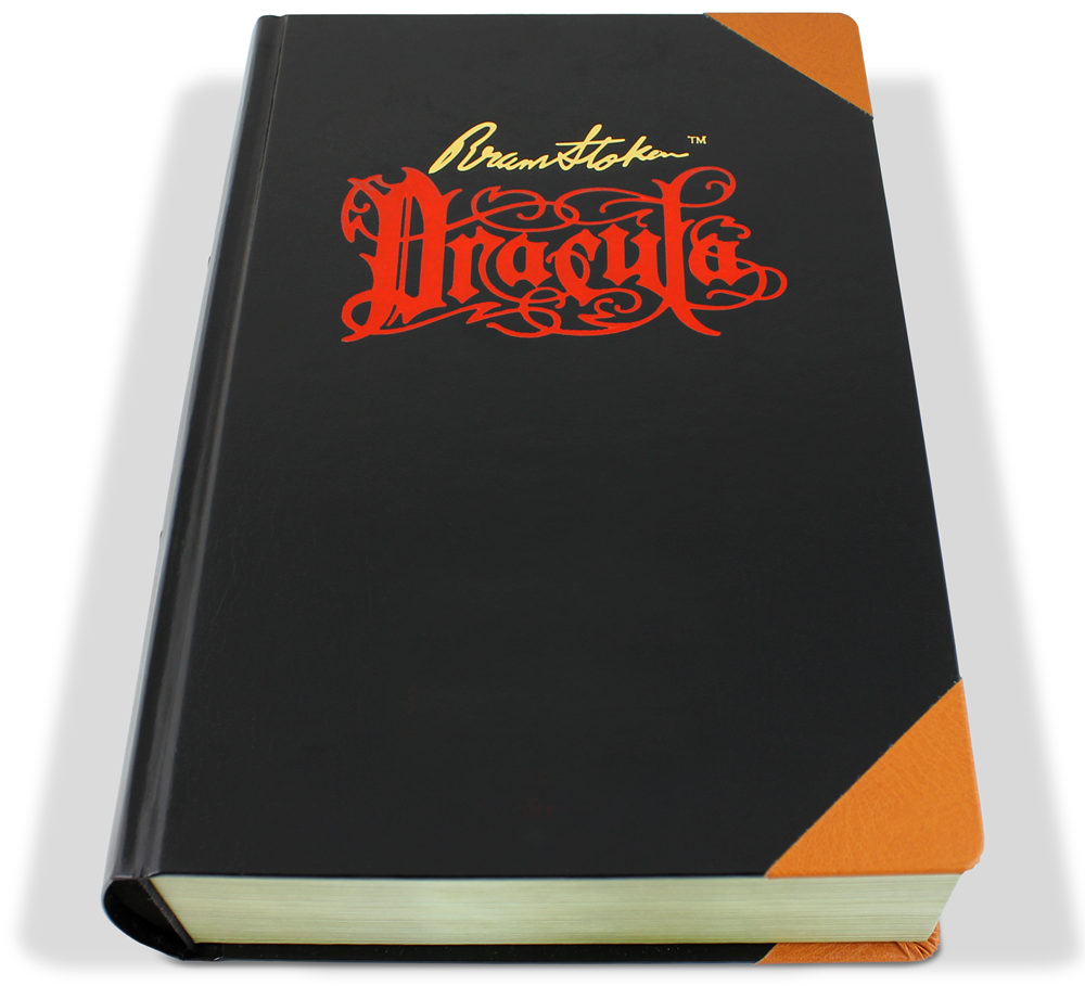
And the entire set is encased in what appears to be a bound edition of Dracula:
The set will retail for $500 and will be availabe through ACME Studio retailers.
4 Comments
RSS feed for comments on this post. TrackBack URI
Leave a comment
Powered by WordPress and Nifty Cube with Recetas theme design by Pablo Carnaghi.
Entries and comments feeds.
Valid XHTML and CSS.



I want that FONT just to use as a FONT. so awesome I love everything you have done!!
Comment by Melanie — June 15, 2013 #
loving your work Michael. I used to be a signpainter myself back in the day and have originated fonts. But I have to admit I never achieved your level of virtuosity.You encapsulate everything good about the (proper)sign industry. Awesome (such an over used word)and with all due respect, well done!
Comment by andie lines — February 12, 2013 #
Thanks for the awesome design! Fun to know the story behind the design, and thrilled to have acquired #56 at Scottsdale Pen on Saturday. Great addition to my collection.
Comment by Kris Brandt Riske — October 29, 2012 #
Beautiful job Michael.
Comment by Daniel — October 1, 2012 #