 |
|
Title Treatment for “Wreck-It Ralph”. —— Client: Walt Disney Animation Studios
June 4, 2012 on 9:02 pm | By Michael | In News | 27 Comments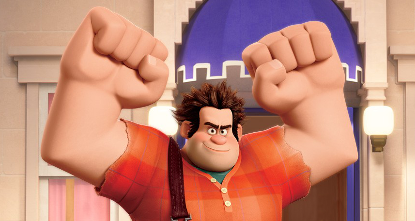 It’s been a while since I’d been called to do a title treatment for a major motion picture, so it was with great pleasure that I went in to see Disney Executive VP John Sabel to discuss working with them on developing a logo for a new animated feature slated for release this November 2nd. Wreck-It Ralph tells the story of Ralph, an arcade video game “bad guy” (John C. Reilly)—a one-man wrecking crew who is determined to prove he can be a good guy. Starting out as a classic arcade 8-bit character, Ralph travels through several arcade worlds, ending up in fully articulated 24-bit form. Here’s the final logo we ended up with:
 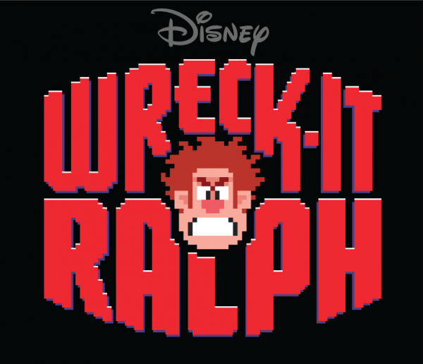 The process of developing this title treatment extended over several months. It’d be impossible to detail here all the stages we went through, but I’d like to just show here first some of my development pencil sketches:
 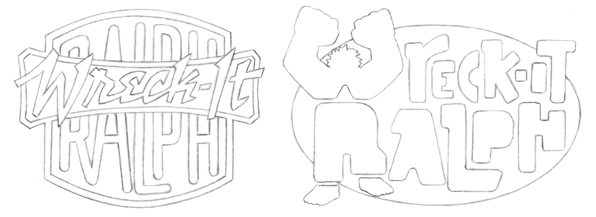 Some of the letterforms I used were reminiscent of the shapes in the character.
 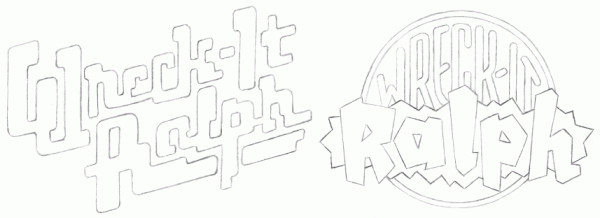 I tried to provide as many attitudes and alternatives as I felt worked for the subject matter.
 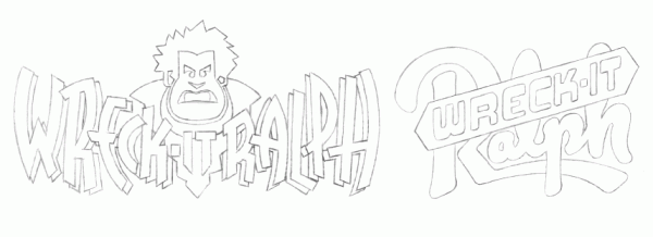 It was felt that a suggestion of the main character and his 8-bit nature might be a good way to go.
 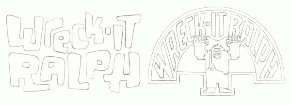 In all cases I wanted the treatment to be playful and reminiscent of some of the classic arcade logos of the ‘70s.
 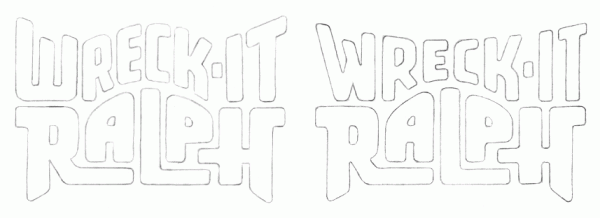 When I came up with the idea of an 8-bit logo surrounding an 8-bit face, I knew we had hit paydirt.
 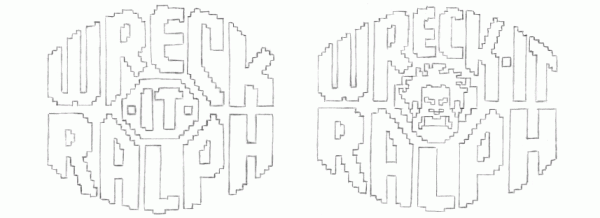 So from that point on I took that approach and developed the logo in digital form. It went through many, many different stages, culminating in the title treatment you see at the top of this post. It was decided that the face I came up with for Ralph was a little too “angry” looking . . . so I took it down a notch. Also the “Disney” logo needed to somehow be incorporated. We tried it both inside and and outside and above the treatment. I tried creating a border, making a self contained “badge” treatment with the Disney logo inside:
 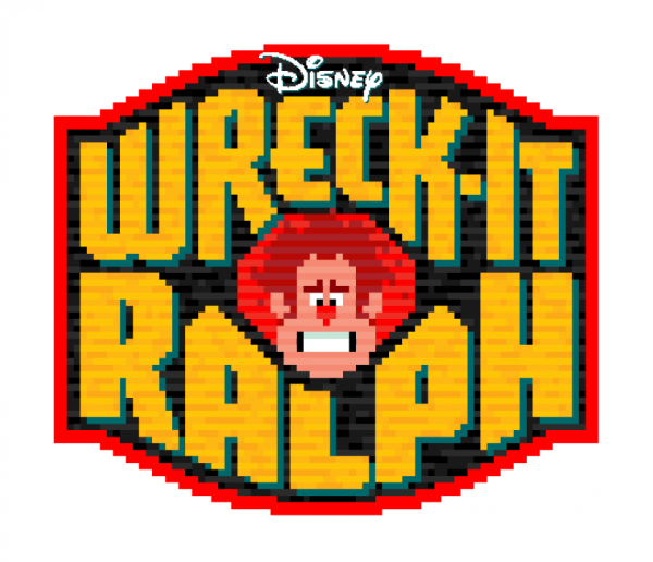 We then simplified the “badge” a bit:
 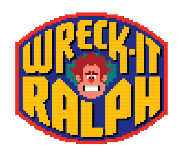 We eliminated the “badge” completely, again opting for more simplicity:
 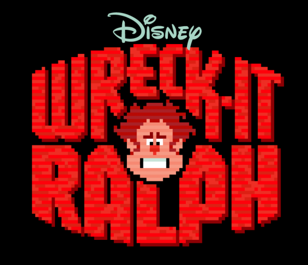 We changed Ralph’s face again, making him a little bit meaner looking, and edited the shapes of the letterforms.
 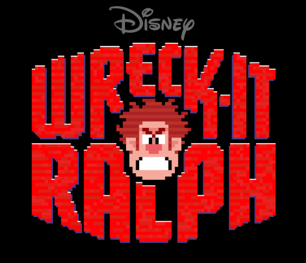 In the end we eliminated the “brick” texture that filled the letterforms, opting again for a simpler look. Here’s that final title treatment again:
Letterpress Print Giveaway to Purchasers of Dynatype Until March 31
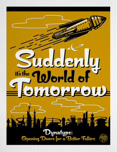
March 7, 2012 on 10:11 pm | By Michael | In Uncategorized | 1 CommentDynatype, just released on MyFonts is on sale at a 20% discount. And until the end of March, I am also pleased to offer purchasers a special limited edition print:
This 8½” x 11″ signed and numbered edition is letterpress printed by Terrence Chouinard of Ithaca Typothetæ in Athens, Alabama. Mr. Chouinard keeps a low profile, but you can read his CV here. (Scroll down to bottom of page.)
So, for $48 you’ll get my latest font design and you’ll receive a numbered, limited edition, finely-crafted letterpress print—printed on exquisite Hahnemuhle Copperplate stock—and signed by yours truly. Unfortunately this offer has terminated. But if you’re interested in purchasing one of these fine letterpress prints, you can click HERE to start the process.
If you are among those taking advantage of this offer, you can expect to receive an email from me asking for a mailing address to send your print to. Rest assured—I will NOT share your info with anyone!
This offer applicable to United States residents only.
Please Email me with any questions.
New Font: Dynatype Just Released
February 10, 2012 on 10:16 pm | By Michael | In Uncategorized | No Comments
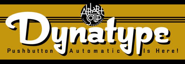
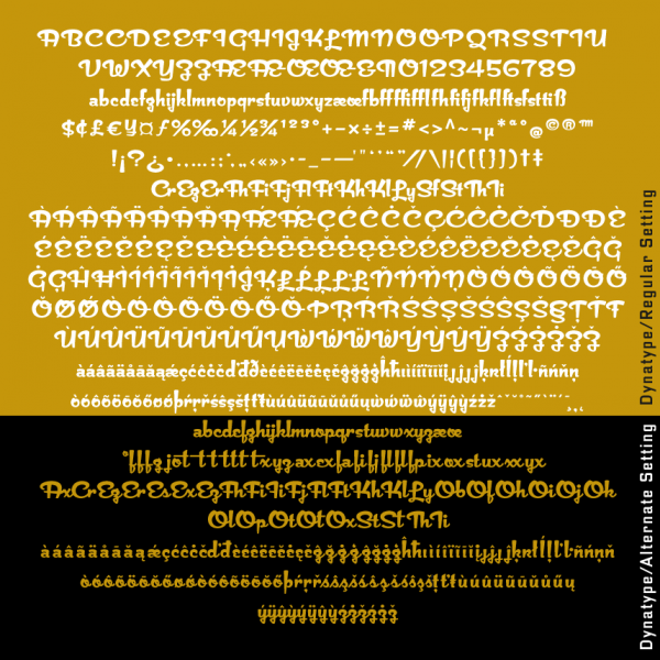
Alphabet Soup is proud to announce the release of Dynatype—the second of its “Dyna-Fonts”. Whereas Dynascript was primarily a connecting script font with a non-connecting italic alternate style, Dynatype is first and foremost an upright, non-connecting font with an upright, connecting alternate component.
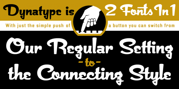
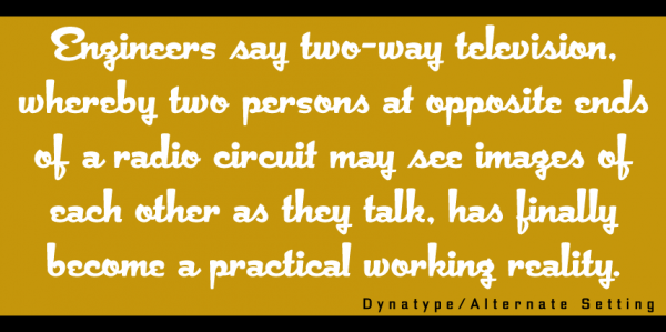
“Suddenly…it’s the World of Tomorrow!” With the push of a button Dynatype will automate your typesetting experience. Dynatype is actually 2-Fonts-In-1: without switching fonts you will be able to instantly change from Dynatype’s “regular” default style to its alternate connecting version with the simple push of a button.
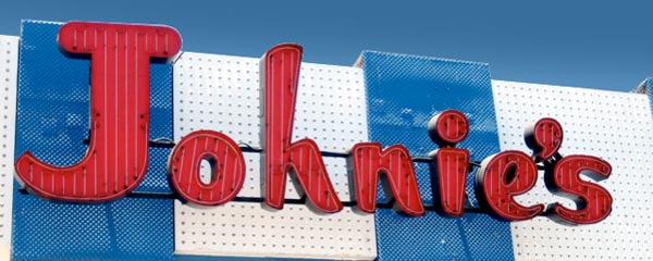
To some these fonts may be reminiscent of various mid-century neon signage, and of sign writing, Speedball alphabets and even baseball scripts. The design of the Dyna-fonts also takes some cues from a historical typographic curiosity that began in Germany in the ‘20s and which lasted into the ‘60s—when Photo-Lettering gave it the name “Zip-Top”. Basically it was believed to be the wave of the future—that by weighting an alphabet heavier in its top half, one could increase legibility and reading speed. The jury’s still out on whether or not there’s any validity to this notion, but hopefully you’ll agree that in the context of this design, the heavier weighting at the top of the letters helps to create some uniquely pleasing forms, and two unusual fonts.
Typesetters across the planet will be able to set copy in their language of choice.
Dynatype’s 677 glyphs can be used to set copy in: Albanian, Basque, Catalan, Cornish, Croatian, Czech, Danish, Dutch, Esperanto, Estonian, Faroese, Finnish, French, Galician, German, Hungarian, Icelandic, Indonesian, Irish, Italian, Kalaallisut, Latvian, Lithuanian, Malay, Maltese, Manx, Norwegian Bokmål, Norwegian Nynorsk, Oromo, Polish, Portuguese, Slovak, Slovenian, Somali, Spanish, Swahili, Swedish, Turkish, and Welsh—and of course English. Sorry! Languages of the Lunar Colonies not yet supported.
Purchase Dynatype on Alphabet Soup HERE.
Download the Dynatype Manual HERE
Dynatype Design and Art: Michael Doret
Dynatype OpenType Programming: Patrick Griffin/Canada Type
Powered by WordPress and Nifty Cube with Recetas theme design by Pablo Carnaghi.
Entries and comments feeds.
Valid XHTML and CSS.
