 |
|
Japanese Time Machine
October 25, 2012 on 10:34 am | By Michael | In Gigs, Wayback Machine | 6 CommentsMy friend José Cruz recently posted this LINK on my Facebook page, reminding me about one of my earliest, favorite projects—one which set the tone for much of my work that followed. In the page that was linked the reproduction my cover was so tiny that I figured it might be time to unearth the real thing and tell its story.
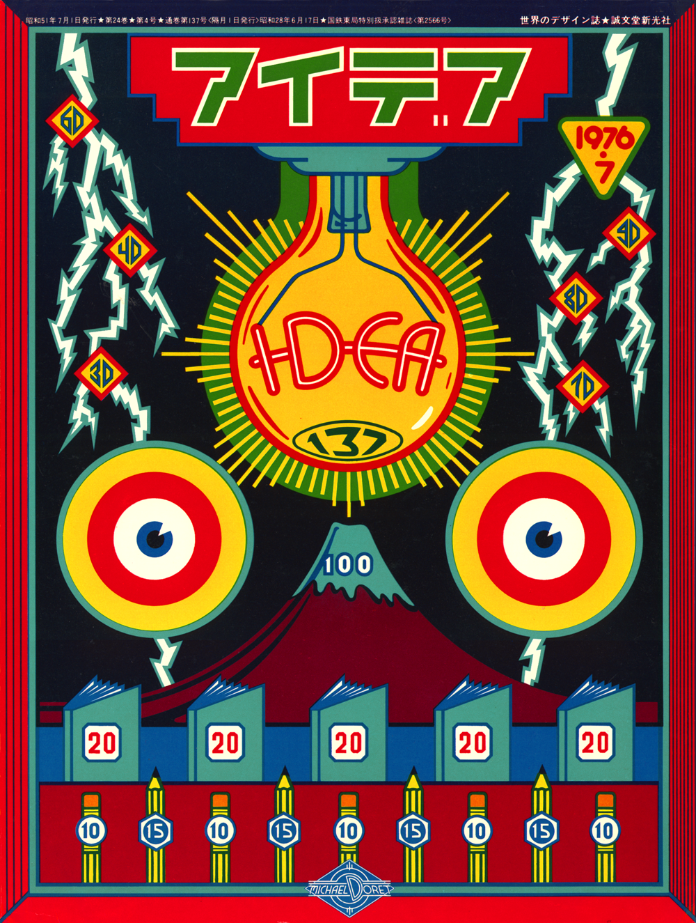
I had only been freelancing for a couple of years when the Japanese magazine “Idea” contacted me, wanting to do an article about my work. I proposed doing a cover for that issue, and they agreed. Rather than designing a standard 4 color process cover, I prepared the art for 5 flat Pantone colors. Overlapping the transparent inks would create even more colors, and I hoped to achieve a richness and depth of color that approached the look of a silkscreen. It all worked out really well.
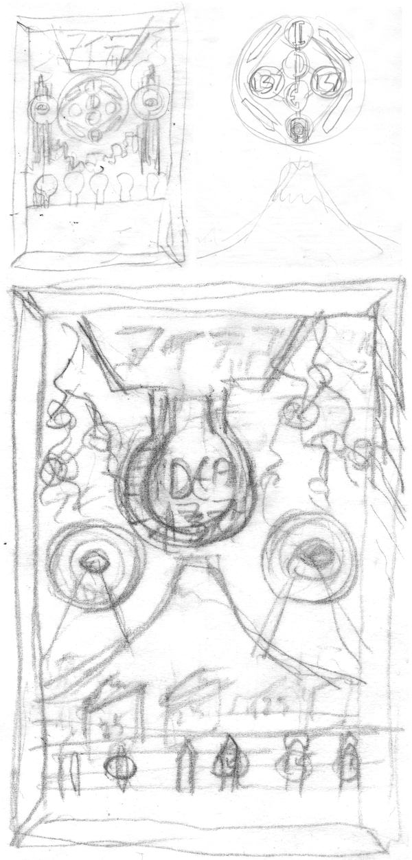
Starting with a few thumbnail pencils, I developed the look for the cover, which was based on an arcade/shooting gallery/metal target game look:
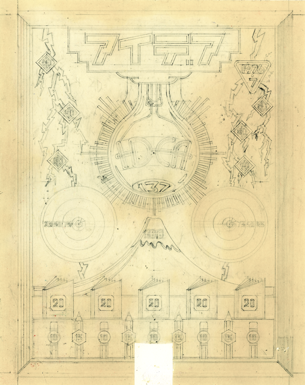
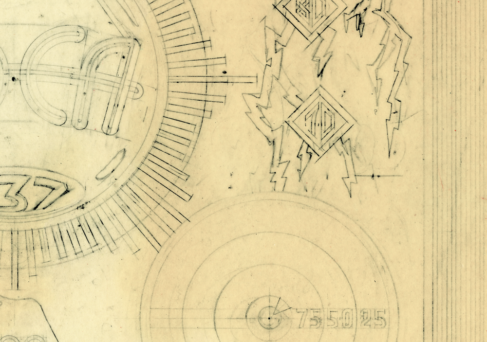
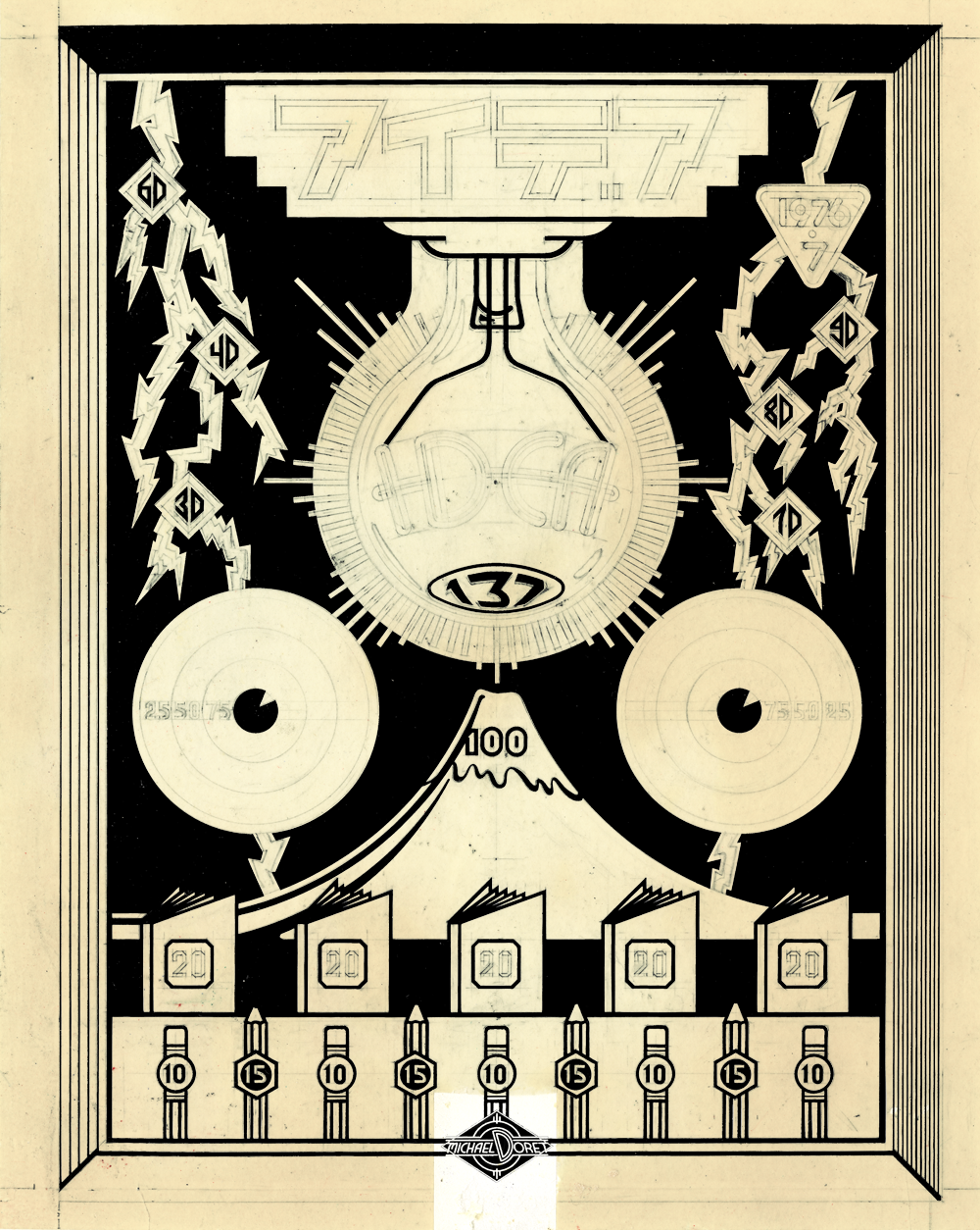
I’m sure there were a couple of pencil drawings between the ones above and the next one, but it’s been many years, and things tend to disappear. This next drawing demonstrates how I used to work pre-computer. I needed to work out the drawing in the finest detail, because once I inked the linework on prepared acetate, there was no such thing as ⌘-Z: making changes was difficult. You’ll notice in the detail, the great care I used when drawing—this was extremely painstaking work (the yellowing of the vellum is mostly due to the aging of the rubber cement used to glue it to a board:
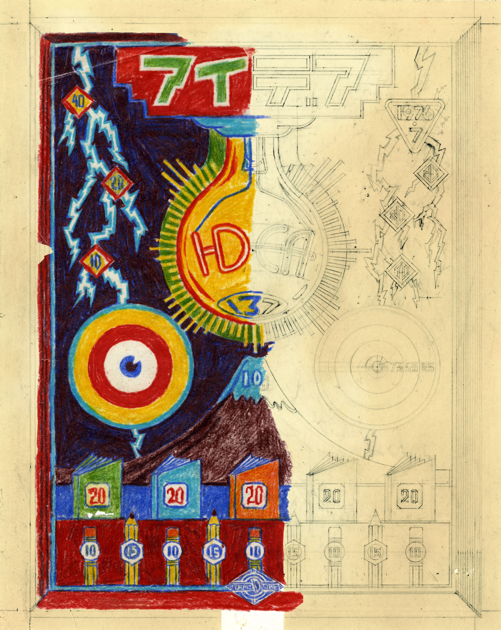
Next I worked out rough color with Prismacolor pencils on a piece of tracing paper over the tight drawing. I was tryng to approximate how transparent Pantone colors would react when laying one over the other. For example laying the blue/violet over the burgundy would get me a very dark—almost black-ish color. There were probably other color studies, but this is all I have left:
After working out the color, all that remained was to create the finished pre-separated art, inked in black with technical drawing pens (Koh-I-Noor Rapidograph). In this case the art consisted of seven inked, prepared acetate overlays, plus the base art that was inked on vellum and glued to an illustration board. Below is a representation of just one of the overlays in position over the tight tracing—where it was when it was inked—this represented the dark blue ink:
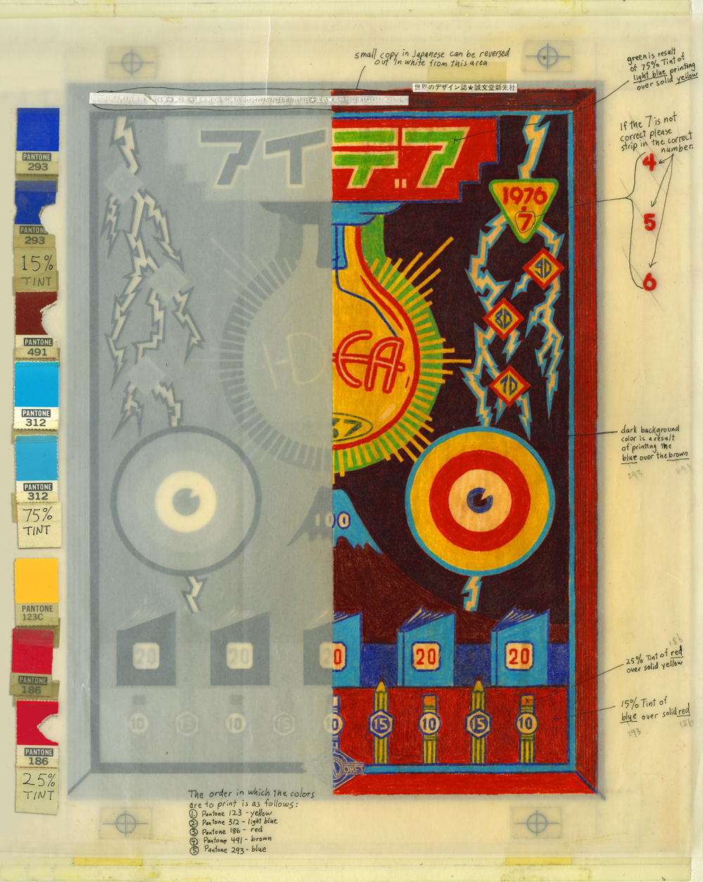
When all the inking was done, all the overlays were registered to each other (note the register marks), and the whole was prepared for the printer in Japan with detailed instructions written on a vellum overlay with a more accurate representation of what the finished piece would look like (rendered in colored pencil). Pantone color chips were taped alongside for color matching. It’s a hell of a lot easier to render art like this today using Adobe Illustrator!
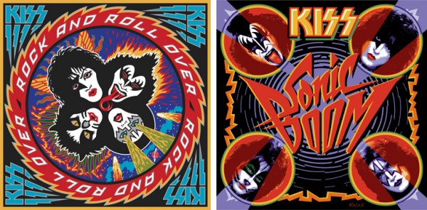
Below is the actual printed cover. It remains one of my favorite pieces. It also served as the design and color model for how I executed the album cover “Rock and Roll Over” for KISS just a few months later that year:
An Interview With “Posting and Toasting”
September 11, 2012 on 2:30 pm | By Michael | In Gigs, Wayback Machine | 3 CommentsMy good friend Norman Hathaway is an avid New York Knicks fan, and follower of Seth Rosenthal‘s humorous Knicks blog Posting and Toasting which boasts one of the biggest communities of Knicks fans on the internet. Apparently Norman spoke or wrote to Seth about my involvement with the NBA, and specifically about how I created the current identity for the Knicks. So Seth contacted me, and we talked about how that whole thing went down. I dug up a ton of my old sketches and comps for this project and sent them to Seth who put them all together, interviewed me and is now posting the story in two parts over two days on his blog.
Today, I’ve reproduced verbatim (below) Seth’s first post, and tomorrow will do so again with the second:

Behind the Knicks Logo with Michael Doret: Part 1
This is the current Knicks logo. This is what the Knicks logo looked like in 1992. Little has changed, y’all. They added a little “New York” and modified the colors recently, but have done nothing else to alter a design that’s been the primary logo for over twenty years. That emblem has been a constant symbol of the team, and its distinctive big, block lettering echoed throughout several other teams’ redesigns in the ’90s, some of which are still in place today. So, where did this logo– which has persisted through multiple Knicks regimes– come from? With the help of P&T citizen normanhathaway, I had the pleasure of corresponding with Michael Doret, the man who made the Knicks logo.
Doret is a New York-raised, Los Angeles-based designer and lettering artist with a rather extensive resume. When the NBA approached him in Spring of 1991, he’d already done some work for the league, as well as designs and design ideas for the MLB, the NFL, TIME Magazine, the band Kiss(!), and a lot more. So, the league felt pretty confident in his abilities and gave him pretty much free reign to try out different logos and letterforms:
“Before starting on this design project I didn’t receive that much input from the NBA other than the directive that they wanted to have something symbolic of New York CIty incorporated into the logo. After discussion we eliminated several options (such as the Statue of Liberty), and settled on the iconic Empire State Building as the only viable alternative that might work in the new logo. So in the beginning stages that was the given which, as we all know, they ended up deciding against as the logo development progressed. I think other than keeping the original blue and orange from the old logo, there wasn’t that much else given me in terms of requirements. The directions I took were mostly left up to me.”
It was a fairly open-ended task and, as Michael notes, the only specific request made of him didn’t even make it to the final product. So, with that dearth of instruction in mind, he set about producing a variety of design concepts. In Part 1 of our magical journey through Michael’s old files, he’ll show us some of the concepts that didn’t make it.
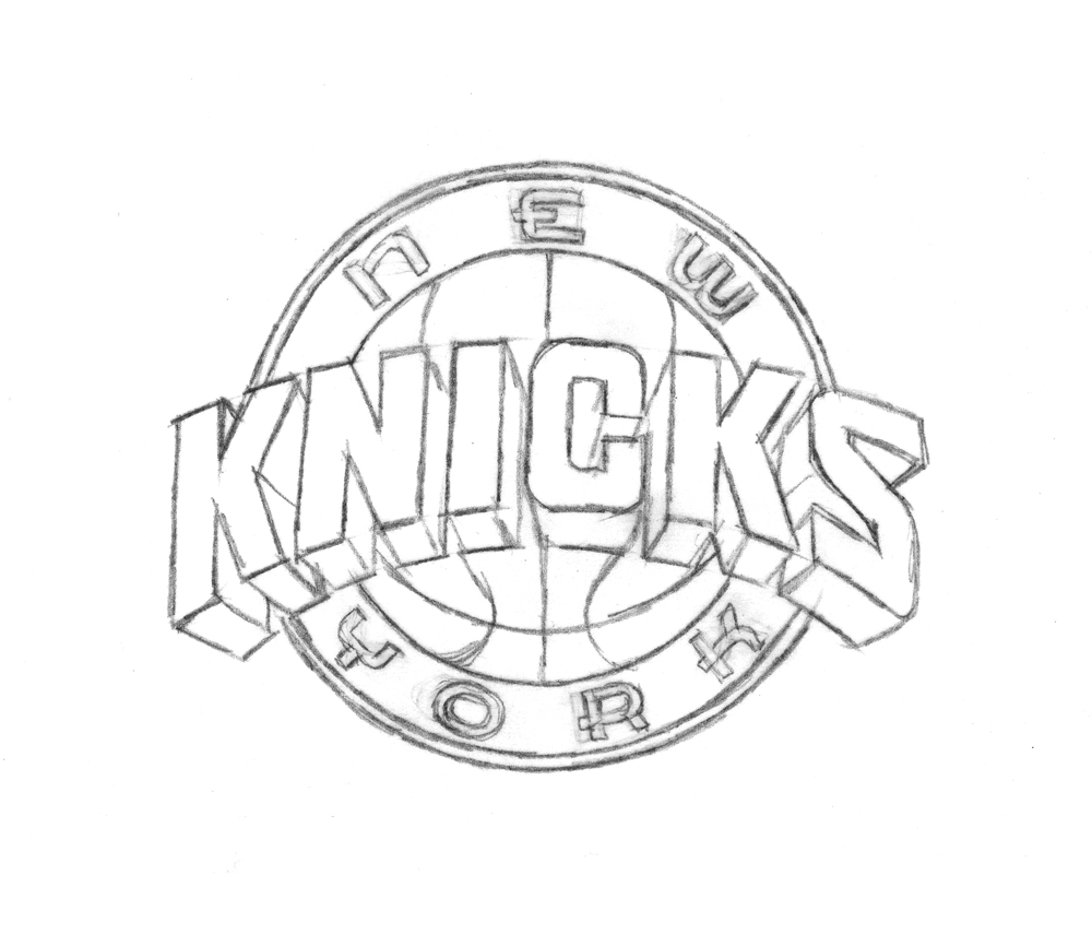
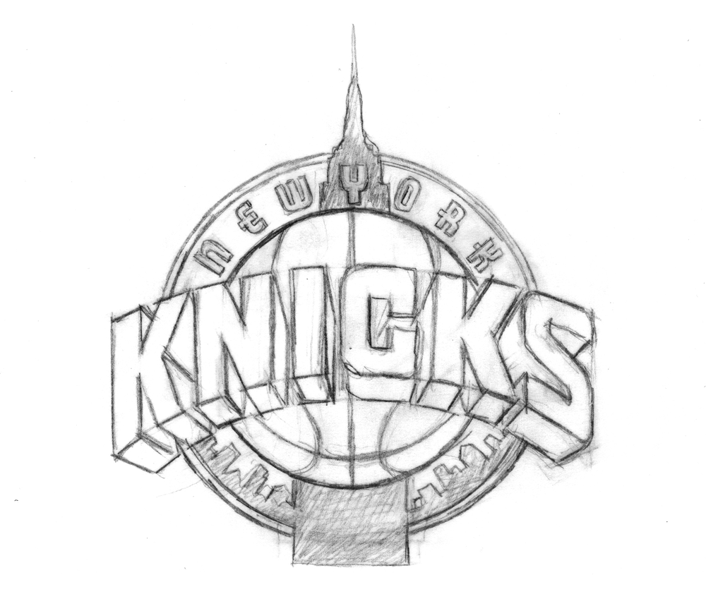
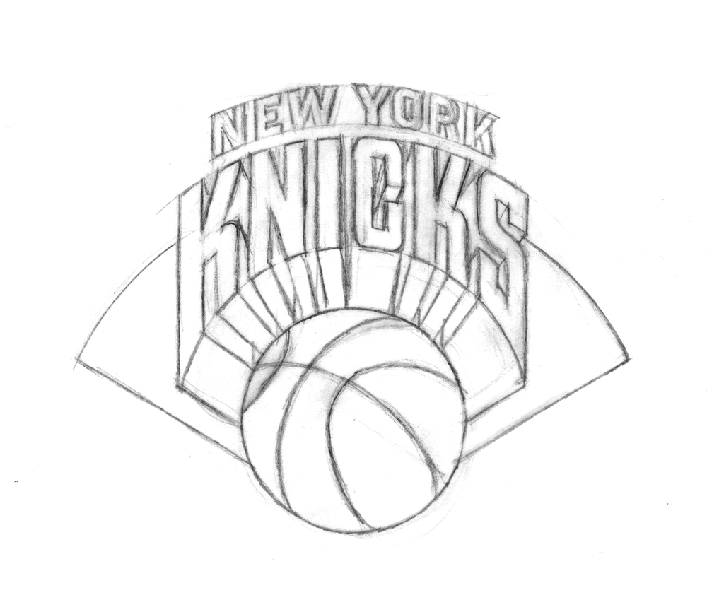
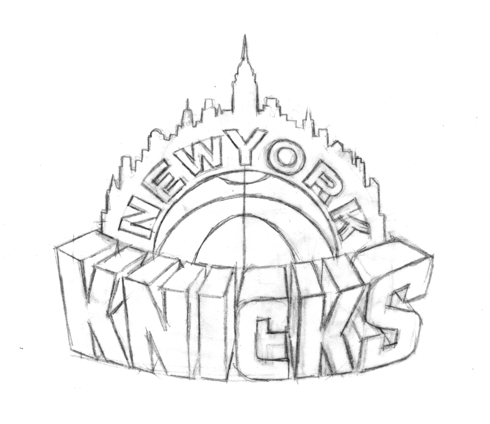
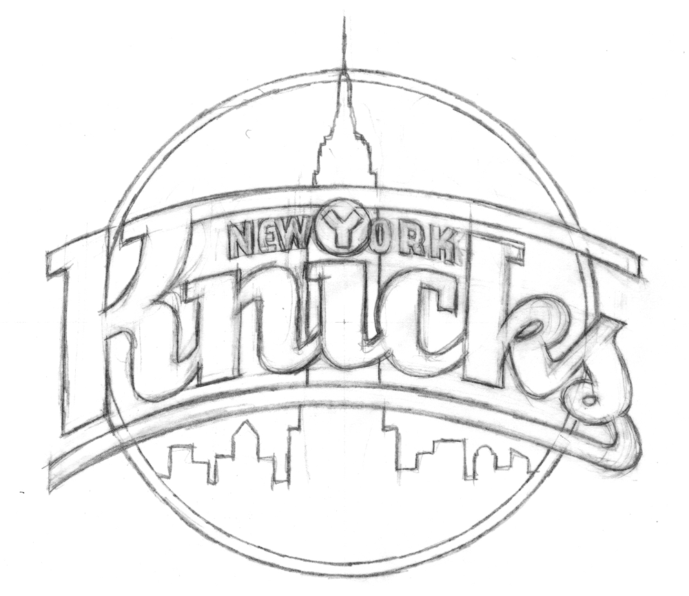
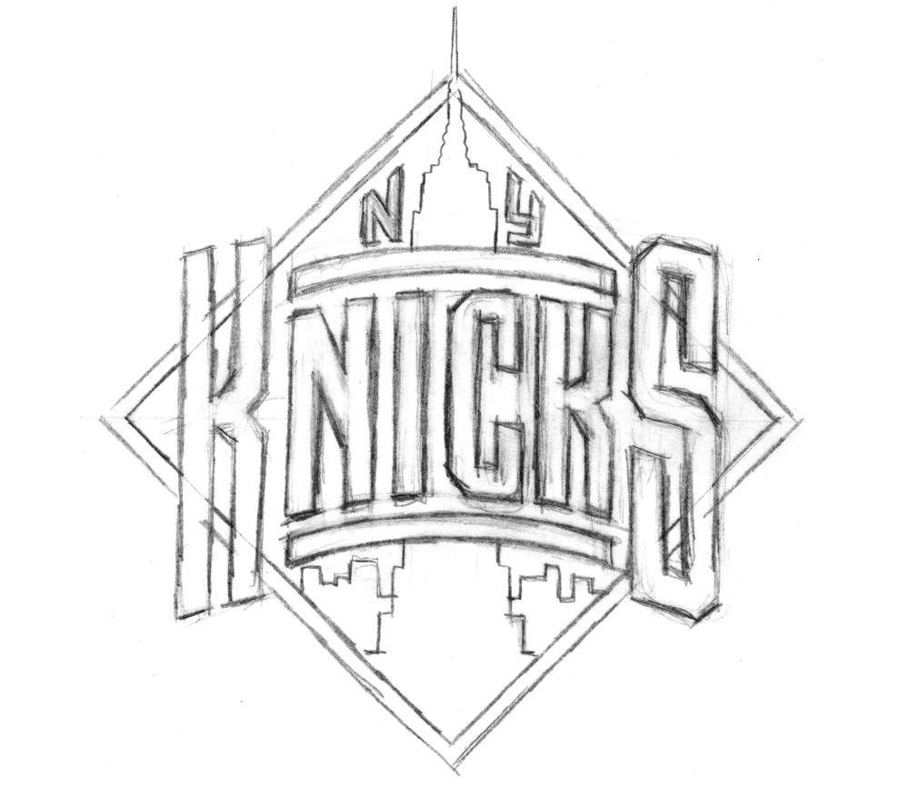
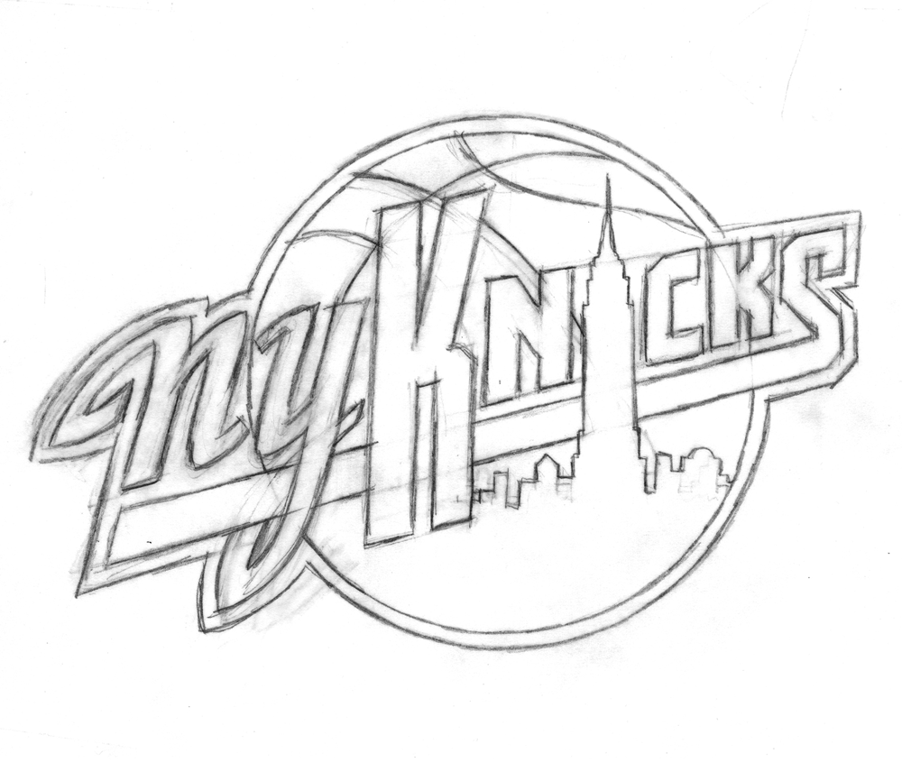
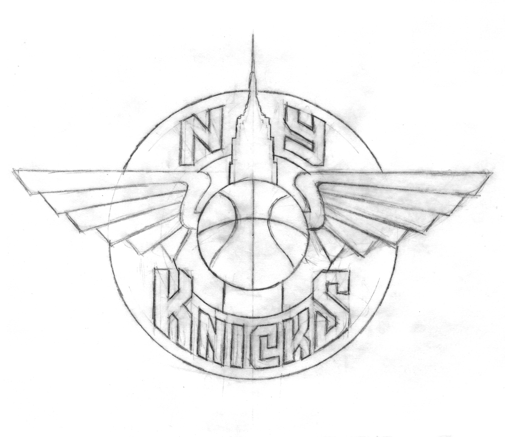
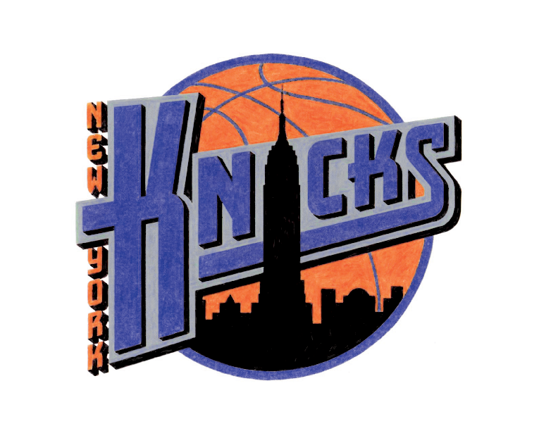
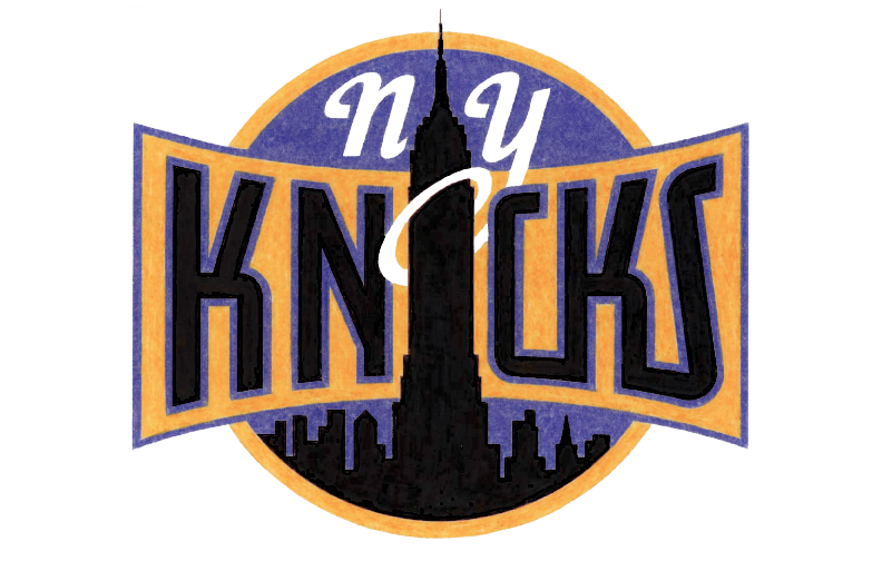
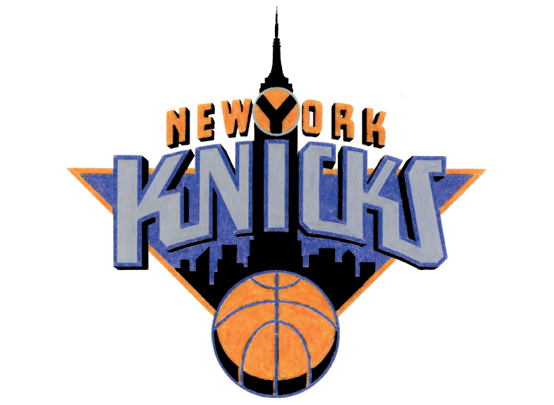
To generate ideas, Michael began with some rough sketches, examples of which are below.
With the Empire State Building icon relatively unchangeable, Michael focused his imagination on the lettering:
“At that time (and even still) my work was all very lettering-oriented. I was trying to open up new areas of letterform design that, up until that point, had tended to be a bit stodgy and traditional. I was just trying to do something different for the time. In actuality I was picking up a lot of cues from bygone eras, from when lettering was really in its heyday-like in the 1930s and ’40s-only this time around with a slight twist.”
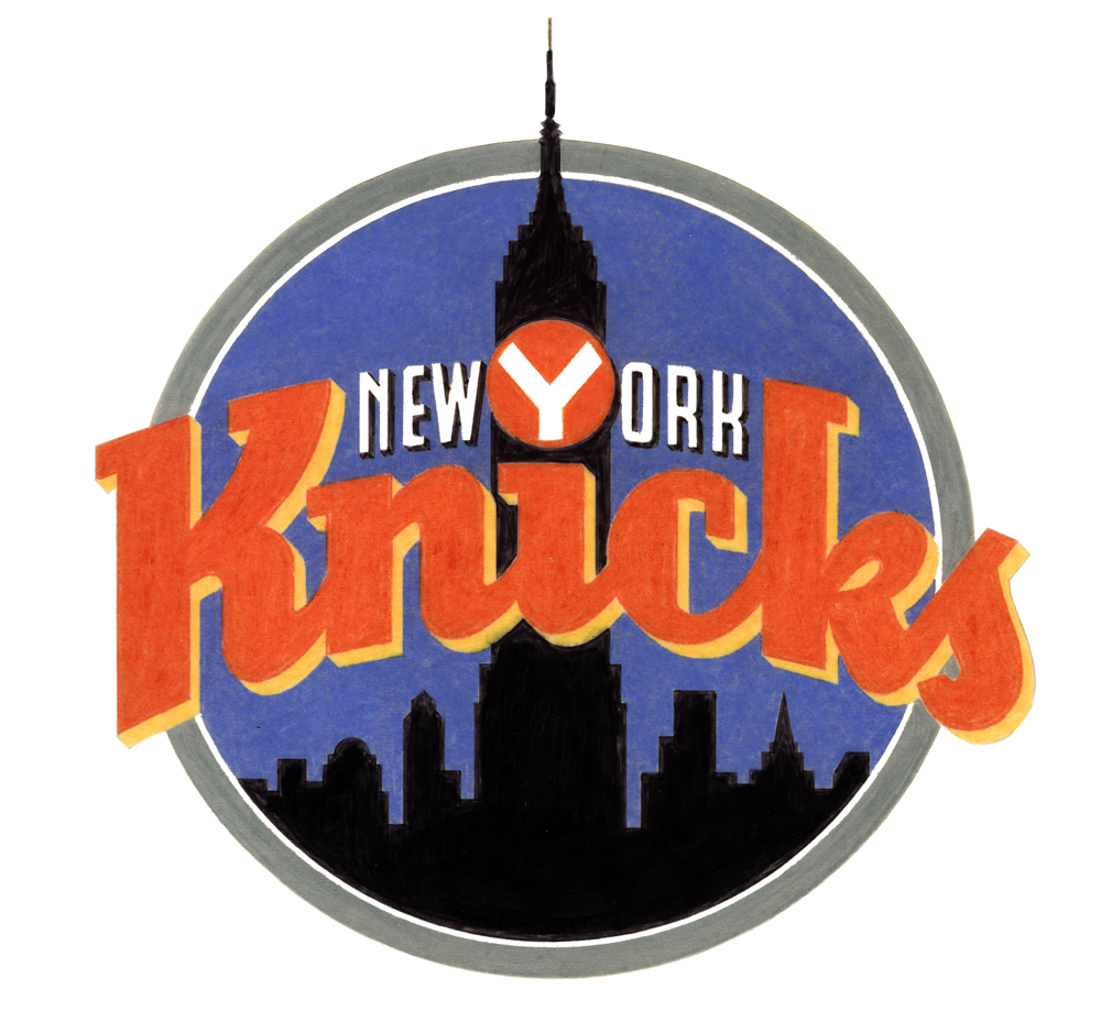
Some of the sketches and elements of others eventually made it into color concepts which, before the widespread use of computer design programs, Michael rendered in colored pencil (the ’90s were a dark time).
Any of these could have ended up as the Knicks’ primary logo (and, incidentally, Michael loves all his logo babies, but told me the first of those color logos was his favorite), but alas, they could only pick one
In Part 2 we’ll look at the process behind the logo of Michael’s that the Knicks did choose, and learn about how another familiar piece of Knicks iconography also comes from Michael’s desk.
WXRX/Live Radio Chat
August 27, 2009 on 1:29 pm | By Michael | In Gigs, News, Wayback Machine | 3 CommentsToday I did my very first live radio interview with Stone and Double T at WXRX radio out of Rockford Illinois, home of the landmark Coronado Theater. I chatted with them about my work on KISS’ album covers: both “Rock and Roll Over” and “Sonic Boom”.
Powered by WordPress and Nifty Cube with Recetas theme design by Pablo Carnaghi.
Entries and comments feeds.
Valid XHTML and CSS.
