 |
|
Archive for the 'Gigs' Category
Wreck-It Ralph Trailer Debuts on Web
June 18, 2012 on 8:39 am | By Michael | In Gigs, News | No Comments
The Wreck-It Ralph official trailer is finally up on the web. Look for the animated version of the title treatment I designed (just below) at the end of the trailer. For more on my design process for this logo see my previous Wreck-It Ralph posting.
<
Dynascript Makes Its 1953 Premiere… In the 21st Century
November 12, 2011 on 1:26 pm | By Michael | In Gigs, News | 13 Comments Several months ago I was contacted by David Klein, Vice President of Charles P. Rogers & Co. in NYC (bed manufacturing), about working together with him on a project. He described his company as “a small idiosyncratic company that has been making a quality product for over 150 years”. David had fallen in love with—and purchased—a 1953 Fageol Van that had been housed in The Golden Age of Trucking Museum which had recently closed its doors. The Fageols were beautiful vans that came in various sizes and configurations.
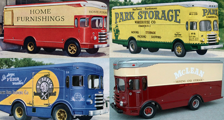
Physically the truck was in good condition, and David loved and wanted to keep the brilliant yellow color that it had been given by the Barrieau family—the van’s original owners. His vision was that this truck would become a moving billboard for CPR & Co, driving around New York, conveying “the Charles P. Rogers Beds message” in a manner that this van might have—had it been theirs back in the ’50s. Wanting to keep as much historical accuracy as I could, I asked about older graphics and logos from the CPR & Co archives but there was very little except for this monogram (which I kind of liked).
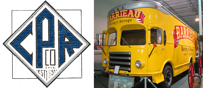 So, I needed to create graphics that felt appropriate for this 1953 van, and which helped evoke a simpler time. The only concrete thing that I had to work with from Rogers & Co. was the monogram, so I used that design as a basis to create a “medallion” that could be used on the front and sides of the truck. Just prior to the call from David I had begun development of a new font (which became Dynascript over the next few months), and decided that somehow it felt right to use it for the supporting graphics/slogans on the sides of the van.
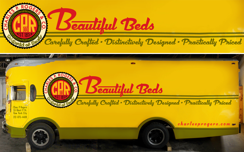
The van is currently in the process of having my graphics applied, so what you’re looking at is a Photoshop assembled composite of the truck with my design work superimposed. 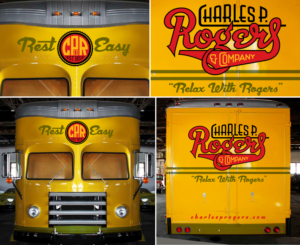
For the back of the van I created a logo in which I tried to evoke and encompass the over 150 year history of the company. Though it is a bit different from the mid-century vibe that Dynascript had helped give the front and side graphics, I felt it was appropriate and didn’t conflict with them. Also, it might be noteworthy to mention that I used the non-connecting italic version of Dynascript for the URLs on the back and sides of the van.
Not unlike my project with Deliscript and the Canter’s food truck, here was another instance of the influence that assignment work and font design had on each other. Even though they both started out as independent projects, they soon became inextricably entwined. Dynascript is probably a better font for it, because, with this project, I was trying to solve its design both from the point of view of a fontmaker, and from that of a font user.
Soon, when actual photos of the finished truck become available, I will post them here along with my development sketches and more detailed descriptions of the design process.
Lettering & Typographic Artists: Sucker Punched by Film Industry?
March 24, 2011 on 12:04 am | By Michael | In Gigs, Wayback Machine | 14 Comments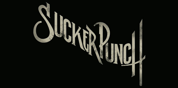 No doubt by now you’ve seen the title treatment for “Sucker Punch”. It seems to be everywhere. I don’t know who designed and did the art for it—and perhaps it’s best that I don’t—because I have a lot of issues with this design including its plethora of inconsistencies. BUT . . . on the bright side, I will say that its free-wheeling disregard for convention is a welcome reprieve from the unimaginative, dull but “safe” typographic treatments that have taken over film promotions for the last few decades. The genres of action and sci-fi movies would seem likely candidates where designers could “stretch their wings” so to speak, and be much more creative with their typography and lettering. If “Sucker Punch” is seen as a successful promotion, perhaps it will be the beginning of a trend, marking the moment when it was OK for creative typography and lettering to return to movie advertising.
There was a time when I was regularly called upon to work on title treatments for feature films. In retrospect there seemed to be more creative freedom back then—less control exerted on creativity by clients. A lot of what I did never saw the light of day, and much of it I’d prefer not to show. But there were some that I’m still proud of.
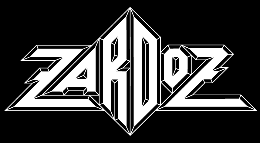 The one that most people remember is my treatment for Zardoz, a film directed by John Boorman—who had previously directed the amazing Deliverance.
The design of this treatment was derived from one of the plot elements in the film—crystal rings. Originally my design had the two Zs mirroring each other, but it was decided that would interfere with legibility. John Boorman liked my solution so much that he used it in the opening credits for the film:
![zardoz[blog]](http://alphabetsoupblog.com/wp-content/uploads/2011/03/zardozblog.png) It has been suggested by others that this design was the original inspiration of many rock and roll band logos done by others—such as “Asia” and “Anthrax”:
It has been suggested by others that this design was the original inspiration of many rock and roll band logos done by others—such as “Asia” and “Anthrax”:
 I have no knowledge that this actually was the case, but looking at them now I have to admit that it seems likely.
Another treatment I’m happy to have worked on was for Wolfen. This little seen film was directed by Michael Wadleigh and starred Albert Finney, Diane Venora, Gregory Hines and Edward James Olmos.
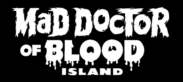
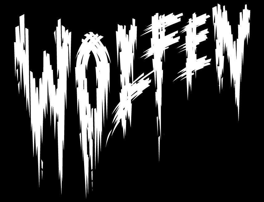 In this particular design I was trying to do my sort of tongue-in-cheek take on all those great horror movie titles from the ’40s and ’50s . . . the ones with the lettering suggestive of dripping blood and ripping flesh—such as:
And finally, the one that I would really have loved to have seen the light of day:
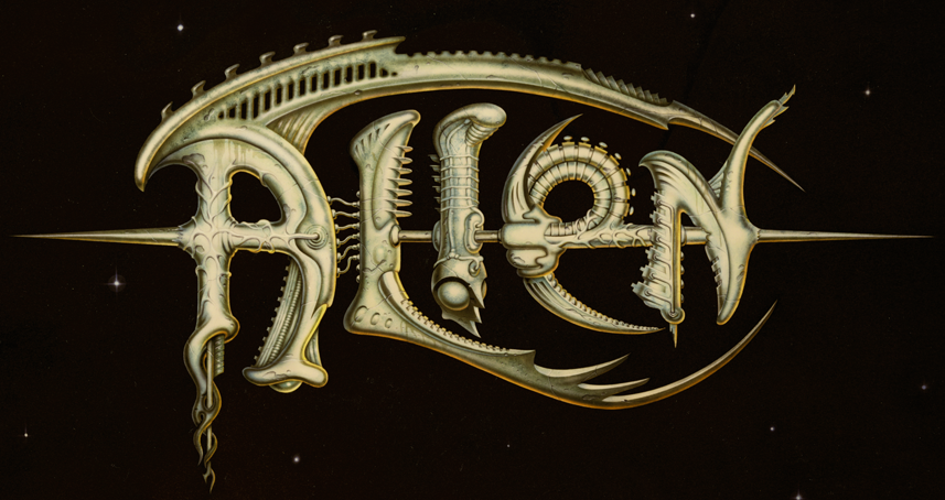
The title treatment I designed for Ridley Scott’s Alien never made it into the public arena. It had some small promotional uses before it was run over by the Bill Gold Advertising machine and relegated to the back burner. At any rate, this was great fun to have worked on—the more so since I was able to work on it with my friend (the now famous “pop-surrealist”) Todd Schorr. I designed and drew the forms based on the “bio-mechanical” forms I saw in some publicity stills from the production, and Todd painted the absolutely gorgeous finished art. Perhaps we went too far with this piece? I’ll probably never know what really happened.
But what I do know is that in the years between then and now we haven’t seen any great strides forward in the art of title treatments. Am I being over-optimistic in thinking that perhaps now we’re at the beginning of a new Golden Age? I hope not.
#
Powered by WordPress and Nifty Cube with Recetas theme design by Pablo Carnaghi.
Entries and comments feeds.
Valid XHTML and CSS.