 |
|
Archive for the 'News' Category
New Font Release: Dark Angel
June 3, 2013 on 3:05 pm | By Michael | In News, Notes | 1 Comment
Alphabet Soup Type Founders and Michael Doret are proud to announce the Release of Dark Angel, a “blackletter/hybrid” font.
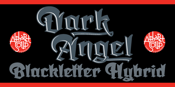
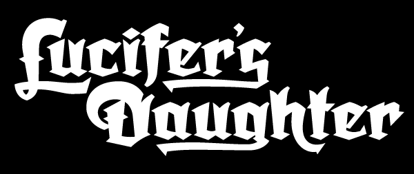
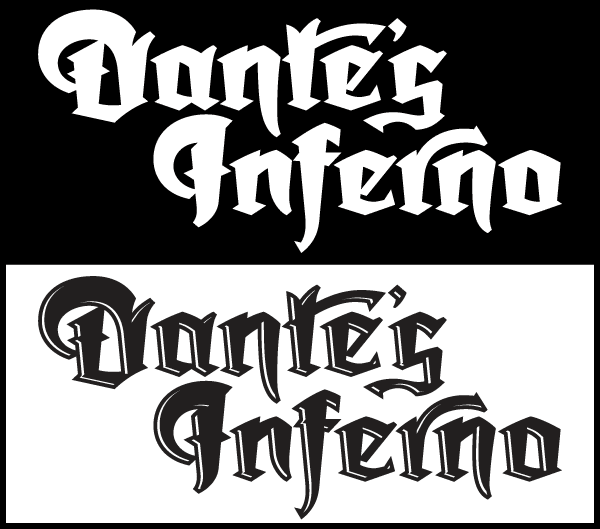
Dark Angel is the first completely new take in decades on the traditional “blackletter” font style. This font had its genesis years ago when the style was born in a sktech Michael created of a new logo for the California Angels baseball team (renamed shortly thereafter the Anaheim Angels). That Angels logo was never completed, but its rough sketch rose from the dead and become the basis for this brand new font design—and was also the source for the name. Below you can compare the forms from that original logo pencil and the corresponding letters from the new font. Many accomodations had to be made to keep these forms working together as a font but, as much as possible, the spirit of that original character design has been kept.
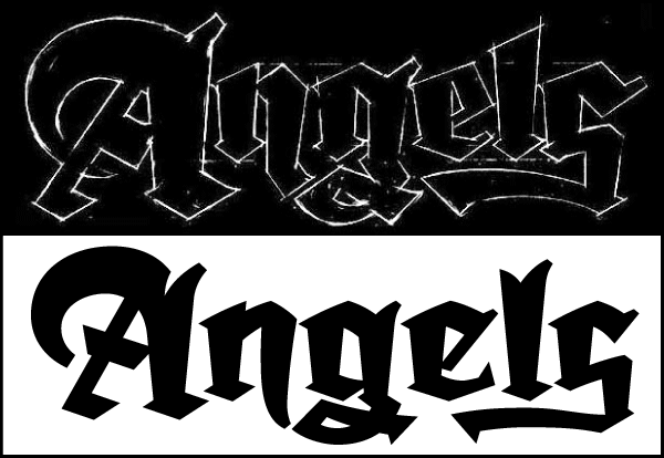
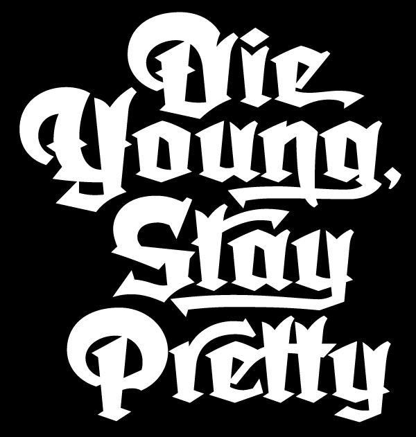
It’s kind of blackletter in feel, but as a display font it’s so much more. It is far more legible than most “Old English” or “Gothic Script” styles, and incorporates many features never before seen in them, such as swashes, tails and a plethora of ligatures.
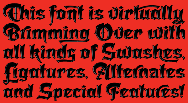
Type purists may be critical of the lack of adherence to traditional forms, but this font should be seen only as “in the spirit of” blackletter, and attempting to create something that hasn’t been seen or done before—something that feels traditional, yet at the same time fresh and unexpected.
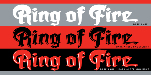
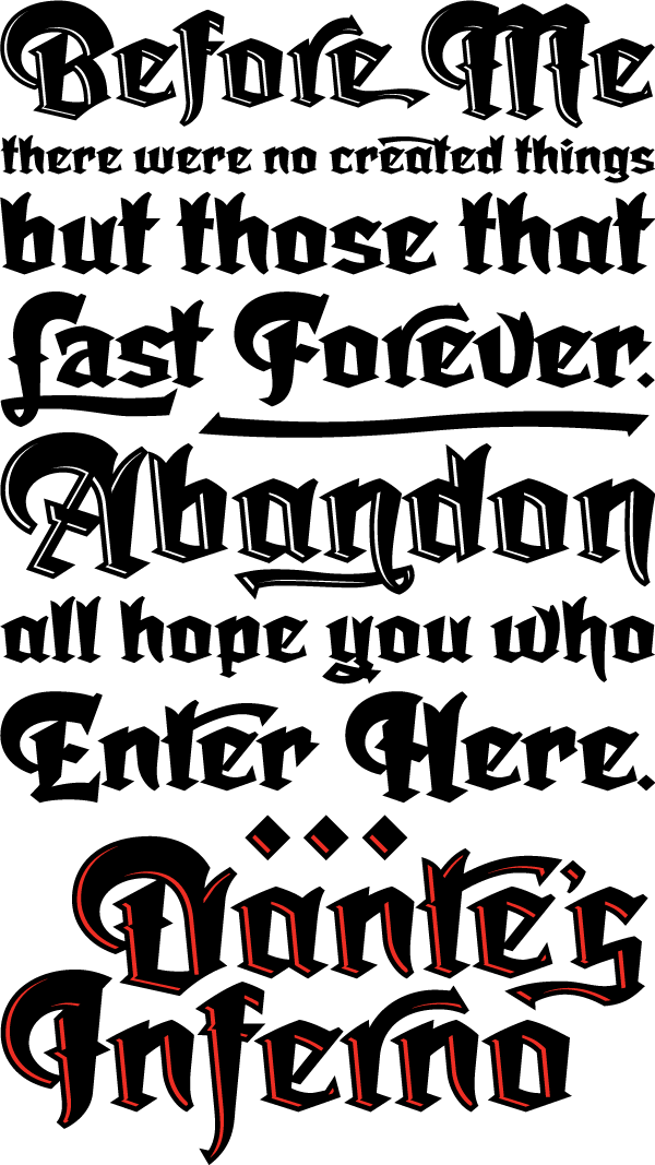
Dark Angel can be purchased in its regular solid form, or as Dark Angel Underlight—a “handtooled” font. When these two fonts are purchased together as a Family package, included will be a third font—Dark Angel Highlight. With this font layered over the basic font, two–color typesetting will be created when the highlight and the base font are assigned two different colors.
With Stylistic Alternates you can go either “Plain” or “Fancy”, changing the look of your copy to suit your needs. Compare the two samples below. Some characters have multiple alternates.
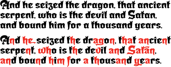
And furthermore…
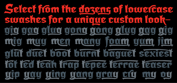
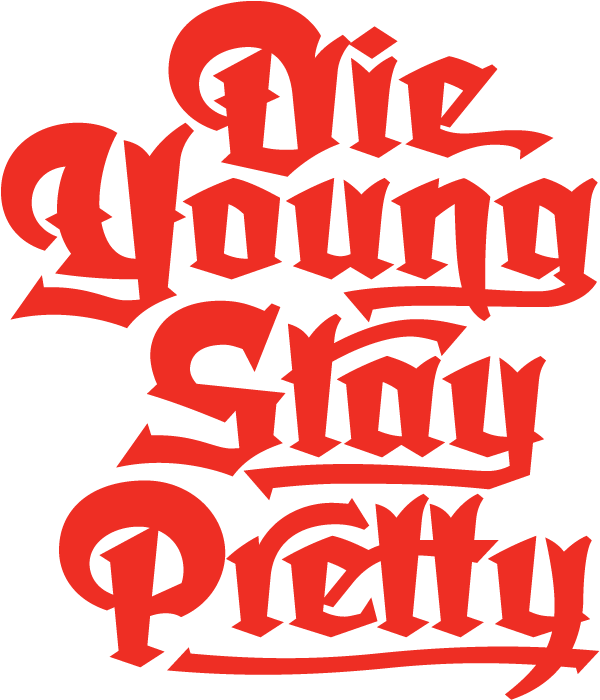
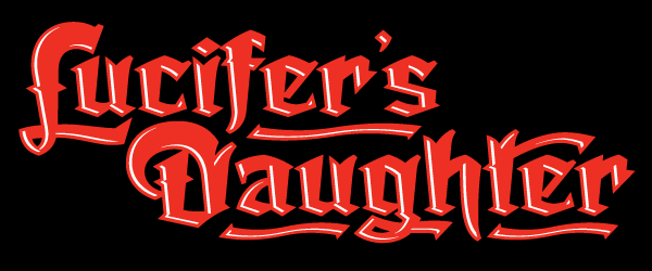
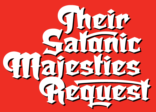
Utilizing Dark Angel’s various features, words can be put together to build creative configurations, wordmarks and “Logos”. The free-standing underlines you see in some of the examples shown here were set independantly and then manually moved into position.
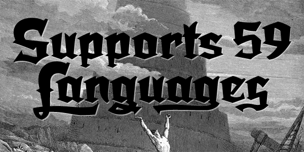
Dark Angel has enough language support to make the builders of Babel envious—its 1,163 glyphs can be used to set copy in 59 different languages. From A to Z: Afrikaans, Albanian, Basque, Bemba, Bosnian, Catalan, Cornish, Croatian, Czech, Danish, Dutch, English, Esperanto, Estonian, Faroese, Filipino, Finnish, French, Galician, Ganda, German, Hungarian, Icelandic, Indonesian, Irish, Italian, Kalaallisut, Kamba, Kikuyu, Kinyarwanda, Lithuanian, Luo, Malagasy, Malay, Maltese, Manx, Morisyen, North Ndebele, Norwegian Bokmål, Norwegian Nynorsk, Nyankole, Oromo, Polish, Portuguese, Romansh, Sango, Shona, Slovak, Slovenian, Somali, Spanish, Swahili, Swedish, Swiss German, Turkish, Welsh, and last (but not least) Zulu.
–For more detailed information download The Dark Angel Manual PDF (1.1 MB).
–Dark Angel on Alphabet Soup
–Dark Angel Design and Art: Michael Doret/Alphabet Soup Type Founders
–Dark Angel OpenType Programming:Patrick Griffin/CanadaType
In the Works—New Blackletter/Hybrid Font
April 30, 2013 on 12:23 pm | By Michael | In News, Notes | No Comments
I have an aversion against taking the easy road. These days many font designers create their designs by referencing designs from the past. Make no mistake—there’s a goldmine of vintage designs out there waiting to be rediscovered. But there are a few of us font designers still left who want to create something that’s not been seen before . . . but that’s not that easy to do. Most of my fonts (with the exception of Steinweiss Script and DeLuxe Gothic) are completely new inventions.
I’ve been working on the font design shown here for the better part of a year—ever since I completed the Dyna-Fonts. The beginings of this font can be traced back to a project I worked on many years ago: a logo I was asked to design for the Califonia Angels baseball team. The work I did for them never saw the light of day, but I always had a soft spot in my heart for one of the logo designs I developed. The letterform portion of my design was comprised of what I called a sort of “blackletter/hybrid”. So I took the basis of that design and expanded it into a full working typeface design. Its working title is currently “Dark Angel”, derived from the project it had originated from.
My intention is that this font be more versatile and more legible than most other blackletter fonts. It’s going to have many, many ligatures, alternates, and letters with tails, and free-floating swashes, giving designers many opportunities to create one-of-a-kind graphics and titling.
It will also come in two versions: a regular solid version and an “underlit” version with a sort of hand-tooled effect.
By the way, did you notice that there are virtually no verticals and no horizontals in this font? I would not have been able to execute this design as you see it without the incredible vector plug-ins from Astute Graphics—particularly VectorScribe. These plug-ins have definitely filled many of the gaps I found in Adobe Illustrator, making it possible for me to do many things that I wouldn’t have attempted without them.
This font is currently in its final stages of programming and production, with a tentative projected release date of June or July 2013. The name “Dark Angel” isn’t yet set in stone, and I’d like to consider other suggestions for the name. If I end up using the name you’ve come up with for this font, you will be the first to receive a complimentary copy of it as soon as its released.
To send a name suggestion for this font, or if you’d like to be notified when the font is released, please drop me an email and I’ll put you on my list to notify.
60 Second Green—An Eco-Friendly Logo
January 9, 2013 on 8:41 pm | By Michael | In Gigs, News | 1 CommentThis logo was selected for inclusion in Graphis Logo Design 8
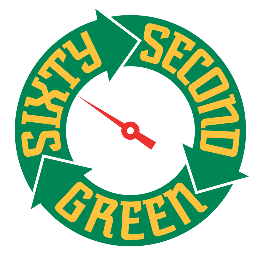
Much of the design work I do tends to be seen by many as “vintage inspired”. I do frequently look to the past for inspiration, but it would be wrong to categorize all my work that way. Case in point: the logo I designed for “Sixty Second Green”. This website will have a series of tips presenting simple ideas and products that are “green” and eco-friendly. The site will propose simple yet powerful ideas on how people can save money and at the same time do good things for the environment—all within videos no longer than 60 seconds. My challenge was to create a memorable logo that would be reflective of the green/sustainability movement.
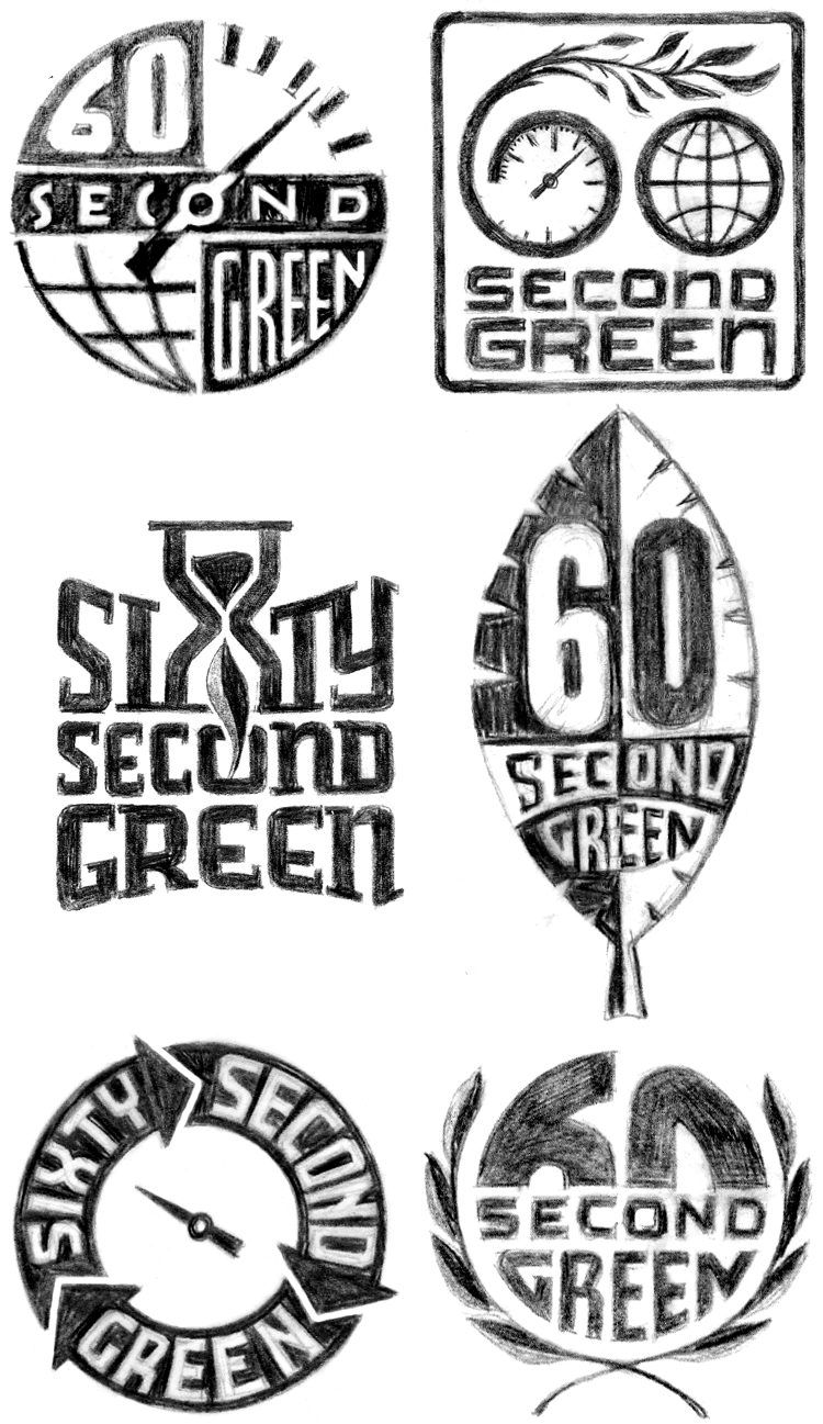
Working with Mark Pruett, owner and senior editor at Storyville Post (whom I had previously worked with some years back designing their logo) I came up with several loose ideas:
Many of the roughs used the obvious element of a leaf as a motif, but one was reminiscent of the design of the Universal Recycling Symbol, designed back in 1970 by USC student Gary Anderson.
Fortunately this rough was what the client reacted most strongly to, and we were able to develop a unique logo that didn’t resort to the usual visual clichés.
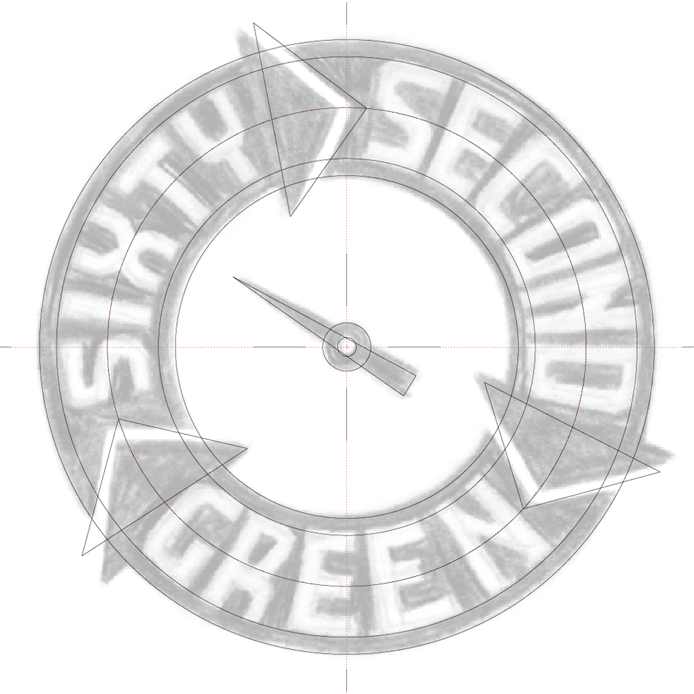
So to develop this design I first had to figure out its geometry by placing my original rough drawing in Adobe Illustrator and working over it:
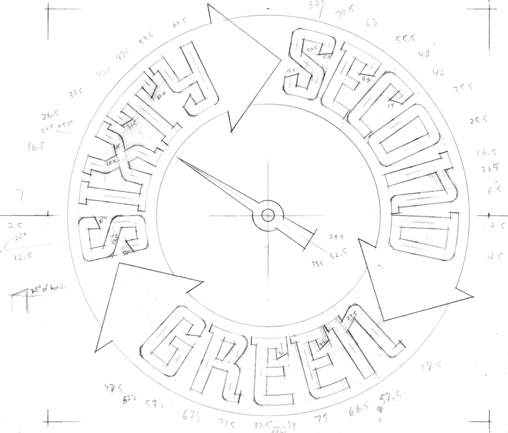
Then I created a new drawing using the inner mechanics derived from my Illustrator sketch. One really cannot set type around a circle without it looking somewhat awkward, so you can see that the verticals in each letterform I’m creating point directly towards the center of the circle, and are marked in the pencil drawing with angle notations:
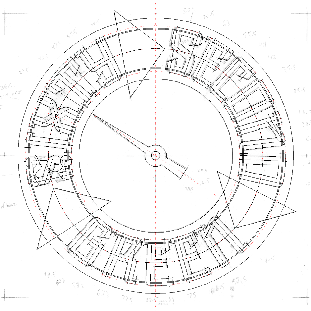
Using the angles I had earlier jotted down on the drawing, I started building the letterforms and the logo.
Note that the letterforms in the upper portion of the logo flare outwards at the top, while those at the bottom are pinched in at the their tops. Yet they’re all consistent within the logic of the design and don’t read as different sorts of letters:
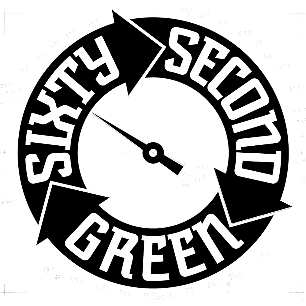
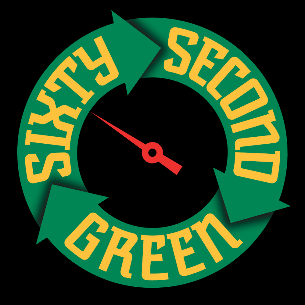
I then created a version with a bit of shading and a black background:
This iteration was used for the animated version that Storyville Post created from my art for the Sixty Second Green videos:
Powered by WordPress and Nifty Cube with Recetas theme design by Pablo Carnaghi.
Entries and comments feeds.
Valid XHTML and CSS.

