 |
|
Archive for the 'News' Category
Writing Dracula: An Anniversary Edition
October 1, 2012 on 12:22 pm | By Michael | In Gigs, News | 4 CommentsBack in 2009 I designed graphics for a pen and business card set for a company named Acme Studios based in Hawaii. I called the design “QWERTY” because I based it on old typewriter keys and the QWERTY keyboard (still in use today on everyone’s computers and phones).
Last year Acme contacted me to see if I’d be interested in designing a logo for “Dracula”. This wasn’t to be Dracula the Movie, or even Dracula the TV show—it was to be for Dracula the Pen. Acme had been contacted by the estate of Bram Stoker to create a limited edition pen set to commemorate in 2012 the 100th anniversary of the death of the author/creator of Dracula, and unacknowledged father of the present day Vampire Empire. It was one of the few times Acme had gone to an outside designer with an assignment—most of the pens created for Acme (like QWERTY) are designer generated ideas. This Dracula logo would be used on the pen itself, and all the packaging—which was to be quite elaborate.
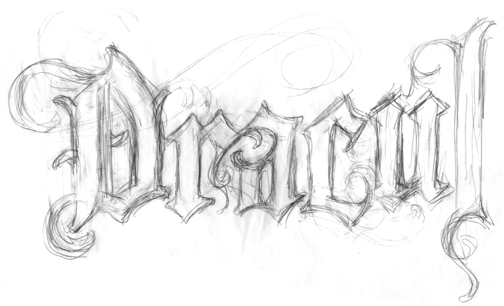
With some projects I start out by creating many small rough pencil sketches to try to discover how I want to solve a problem. Somehow with this project I knew from the start what I wanted to do. In my head I had eliminated all the hackneyed and clichéd solutions that one would come to expect for such a logo. I decided that I wanted to start out with a sort of black-letter, gothic form as a base, and then transform it into something that would communicate what I thought of as a sort of “decayed elegance”. So I just started drawing:
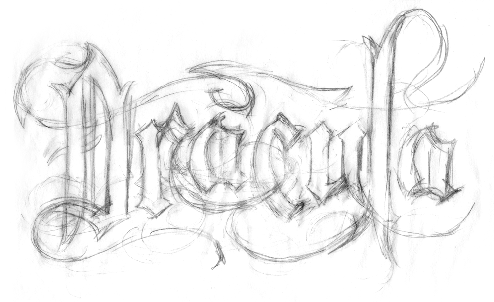
For some reason I stopped before completing the word (guess I knew what another “a” would look like). But I liked a lot of what I was seeing and expanded it into my next rough. This one was a lot more fluid, and I really liked where it was going:
What had started out with gothic, black-letter forms, was turning into something else—but I wasn’t sure how to define it:
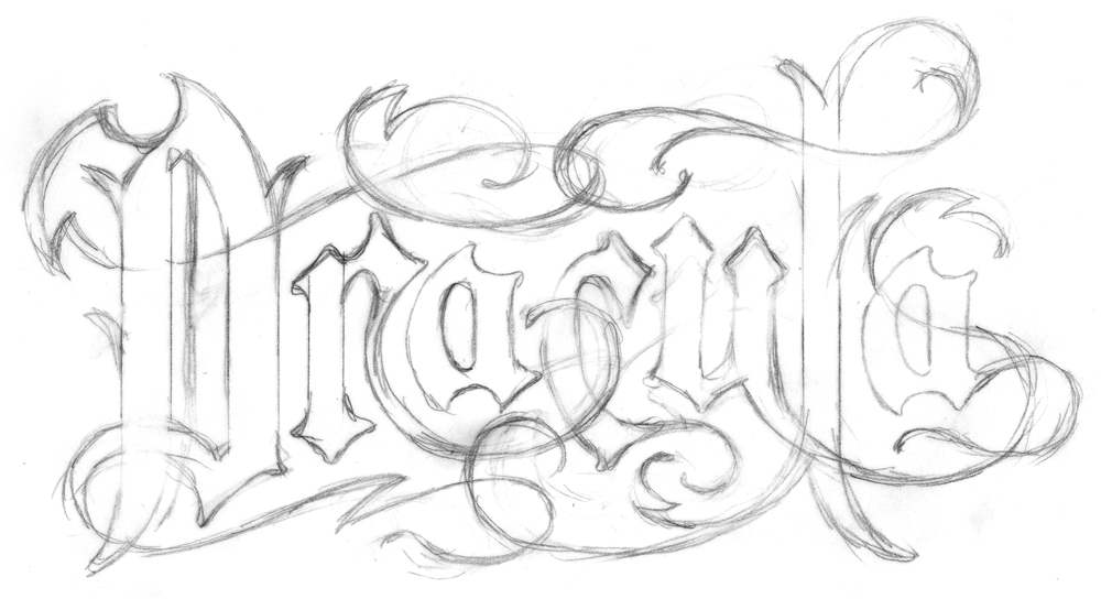
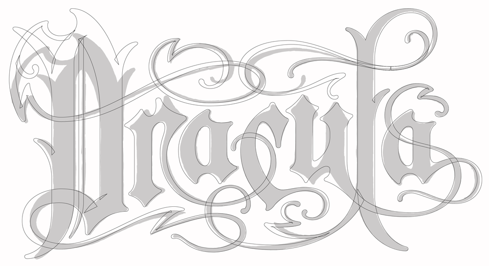
Then, using that pencil rough as a base, I started inking over it on an overlay to start to work out and refine the weights and forms:
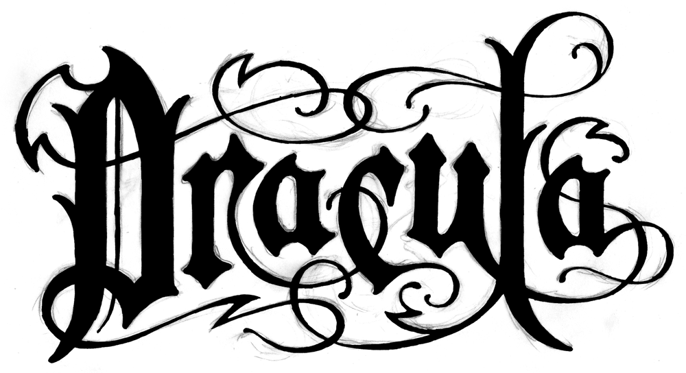
After scanning the inked version, I placed it in Adobe Illustrator as a template, and started creating the final art. As you can see, I ended up deviating from my inking in several places:
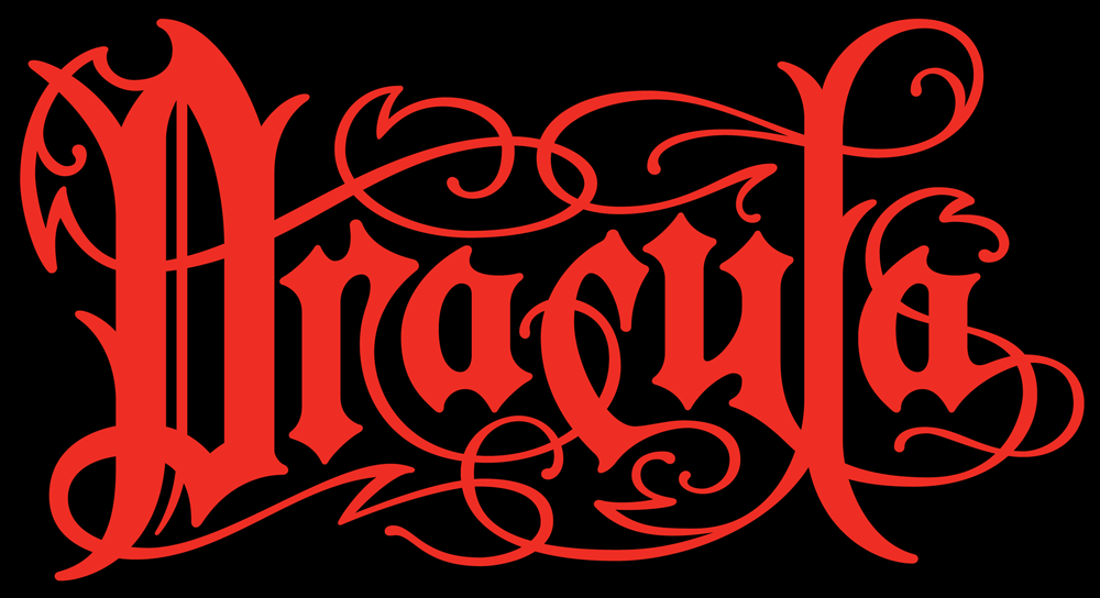
Finally, I was pleased with what I had done . . . I felt it had that feeling of “decayed elegance” that I had been striving for. I rendered it in blood-red against a black background then presented the final art to Acme, who in turn presented it to the Stoker estate. It was approved without a hitch:
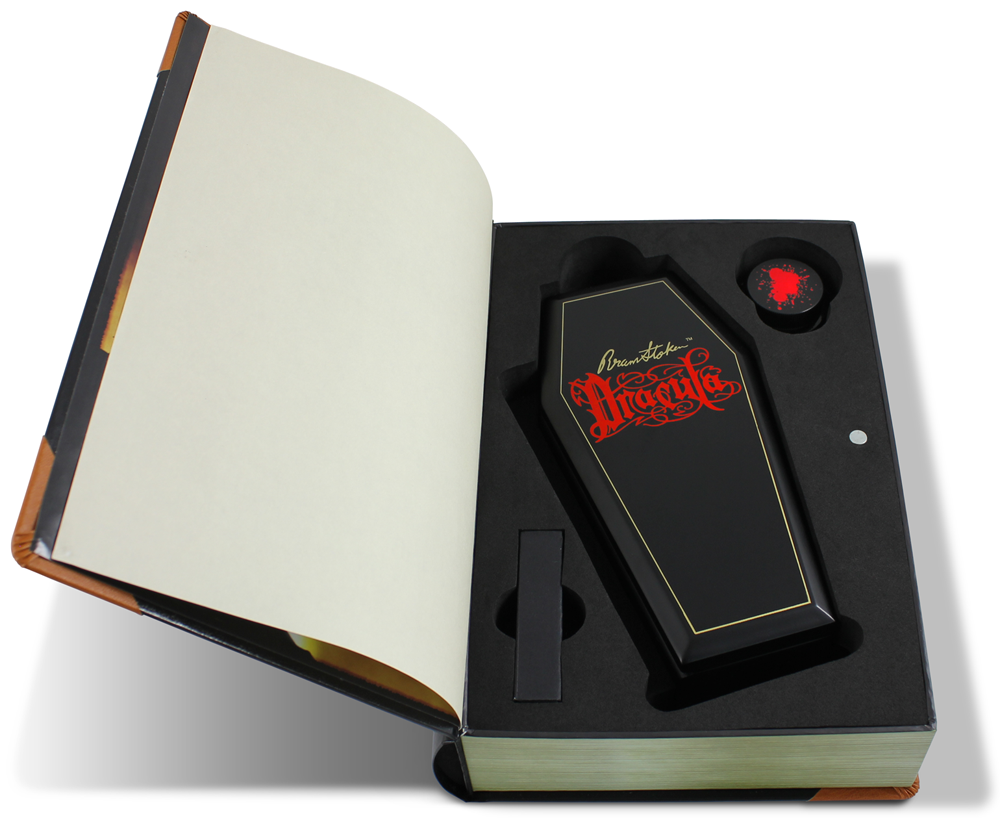
Acme will be releasing this pen set this year in time for Halloween. It will be in a limited edition of 999 fountain pens with blood-red ink and an interchangeable rollerball option. The pen will lay within a coffin shaped box together with a bottle of blood-red ink, and a red rollerball refill:
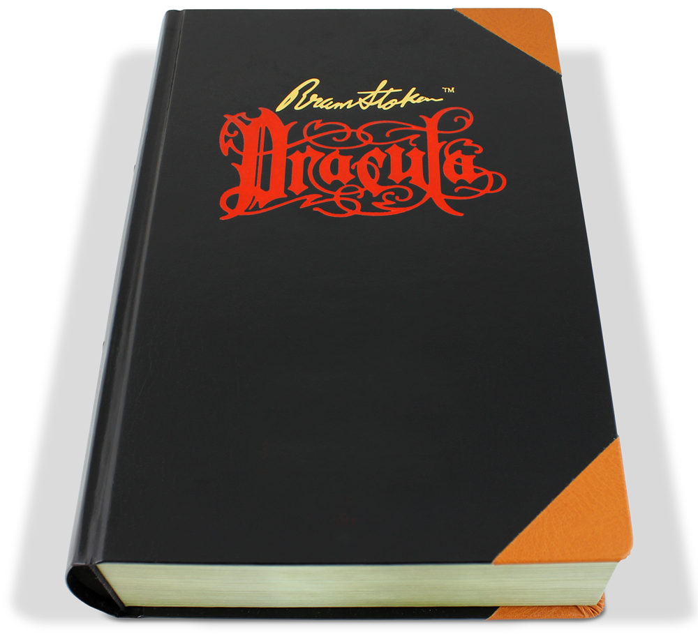
And the entire set is encased in what appears to be a bound edition of Dracula:
The set will retail for $500 and will be availabe through ACME Studio retailers.
I Should Have Seen This One Coming!
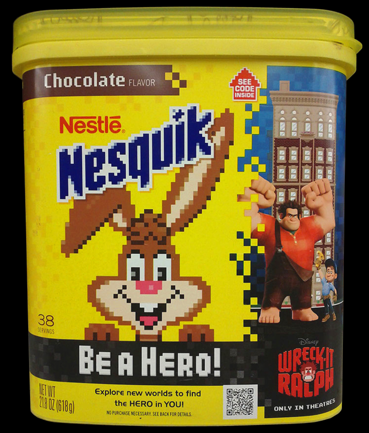
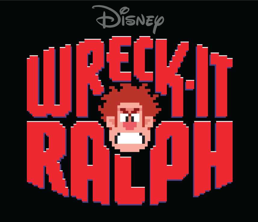
September 26, 2012 on 11:45 am | By Michael | In Gigs, News | No CommentsApparently Nestlé’s Nesquik has taken a cue from my Wreck-It Ralph logo design and is now running a branded cross-promotion with Disney’s upcoming animated feature Wreck-It Ralph. As we did with Ralph, they’ve turned Quiky the bunny and the Nesquik logo into fun 8-bit versions.
So remember kids: “It’s so rich and thick and choco-lik, That you can’t…drink it slow…if it’s Quik!”
A big “Thank You” to Art Thompson of NoRelevance for alerting me and sending the photo.
The “Sassafras” Logo Project (2)—The Decayed Opulence of an Old Southern Estate…Opening Friday in Hollywood
September 10, 2012 on 11:31 am | By Michael | In Gigs, News | 2 Comments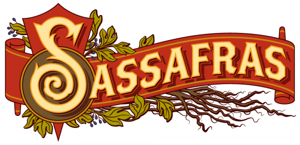 A few weeks ago I posted an article about my logo project for Sassafras, a saloon set to open in Hollywood—another brainchild of Bobby Green of 1933 Group. The timing for these kinds of openings is always a bit cattywampus, and we didn’t know exactly when the Grand Opening was gonna be. I can now tell y’all with certainty that it will be on Friday, September 14th.
I’ve been to this honkey-tonk, and I can honestly say that it’s everything you’d expect from a Southern plantation which has been moved brick by brick and transplanted to Vine Street in Hollywood.
You can start slowly, out on the “front porch”, a great place to relax with a Toasted Pecan Julep…
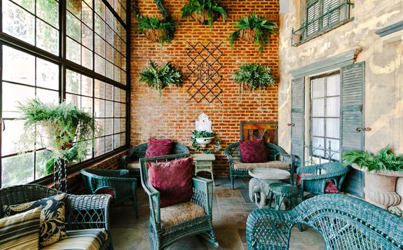 Photo by Alen Lin
…then I reckon you’ll want to sidle on over to the “living room” with your Southern Belle (or Beau Hunk) to enjoy some of Sassafras’ signature “Barrel Aged” cocktails —perhaps a “Between the Sheets”…
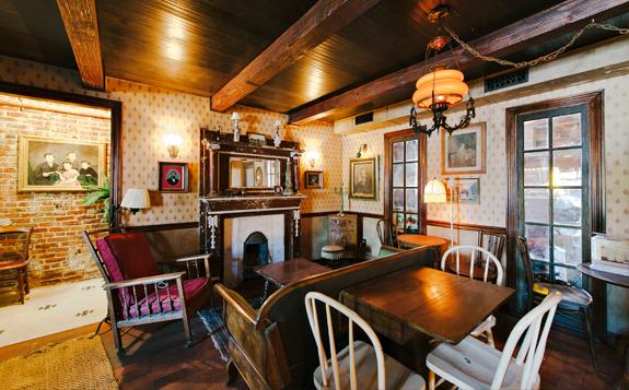 Photo by Alen Lin
…and then finally end up at the bar and take in the strains of a live band performing from the balcony…
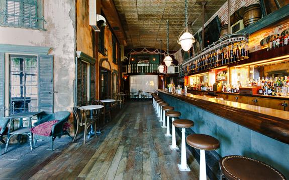 Photo by Alen Lin
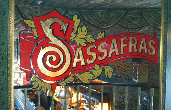
Voila…the mirror on the balcony (logo designed by yours truly, and painted in gold-leaf by sign artist/fine artist Daniel Winter [Instagram – winter_stone]), through the reflection of which can be seen the saloon’s decaying opulence. From here you will be serenaded “New Orleans” style. Well, hush my mouth and slap your pappy!
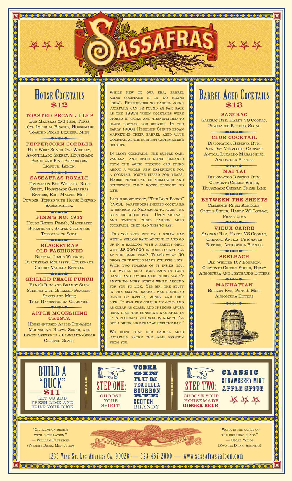
Now take a gander at what you can look forward to. (Menu Art Direction courtesy of Mr. James “Buster” Heimann, and the design talents of Ms. Cindy Vance of Think Modern Design.) Make mine an Apple Moonshine Crusta!
And Bobby Green’s awesome little business card, also courtesy of Ms. Vance.
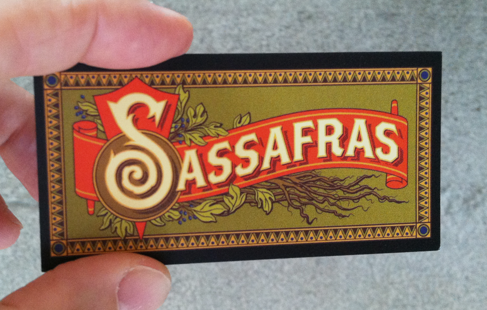 Looks good? Hope to see you there, y’all!
Powered by WordPress and Nifty Cube with Recetas theme design by Pablo Carnaghi.
Entries and comments feeds.
Valid XHTML and CSS.

