 |
|
Archive for the 'News' Category
Fun With Type!
August 23, 2012 on 7:56 am | By Michael | In Gigs, News | 1 CommentLast year I became a beta-tester for Astute Graphics’ Adobe Illustrator plugin “VectorScribe”. Those who know me know that I’m not really a very tech-savvy person. I get quite comfortable just sticking with doing things the way I usually do them. Over the years I’ve become very adept at using Illustrator, and was not overly excited at the thought of having to learn some new tools. I’d heard of Illustrator plugin tools, but I’d never really thought of using them before. So, to my surprise, I almost immediately embraced the new tools in VectorScribe. They work really well, ironing out a lot of the inherent flaws in Illustrator. I’d learned to live with a lot of those flaws, but once I learned I didn’t need to live with them anymore, those “flaws” started to look more and more like gaping wounds. VectorScribe is great—now I don’t know how I ever got along without it! You can download a little Case Study we did about VectorScribe here. I would definitely encourage all serious Adobe Illustrator users to at least try the 14 day free trial version. It will change your life!
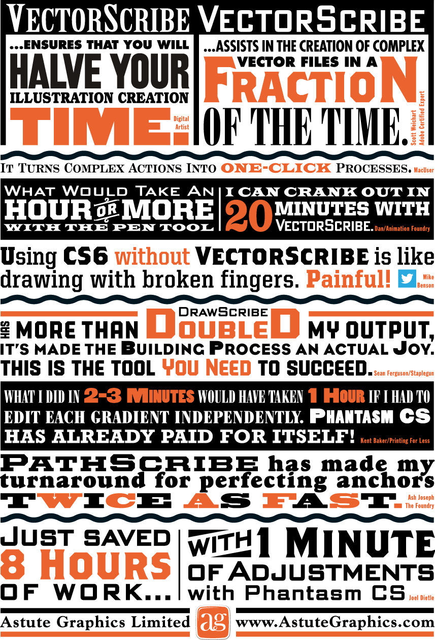
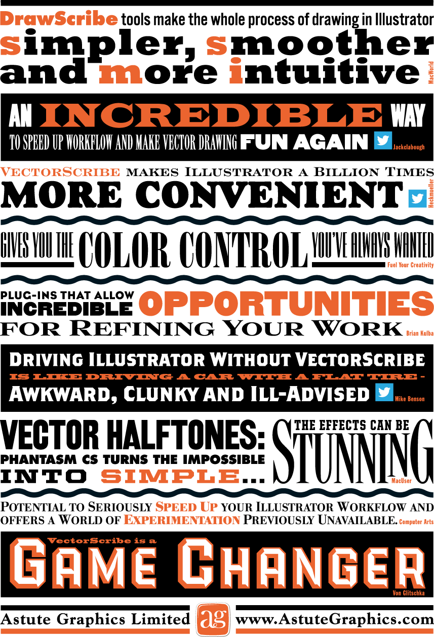
So when the good folks at Astute Graphics asked me if I’d work on a little printed promo for them I thought “Well, why not? I really believe in their products”. The front and back covers of the piece were to be covered with testimonial quotes about their plugins from other users. The challenge was to make this list of quotes visually exciting. Most of my work is lettering-centric, but with this project the challenge was to only use set type and limited color—something a little different for me. I did use two of my own fonts, PowerStation (currently on sale) and DeLuxe Gothic: see if you can find them. Anyway, I think you can see that it’s possible to create a lot of visual fun by just using the basics, and combining them in imaginative ways. This is real Alphabet Soup!
Above is how the front cover turned out…
…and the back cover below:
The “Sassafras” Logo Project—New Bar Set to Open in Hollywood
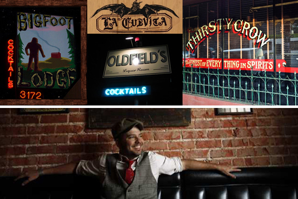
July 30, 2012 on 9:13 pm | By Michael | In Gigs, News | 8 CommentsBobby Green of 1933 Group has cornered the market for drinking establishments in Los Angeles with a string of bars including Atwater’s Bigfoot Lodge, Highland Park’s La Cuevita, Culver City’s Oldfield’s Liquor Room, and Silverlake’s Thirsty Crow.
Now Bobby’s about to carve the another notch in his belt of Los Angeles watering holes with the opening of the Deep South inspired “Sassafras” in Hollywood on Vine Street—which at 3000 square feet will be the group’s flagship location.
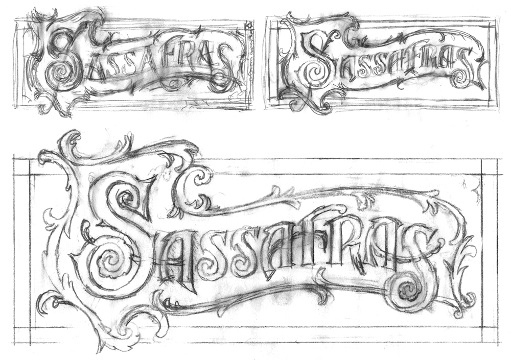
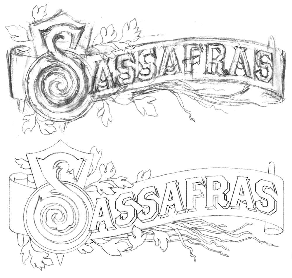
Tasked with designing the Sassafras logo, I first met with Jim Heimann, who’d acted as AD for several of Bobby’s other projects (and who’s also an editor at Taschen America). Discussing the look that Bobby wanted, it became clear that we needed to move towards a turn-of-the-century (19th to 20th)—and decidedly decorative look,with a sort of organic/plant-like flavor . . . perhaps using decorative borders that felt like vines or roots, to try to get across the feeling of the root-inspired intoxicants that Sassafras will be featuring. Thinking I knew exactly what they wanted, I went through the following roughs, presenting the tighter one to both Bobby and Jim:
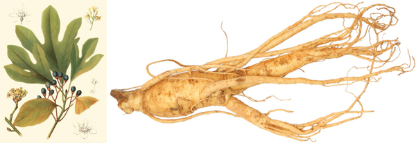
The design generally went over OK, except that Bobby wanted the design to become even more specific to the actual sassafras plant. We discussed various ways we could achieve that, and Bobby also provided me with images of roots and of the sassafras plant and flowers. He further explained that the bar will serve root-inspired intoxicants containing both sassafras (from which root beer is made) and sarsaparilla, in addition to barrel-aged cocktails.
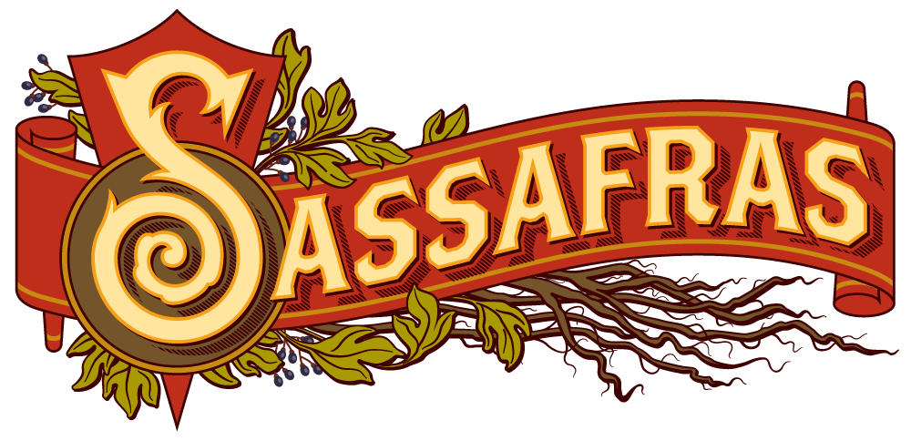
So I went back to the drawing board and started over taking into consideration the reference and other comments from the meeting. I then developed the following layout—what I had in mind was to use the “Brothers” typeface (this font was designed by my friend John Downer) as the basis for the word (except for the cap “S”), so that if we needed to create a straighter, simpler “Sassafras”, it wouldn’t be that much of a problem.
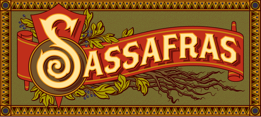
Feeling confident of this direction, I presented it to both Bobby and Jim. With the exception of my needing to add a border back in, it went over well, and I proceeded to flesh the logo out in Illustrator. So here’s where we ended up, both with and without borders:
Sassafras is located at 1233 Vine Street, next door to the historic Villa Elaine. During the 1940s this historic landmark apartment building was home to Man Ray, Orson Welles and Henry Miller (there is a lot of history in this town). Sassafras’ opening will be towards the end of August—so watch this blog for update postings. Hope to see you all there!
The Dyna-Fonts Winners at Applied Arts
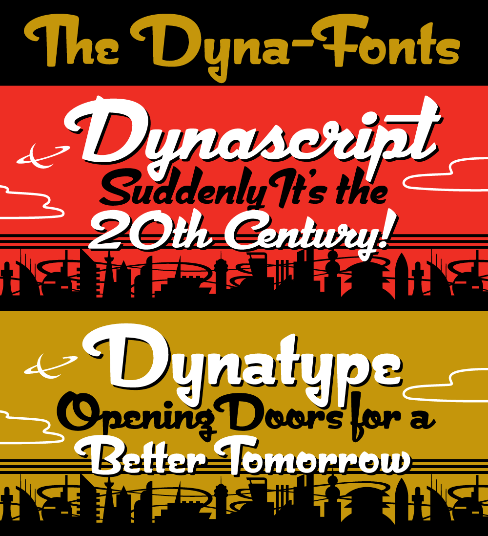
July 8, 2012 on 11:28 pm | By Michael | In News | No CommentsThe judges at this year’s Applied Arts Design Competition, in their first ever Typeface Design category, selected both Dynascript and Dynatype as winners. They were selected as The Dyna-Fonts—a typeface family.
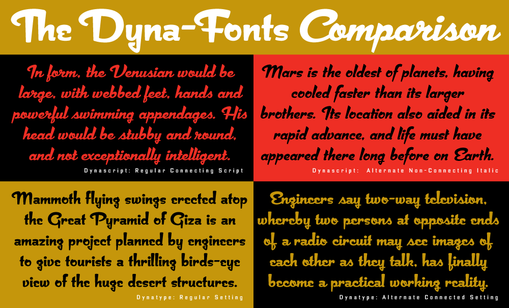
I’m very proud of these fonts, and am pleased that they’ve begun to get the recognition I think they deserve. They work extremely well both together and separately, and in both display and in smaller settings, as you can see from the comparison below (click to enlarge).
I’ve begun to make both Dynascript and Dynatype available together at a reduced price. They can be found under the name “The Dyna-Font Collection” which can be purchased from my Website.
The Dyna-Fonts are now following in the footsteps of some of my other recent fonts that have garnered industry acclaim—most notably Deliscript, which was lauded by the Type Directors Club in their TDC² 2010 competition and also in 2011 by CA’s Typography Annual 1, (the page excerpt of which can be seen HERE), and Steinweiss Script—also recognized in this year’s Typography Annual 2, (the page excerpt of which can be seen HERE). After being named a “Rising Star” Metroscript became “MyFonts’ Brush Script Font of the Year” and was subsequently named as #5 in Smashing Magazine’s “30 Brilliant Typefaces For Corporate Design“. The magazine went on to say about Metroscript: “lettering artist Michael Doret has adapted his trademark hand-lettering style to the computer, creating one of the most sophisticated suites of script fonts on the market.”
Powered by WordPress and Nifty Cube with Recetas theme design by Pablo Carnaghi.
Entries and comments feeds.
Valid XHTML and CSS.
