 |
|
Archive for October, 2012
“Sweet!”/A Logo Project–Part 3 of 5: Route 66 / Candy Americana
October 9, 2012 on 10:32 pm | By Michael | In Gigs, News | 2 CommentsPlease read Parts 1 and 2 of this series before proceeding!
“Won’t you get hip to this timely tip / When you make a-that California trip / Get your kicks on Route sixty-six.” Well, If by “California trip” they meant the Sweet! candy shop in Hollywood, and if by “kicks” they really meant “candy”, then there’ll be plenty to be got in “Route 66 – Candy Americana”.
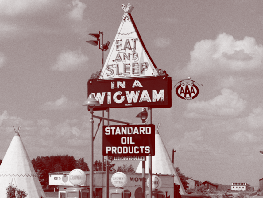
The real historic Route 66 still runs through Hollywood only a few blocks south of Sweet!, on Sunset running west down to the ocean ending at the Santa Monica Pier. But the Route 66 in Sweet! harkens back to a sweeter, simpler time. In this shop you’ll find an actual, built-to-scale gas station built out of porcelain enamel, just as you’d see if you were driving down the original Route 66 back in the ’50s, before the Interstate system made the road obsolete. You’ll also find a scale reproduction of the famous Wigwam Motels—you know, where you could have stayed on your road trip across America (“Sleep in a Wigwam!). All this to house the finest selection of classic American candies, some that you may not have seen in a while.
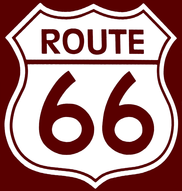
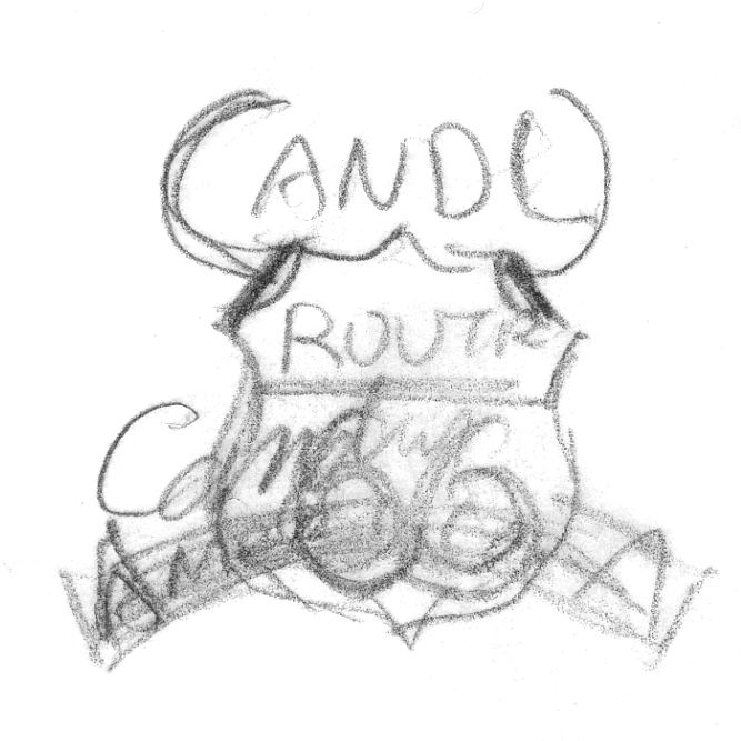
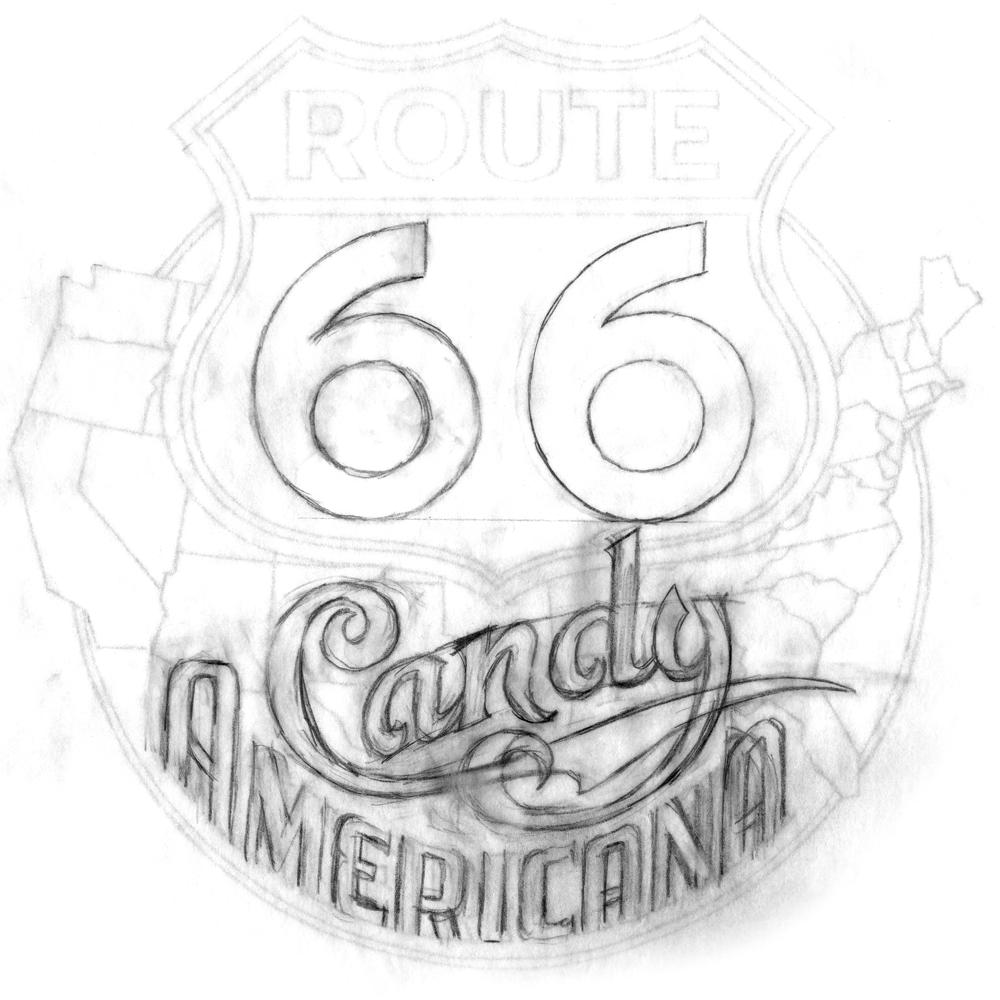
Obviously the logical place to start a Route 66-ish logo would be to use the iconic road sign as a base. So with that as a given (which I gave myself) I started with some very rough sketches like these:
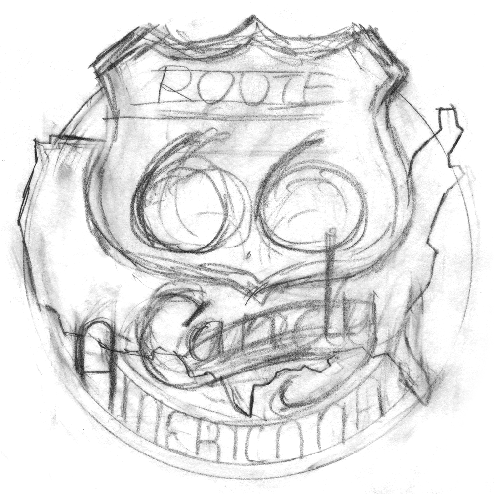
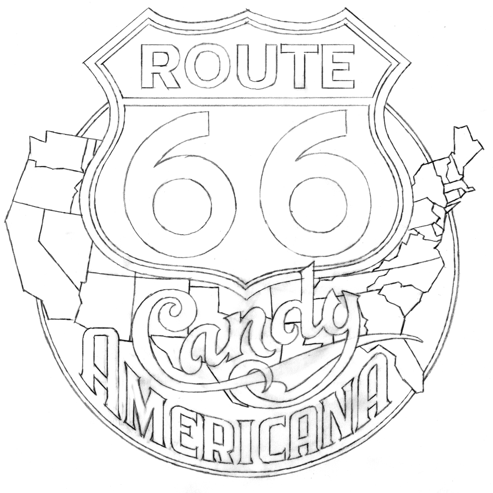
One of the most critical parts of this direction was to figure out how to successfully integrate all the different elements. I had a sign, a map, and several different styles of lettering/typography. I also felt it had to have the authentic look of classic American Automobilia, yet be playful and colorful enough to represent a candy store. So I started to work out exactly how all the elements might fit together. After combining a map of the USA and a standard Route 66 sign I started designing my own “66” numerals and the words “Candy” and “Americana”. Not only was I trying to integrate the two words , but to do so with the right amount of playfulness in “Candy” and the right amount of gas station-y feel in “Americana”. As you can see below, there was a lot of drawing and redrawing before I felt I was close to how it should be:
Once I was happy with the balance, In tightened up the drawing in preparation for redrawing the whole thing in Adobe Ilustrator:
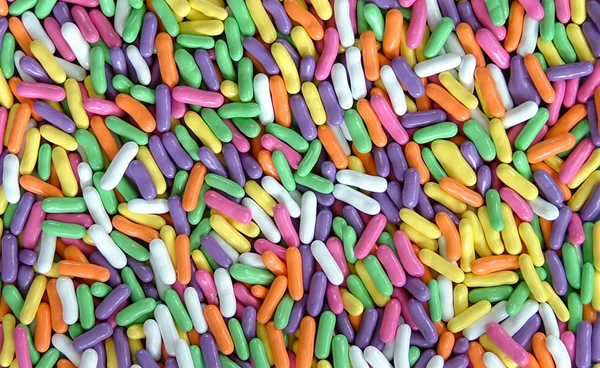
To help give this logo a bit more candy store appeal, I envisioned the individual states in five different “Good ’N’ Plenty” colors (which I’ve always loved):
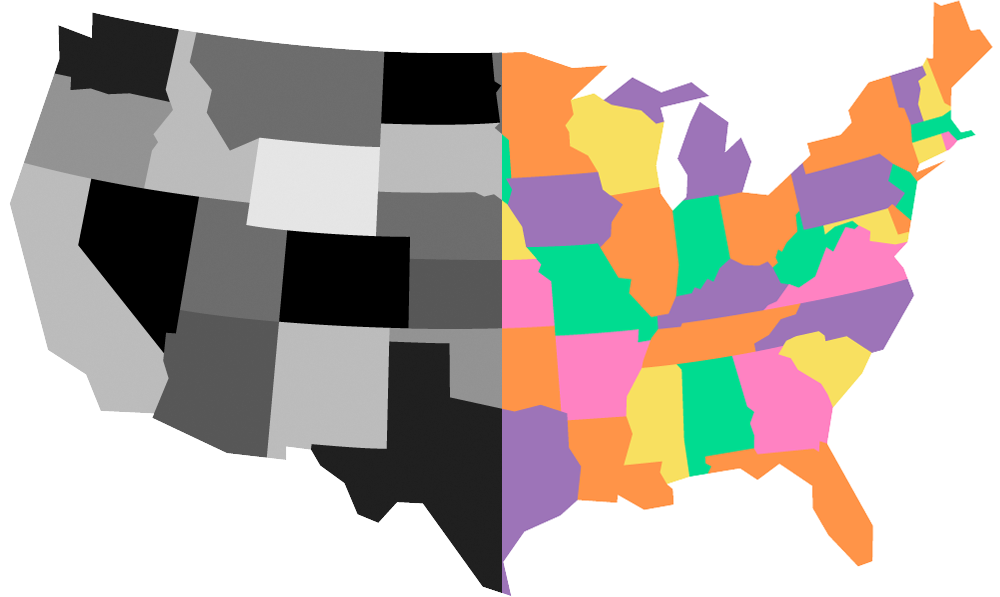
So first I needed to create an accurate (but graphic) map of the USA in Adobe Illustrator where, for separation purposes, no two states touching each other were the same color. So as a working model I did the file in black and 4 grays, then made it the “Good ’N’ Plenty” USA map in 5 colors:
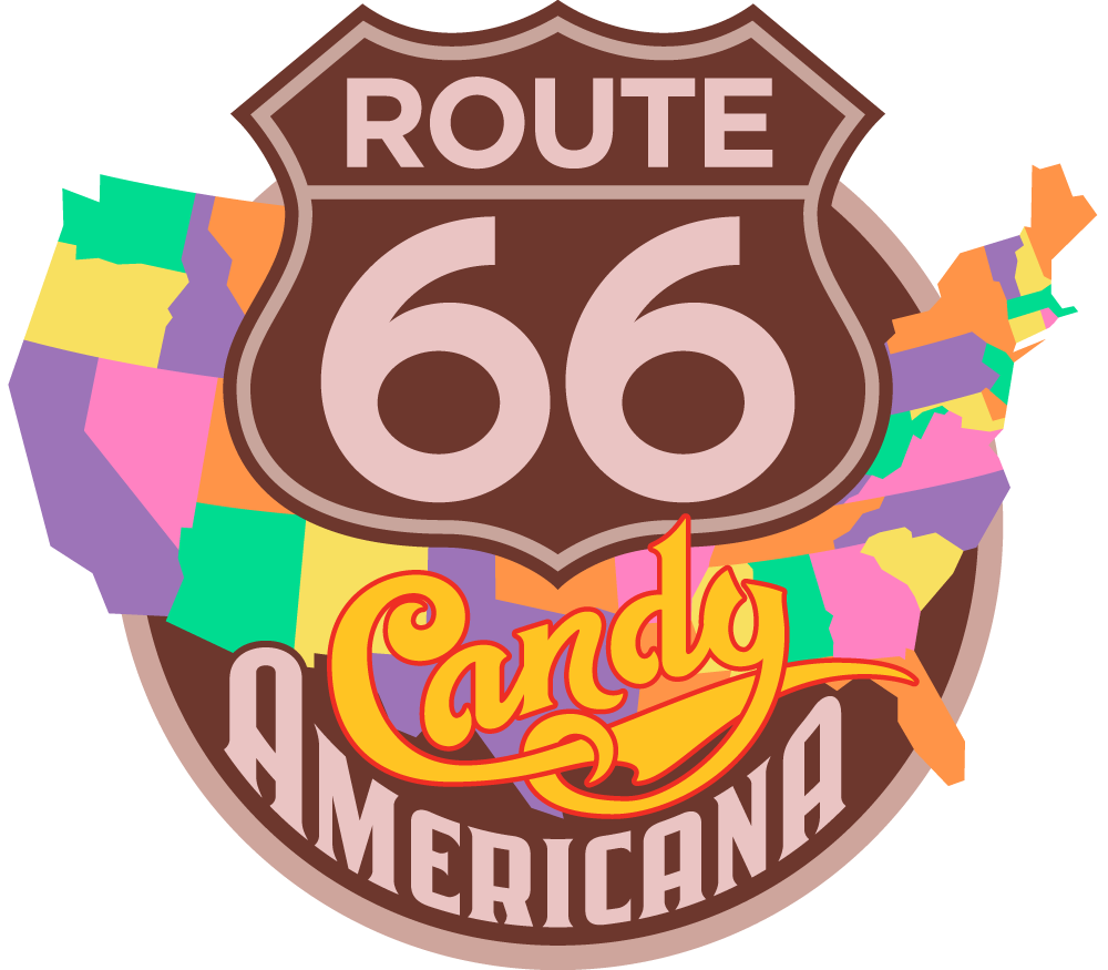
. . . and here are the map, sign and lettering all put together in my first draft:
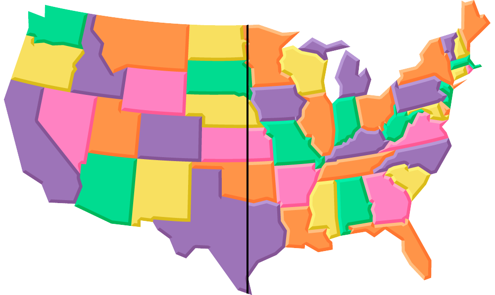
But to me it was all feeling way too flat. I decided that I wanted to give the states a soft, dimensional “marshmallow-y” feel. So I first added a darker extrusion on the right and lower portions of the states (left side of the map, below), and then a lighter area on the upper and left portions (right side of the map, below)—the Marshmallow States of America:
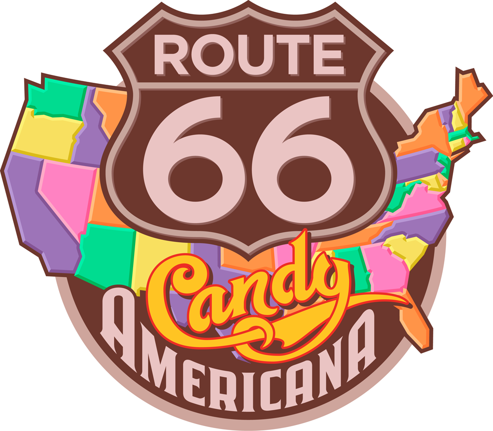
. . . also adding a dropshadow to the word “Candy” and to the Route 66 lettering and badge, and an outline to the map:
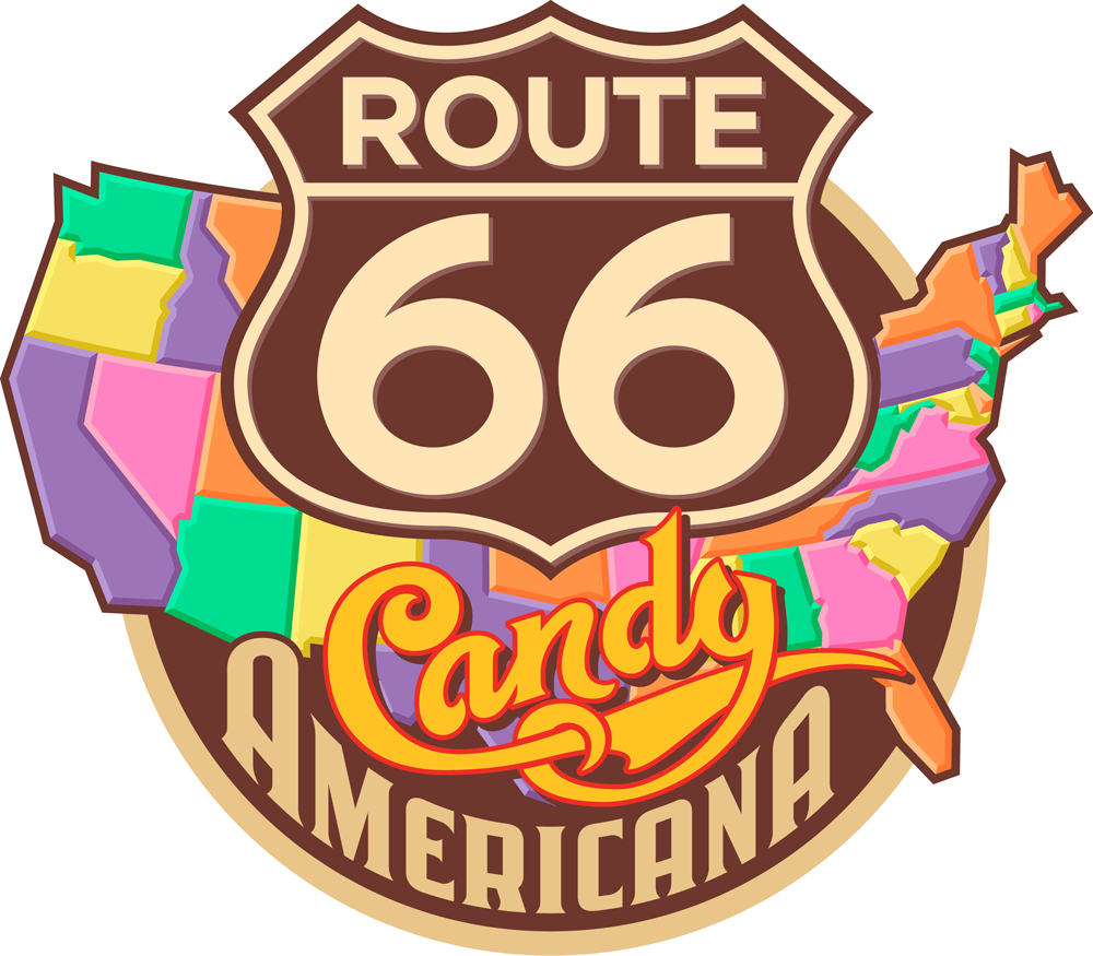
I wasn’t too happy with the mauve-y color, so I gave it one last tweak, warming it up a bit. Everybody loved the way it now looked and felt:
This graphic will be used in the store on packaging, T-Shirts, bags, etc.
Tomorrow we’ll move from the sublime to the ridiculous, from Route 66 to Part 4: “YUCKY” – the most disgustingly delicious candy shop logo in the world!
“Sweet!”/A Logo Project–Part 2 of 5: Peace of Candy + AS IF
October 8, 2012 on 11:53 pm | By Michael | In Gigs, News | 5 CommentsPlease read Part 1 of this series before proceeding!
According to Sweet!’s founder, Gary Shafner, all the world’s countries have their differences—they either love or hate each other—but truth be told, we all have one thing in common: everyone loves candy. Gary wants to share that sentiment by finding some of the wackiest, and some of the best confections from around the globe and making them available in his “Peace of Candy” shop. World Peace through sugar rush!
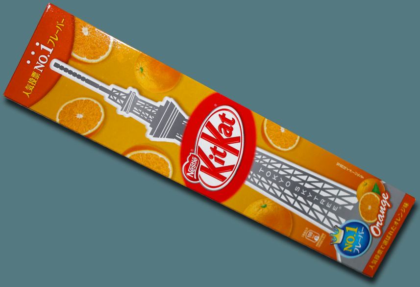
Take Japan for example. In the US Kit Kat is licensed by Hershey, but it was originally created by Rowntree’s in England, and is now a Nestlé product there and in most of the rest of the world. But the Japanese have turned Kit Kat into something that is both uniquely their own and immensely popular. Over the years they have developed over 200 flavors of Kit Kat. The all-time favorite Japanese Kit Kat flavor is Orange. Gary says that among the many, many other candies from around the globe you will find in Peace of Candy of course there will be those Orange Kit Kats, packaged in a special “Tokyo Tower” commemorative box:
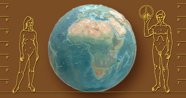
How will you find Peace of Candy when you’re in Sweet! you might ask? Just look towards the center of the store where you will find a giant relief globe (below)—7 feet in diameter—originally salvaged from Chicago’s Historic Rand McNally Building. There’ll be Peace signs placed over each and every country.
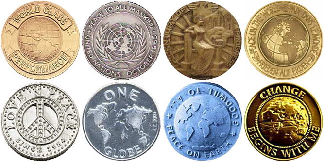
Inspiration for creating a logo for Peace of Candy was not hard to come by. Medallions extolling the virtues of Peace and Goodwill may easily be found. So it was not much of a stretch to take our design cues from some of these many and varied metallic coins.
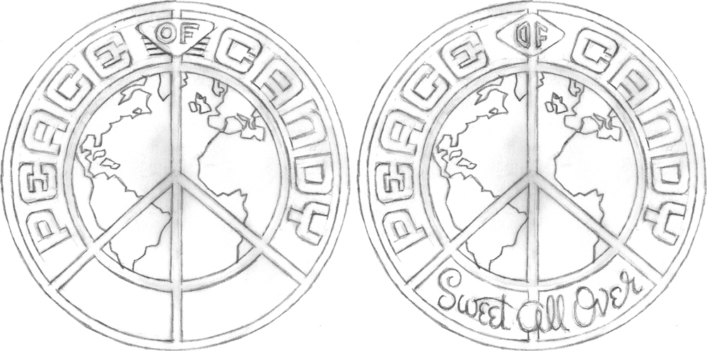
The first pencil sketch pretty much summed up the direction I wanted to go…but then it was decided that we needed to add the tagline “Sweet All Over”:
Once the direction was approved I needed to start fleshing out the look of the medallion, giving it depth and life. At the beginning, everything was pretty flat. Then I added dimension and texture—all done in Adobe Illustrator:
We tried different iterations of how to treat the “Sweet All Over” tagline panel:
And the final selected version:
I’m told that they’re actually going to make chocolate medallions with this design in relief!
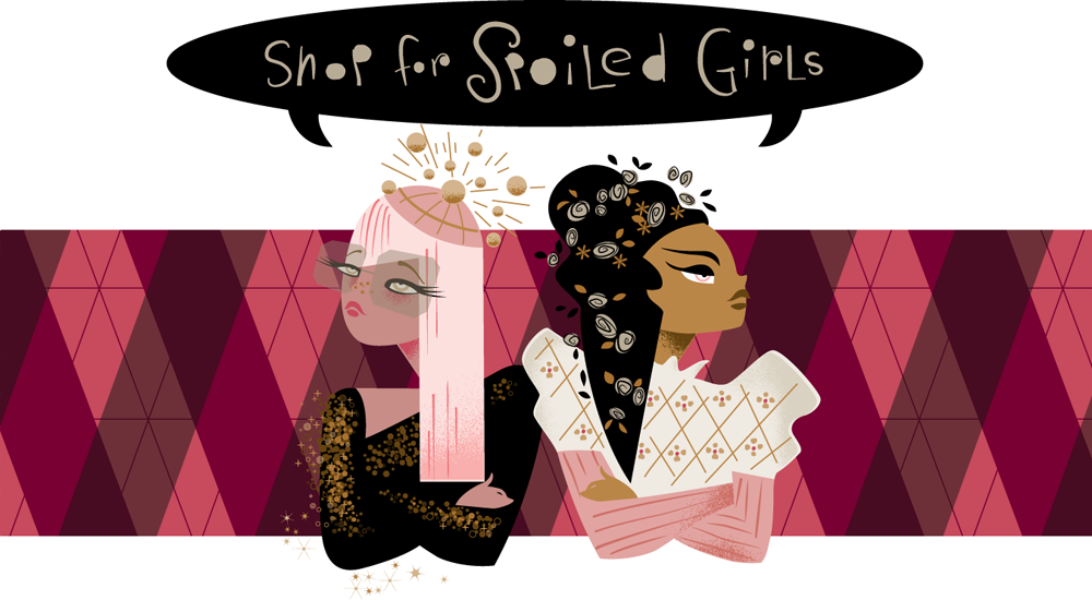
AS IF – Shop for Spoiled Girls
Because at least one of the shops (Yucky—coming up in Part 4) is mainly directed at boys, Gary didn’t want girls to feel left out, so he created a shop just for them: “AS IF – Shop for Spoiled Girls”. The theme of this shop revolves around two characters: Amanda Sugar (initials AS) and Isabella Fairchild (initials IF). These are two pampered, coddled, rotten and snobbish little girls. The back story is that both have a boarding school background, but have different (but indeterminate) ethnicities. Amanda is more into the club scene, while Isabella is more into period design. But over time they both realized that they had more in common than not—fashion being their common denominator—and begrudgingly became friends.
Gary, having become familiar with the illustration work my wife Laura Smith had been doing, decided she would be the right person to create a graphic of these two characters for this very girly boutique. So having been briefed by Gary on what these two were about, Laura set out to bring them to life.
The first thought was to have Amanda and Isabella back-to-back, kind of like bookends—as are these two Mudflap Twins:
But Amanda and Isabella really aren’t refusing to acknowledge each other, as this type of arrangement might suggest. But Laura decided to keep something of this back to back, belligerent attitude, only a bit less contentious.
To capture a bit of the attitude and indeterminate ethnicity of these two brats Laura looked at many, many fashion shots of female models—only these were a bit older than her subjects were supposed to be. She looks at reference like this not for any specific details, but to get a better feel for her subject matter, possibly combining many separate features into an interesting composite.
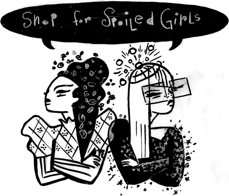
Here’s Laura’s concept sketch of these two characters. Can you guess which character is which?
First she roughed this out in pencil and went over that with pen. She usually go through more stages, but felt good about this direction:
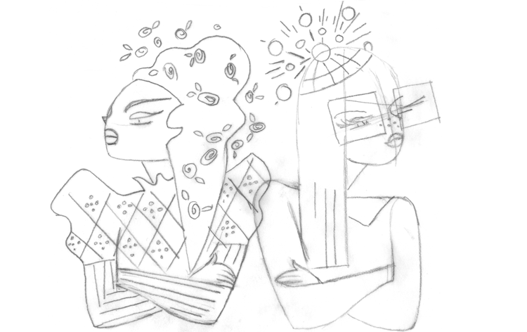
Here’s a tighter pencil drawing, where Laura starts working out some of the details:
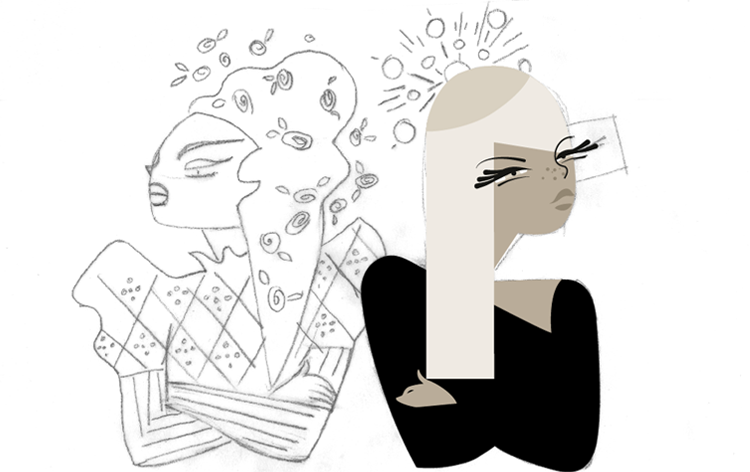
Once it was clear that Laura wanted to contrast the darkness of one girls hair and oppose that with the a lighter or blond color on her counterpart the piece was easier to visualize and I was able to flesh the rest out on computer. For Laura, it’s an organic process. Value or color against color, making sure that eveything reads properly:
Finessing the eyes of Amanda Sugar (on the right) was a little trickier. Laura had to play with that a little until she was satisfied. Laura wanted Amanda’s eyes to have a slightly more “Asian” look to them:
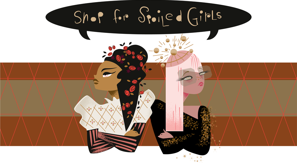
Color and background needed tweeking in a way that made them both equally important and not overwhelmed by the background pattern. And Laura decided that the two girls should be in “AS IF” order: Amanda Sugar on the left, and Isabella Fairchild on the right:
So here they are, visualized in their perpetual love/hate relationship—unwilling to see eye-to-eye, yet unable to live without each other.
Tomorrow our global trek comes full circle—back to the US and ending up in Part 3 on “Route 66 – Candy Americana”.
“Sweet!”: 6 Logos for a New Candy Store Opening in Hollywood/Part 1 of 5
October 8, 2012 on 9:03 am | By Michael | In Gigs, News | 8 CommentsSo . . . what ever happened to the corner candy store—do they have a future? For the answer, please keep reading!
 Photo courtesy of Mod Betty/Retro Roadmap
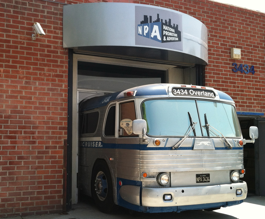
I recently worked on a wonderful project—designing logos for a new concept in candy stores—and this is going to be big! It’s just about to open in the Hollywood and Highland Center in the heart of Hollywood. It’s called “Sweet!” and is the creation of Gary Shafner—the brains behind NPA (National Promotions & Advertising), one of the first guerilla marketing companies. It’s a collection of 12 boutique candy shops, each with their own identity—but all under one roof. When I met Gary at his headquarters, I was blown away by his crazy inventiveness: the only way to gain access to his office/warehouse/printing plant was to enter through an actual vintage Greyhound bus that is built into the facade of his building, the interior of which also formed the reception area.
As you enter the NPA headquarters it becomes apparent that this playful attitude continues throughout the building, as the bus depot theme gives way to a ’50s diner theme, an auto showroom theme, an outdoor city street theme, and on and on as the interior morphs into a very personal kind of amusement park, and a kitchy, friendly environment for Gary’s employee’s to work in.
Gary found my work through a friend of his: Chris Nichols, Associate Editor at Los Angeles Magazine had directed him to me. Chris brings a historical perspective to the magazine, being a passionate advocate for historic Los Angeles, and serving on the LA Conservancy’s Modernism Committee. Mr. Nichols, being familiar with my work, understood what Gary was looking for and saw in my work an understanding for Gary’s playful, eclectic vision.
So why Sweet! . . . and why now? Gary grew up in this town loving what Hollywood was, and realizing that the Hollywood of days gone by was no more . . . and that once tourists were done with the Chinese Theater, after they had seen the footprints, the Hollywood experience was basically over. He decided that he wanted to build a magical place in Hollywood, and that perhaps he could bring back a little bit of that experience by opening this boutique of 12 different candy shops—each staged differently with a different fun theme, and all about the joy of candy and of being in Hollywood—in Tinseltown . . . in a word: “Candytainment”!
I ended up designing graphics for five of these shops—each completely different stylistically from the one before. My wife, illustrator Laura Smith also created a more illustrated logo for a sixth shop. Right here, over the next few days I’m going present a case study (one or two a day) of each of the graphics we worked on, and describe briefly the inventive fun that Gary has in mind for each shop.
The first stop in any candy themed tour of Hollywood would of course be . . . Lollywood:
Lollywood
As far as anyone knows, Lollywood will be the only, first ever store in the world that sells only Lollipops . . . and there will be lollipops of every shape, size, taste, and description. Gary has gone out of his way to make this shop totally unique, building into it both a life-size Sugar Plum tree and, for the counter . . . The Good Ship Lollipop! While shopping, sugar lovers will be serenaded by clips of both Shirley Temple and The Lollipop Guild. And Gary promises there’ll be more surprises as well.
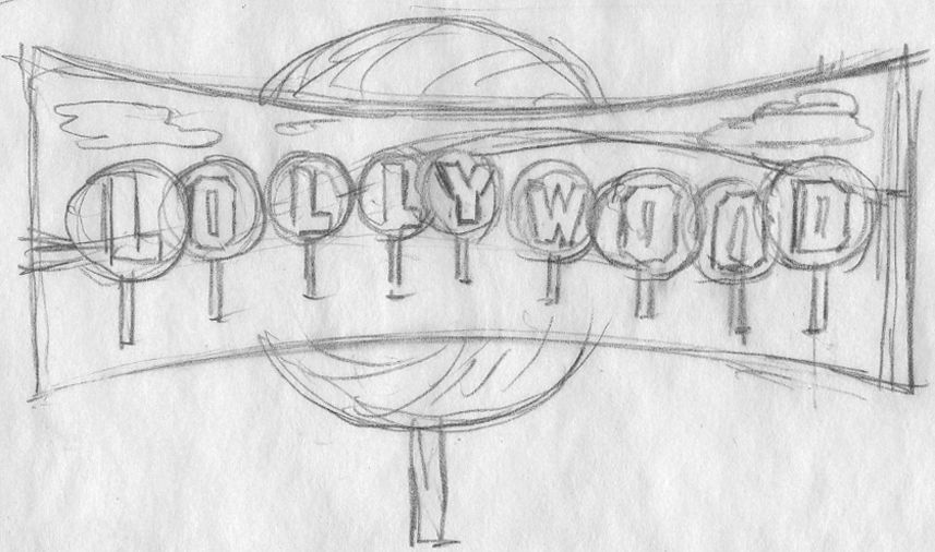
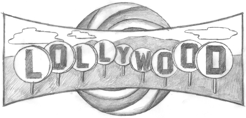
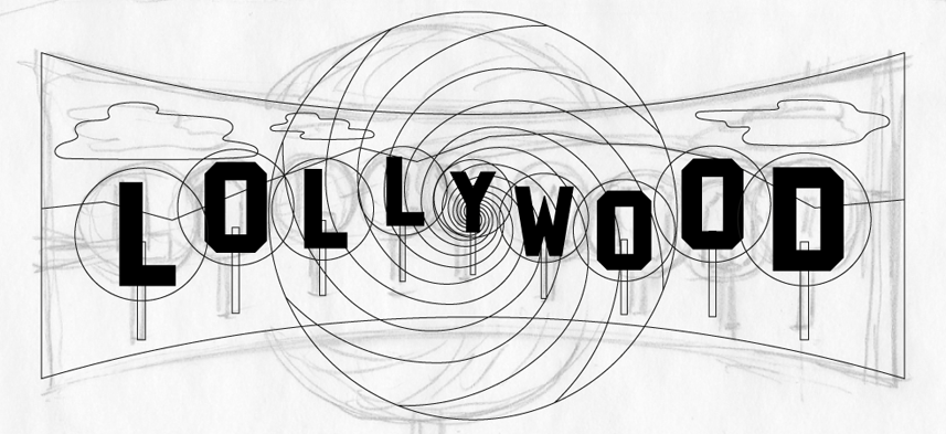
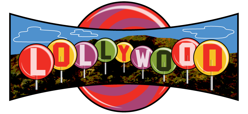
As far as the logo was concerned, the obvious way to go was, of course to reference that darned Hollywood sign. To my mind it’s been overused commercially to the point where it’s lost any design relevance. So I felt I had to bring something fresh to it while still maintaining its recognition factor. The direction I decided to go may seem obvious, but I think it actually works pretty well. I decided to embed those letters inside giant lollipops, and have this scene appear inside a giant Cinerama shaped screen in front of an even larger lollipop swirl.
This was how I presented the idea to Gary. At this point I didn’t know how I was going to render any of this (especially those hills). but I felt inspiration would come to me.
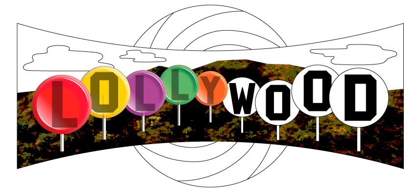
Getting the go ahead was easy. The hard part was figuring out how to do it! Here is one of the early stages in Illustrator.
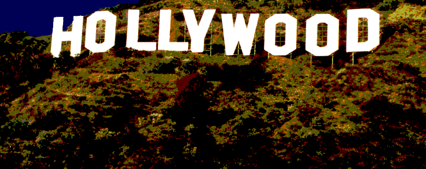
Then I had a brainstorm (or at least I thought so): I’d take a photo of the Hollywood sign, then I’d manipulate it in Photoshop making it really flat and graphic. I’d use only the portions of the photo that were the actual hillside under the sign. Why go to this extreme when I could probably take any hillside photo and make it work? I’m just a sucker for “the real thing”, I guess.
I thought this was working pretty well, so I put it into the art . . . and voila!
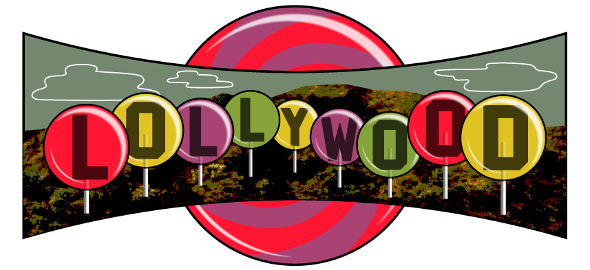
I had already been working on the lollipops—my thought was to make the letters kind of like large fossilized insects caught in amber.
But with some further development, I still wasn’t thrilled. It didn’t seem colorful enough—in fact it was starting to feel a bit gloomy.
This is one thing that I love about working digitally—you can almost design “on the fly”. If the colors aren’t working the way you want, just keep shifting things around until you get to where you want to be.
Please check back here tomorrow, and I’ll post two more designs in Part 2: “Peace of Candy” + “AS IF / Shop for Spoiled Girls”.
Powered by WordPress and Nifty Cube with Recetas theme design by Pablo Carnaghi.
Entries and comments feeds.
Valid XHTML and CSS.

