 |
|
“Sweet!”/A Logo Project–Part 3 of 5: Route 66 / Candy Americana
October 9, 2012 on 10:32 pm | By Michael | In Gigs, News | 2 CommentsPlease read Parts 1 and 2 of this series before proceeding!
“Won’t you get hip to this timely tip / When you make a-that California trip / Get your kicks on Route sixty-six.” Well, If by “California trip” they meant the Sweet! candy shop in Hollywood, and if by “kicks” they really meant “candy”, then there’ll be plenty to be got in “Route 66 – Candy Americana”.
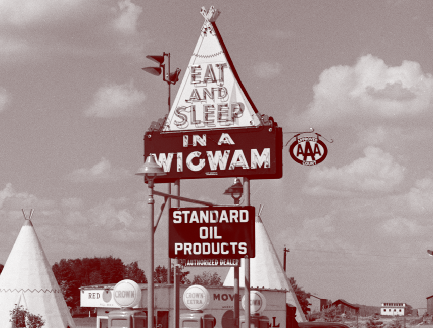
The real historic Route 66 still runs through Hollywood only a few blocks south of Sweet!, on Sunset running west down to the ocean ending at the Santa Monica Pier. But the Route 66 in Sweet! harkens back to a sweeter, simpler time. In this shop you’ll find an actual, built-to-scale gas station built out of porcelain enamel, just as you’d see if you were driving down the original Route 66 back in the ’50s, before the Interstate system made the road obsolete. You’ll also find a scale reproduction of the famous Wigwam Motels—you know, where you could have stayed on your road trip across America (“Sleep in a Wigwam!). All this to house the finest selection of classic American candies, some that you may not have seen in a while.
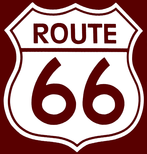
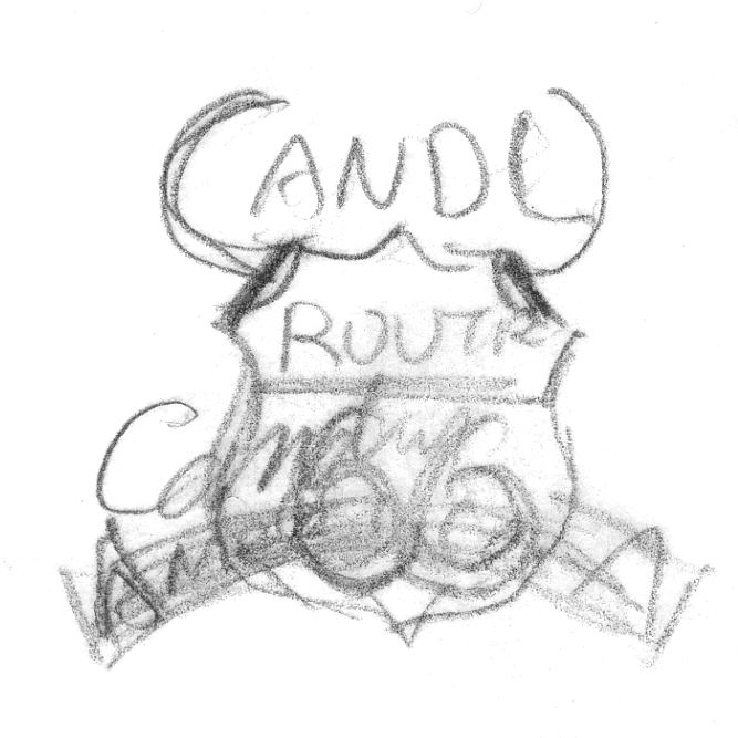
Obviously the logical place to start a Route 66-ish logo would be to use the iconic road sign as a base. So with that as a given (which I gave myself) I started with some very rough sketches like these:
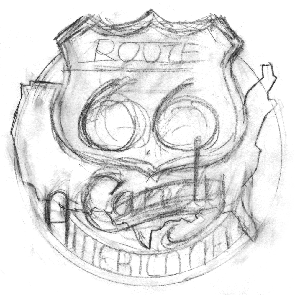
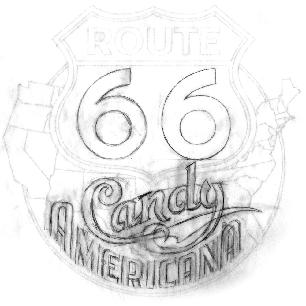
One of the most critical parts of this direction was to figure out how to successfully integrate all the different elements. I had a sign, a map, and several different styles of lettering/typography. I also felt it had to have the authentic look of classic American Automobilia, yet be playful and colorful enough to represent a candy store. So I started to work out exactly how all the elements might fit together. After combining a map of the USA and a standard Route 66 sign I started designing my own “66” numerals and the words “Candy” and “Americana”. Not only was I trying to integrate the two words , but to do so with the right amount of playfulness in “Candy” and the right amount of gas station-y feel in “Americana”. As you can see below, there was a lot of drawing and redrawing before I felt I was close to how it should be:
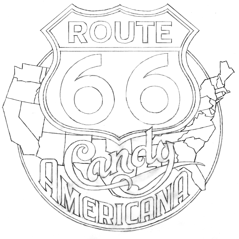
Once I was happy with the balance, In tightened up the drawing in preparation for redrawing the whole thing in Adobe Ilustrator:
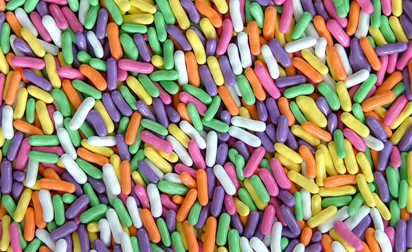
To help give this logo a bit more candy store appeal, I envisioned the individual states in five different “Good ’N’ Plenty” colors (which I’ve always loved):
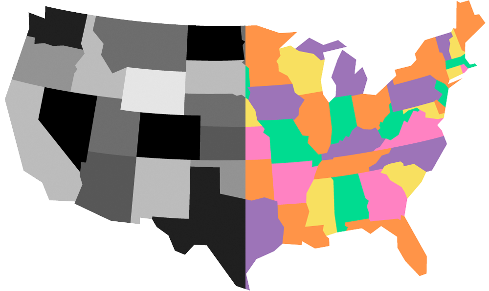
So first I needed to create an accurate (but graphic) map of the USA in Adobe Illustrator where, for separation purposes, no two states touching each other were the same color. So as a working model I did the file in black and 4 grays, then made it the “Good ’N’ Plenty” USA map in 5 colors:
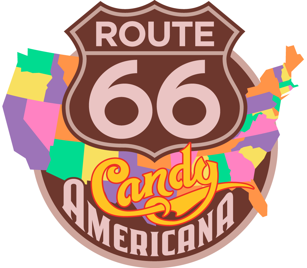
. . . and here are the map, sign and lettering all put together in my first draft:
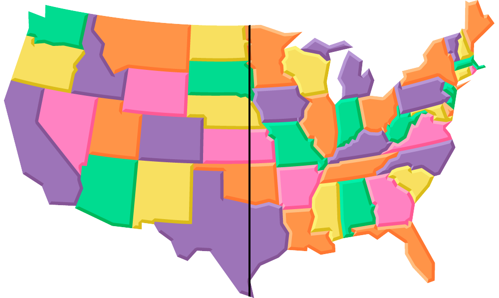
But to me it was all feeling way too flat. I decided that I wanted to give the states a soft, dimensional “marshmallow-y” feel. So I first added a darker extrusion on the right and lower portions of the states (left side of the map, below), and then a lighter area on the upper and left portions (right side of the map, below)—the Marshmallow States of America:
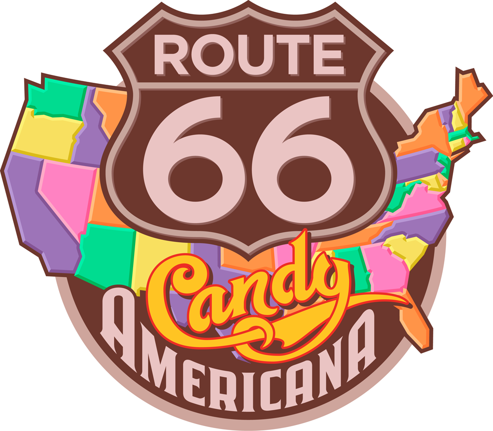
. . . also adding a dropshadow to the word “Candy” and to the Route 66 lettering and badge, and an outline to the map:
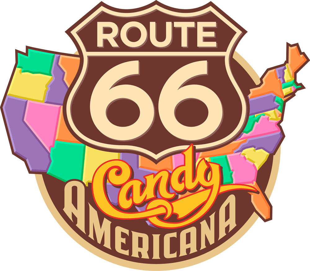
I wasn’t too happy with the mauve-y color, so I gave it one last tweak, warming it up a bit. Everybody loved the way it now looked and felt:
This graphic will be used in the store on packaging, T-Shirts, bags, etc.
Tomorrow we’ll move from the sublime to the ridiculous, from Route 66 to Part 4: “YUCKY” – the most disgustingly delicious candy shop logo in the world!
2 Comments
RSS feed for comments on this post. TrackBack URI
Leave a comment
Powered by WordPress and Nifty Cube with Recetas theme design by Pablo Carnaghi.
Entries and comments feeds.
Valid XHTML and CSS.


Tout ton travail est excellent et je suis un fan absolu..
Big up
Djib Anton for kamatola from Senegal, west Afrka
Comment by kamatola — January 2, 2013 #
[…] our global trek comes full circle—back to the US and ending up in Part 3 on “Route 66 – Candy […]
Pingback by Alphabet Soup Blog » Blog Archive » “Sweet!”/A Logo Project–Part 2 of 5: Peace of Candy + AS IF — October 9, 2012 #