 |
|
“Sweet!”: 6 Logos for a New Candy Store Opening in Hollywood/Part 1 of 5
October 8, 2012 on 9:03 am | By Michael | In Gigs, News | 8 CommentsSo . . . what ever happened to the corner candy store—do they have a future? For the answer, please keep reading!
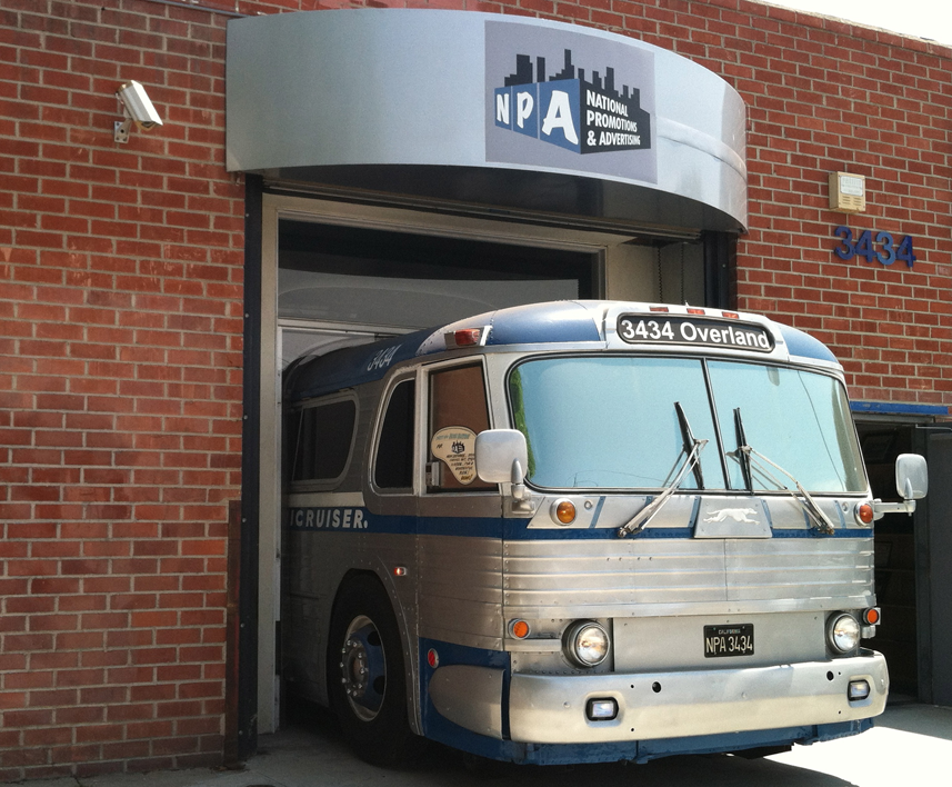
 Photo courtesy of Mod Betty/Retro Roadmap
I recently worked on a wonderful project—designing logos for a new concept in candy stores—and this is going to be big! It’s just about to open in the Hollywood and Highland Center in the heart of Hollywood. It’s called “Sweet!” and is the creation of Gary Shafner—the brains behind NPA (National Promotions & Advertising), one of the first guerilla marketing companies. It’s a collection of 12 boutique candy shops, each with their own identity—but all under one roof. When I met Gary at his headquarters, I was blown away by his crazy inventiveness: the only way to gain access to his office/warehouse/printing plant was to enter through an actual vintage Greyhound bus that is built into the facade of his building, the interior of which also formed the reception area.
As you enter the NPA headquarters it becomes apparent that this playful attitude continues throughout the building, as the bus depot theme gives way to a ’50s diner theme, an auto showroom theme, an outdoor city street theme, and on and on as the interior morphs into a very personal kind of amusement park, and a kitchy, friendly environment for Gary’s employee’s to work in.
Gary found my work through a friend of his: Chris Nichols, Associate Editor at Los Angeles Magazine had directed him to me. Chris brings a historical perspective to the magazine, being a passionate advocate for historic Los Angeles, and serving on the LA Conservancy’s Modernism Committee. Mr. Nichols, being familiar with my work, understood what Gary was looking for and saw in my work an understanding for Gary’s playful, eclectic vision.
So why Sweet! . . . and why now? Gary grew up in this town loving what Hollywood was, and realizing that the Hollywood of days gone by was no more . . . and that once tourists were done with the Chinese Theater, after they had seen the footprints, the Hollywood experience was basically over. He decided that he wanted to build a magical place in Hollywood, and that perhaps he could bring back a little bit of that experience by opening this boutique of 12 different candy shops—each staged differently with a different fun theme, and all about the joy of candy and of being in Hollywood—in Tinseltown . . . in a word: “Candytainment”!
I ended up designing graphics for five of these shops—each completely different stylistically from the one before. My wife, illustrator Laura Smith also created a more illustrated logo for a sixth shop. Right here, over the next few days I’m going present a case study (one or two a day) of each of the graphics we worked on, and describe briefly the inventive fun that Gary has in mind for each shop.
The first stop in any candy themed tour of Hollywood would of course be . . . Lollywood:
Lollywood
As far as anyone knows, Lollywood will be the only, first ever store in the world that sells only Lollipops . . . and there will be lollipops of every shape, size, taste, and description. Gary has gone out of his way to make this shop totally unique, building into it both a life-size Sugar Plum tree and, for the counter . . . The Good Ship Lollipop! While shopping, sugar lovers will be serenaded by clips of both Shirley Temple and The Lollipop Guild. And Gary promises there’ll be more surprises as well.
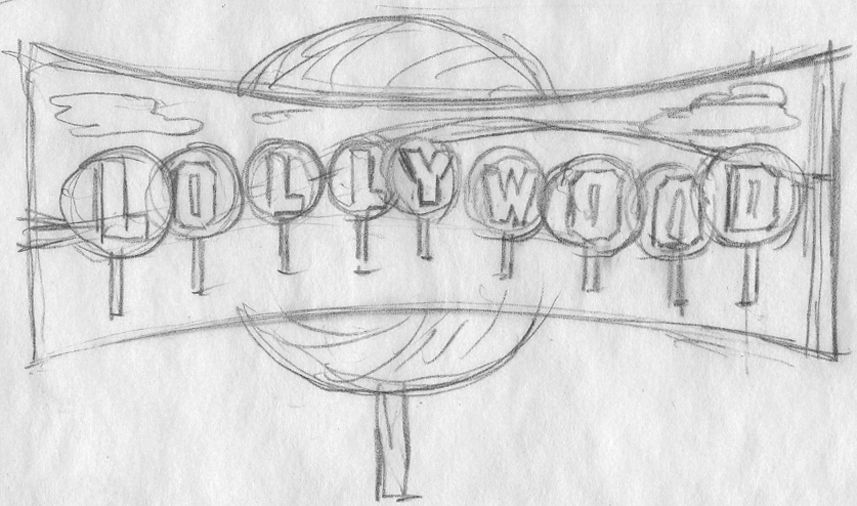
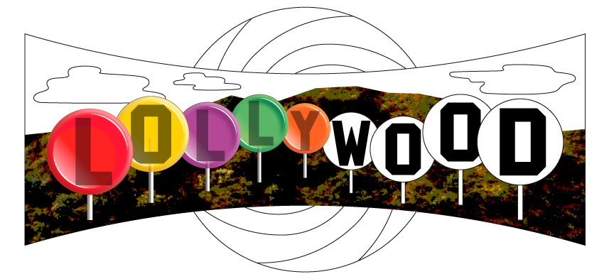
As far as the logo was concerned, the obvious way to go was, of course to reference that darned Hollywood sign. To my mind it’s been overused commercially to the point where it’s lost any design relevance. So I felt I had to bring something fresh to it while still maintaining its recognition factor. The direction I decided to go may seem obvious, but I think it actually works pretty well. I decided to embed those letters inside giant lollipops, and have this scene appear inside a giant Cinerama shaped screen in front of an even larger lollipop swirl.
This was how I presented the idea to Gary. At this point I didn’t know how I was going to render any of this (especially those hills). but I felt inspiration would come to me.
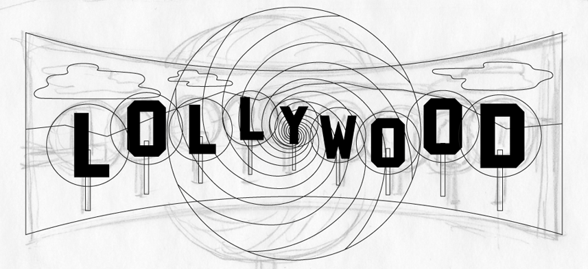
Getting the go ahead was easy. The hard part was figuring out how to do it! Here is one of the early stages in Illustrator.
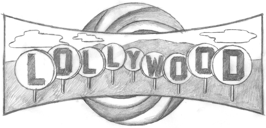
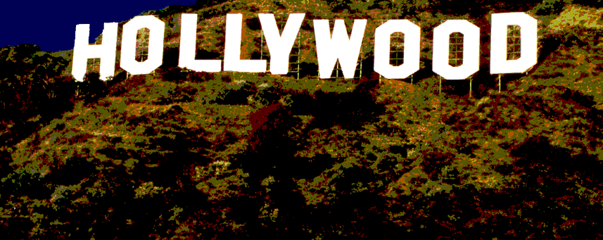
Then I had a brainstorm (or at least I thought so): I’d take a photo of the Hollywood sign, then I’d manipulate it in Photoshop making it really flat and graphic. I’d use only the portions of the photo that were the actual hillside under the sign. Why go to this extreme when I could probably take any hillside photo and make it work? I’m just a sucker for “the real thing”, I guess.
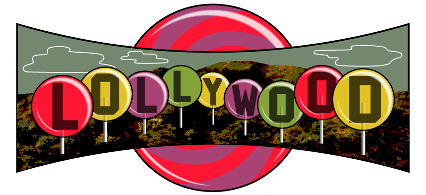
I thought this was working pretty well, so I put it into the art . . . and voila!
I had already been working on the lollipops—my thought was to make the letters kind of like large fossilized insects caught in amber.
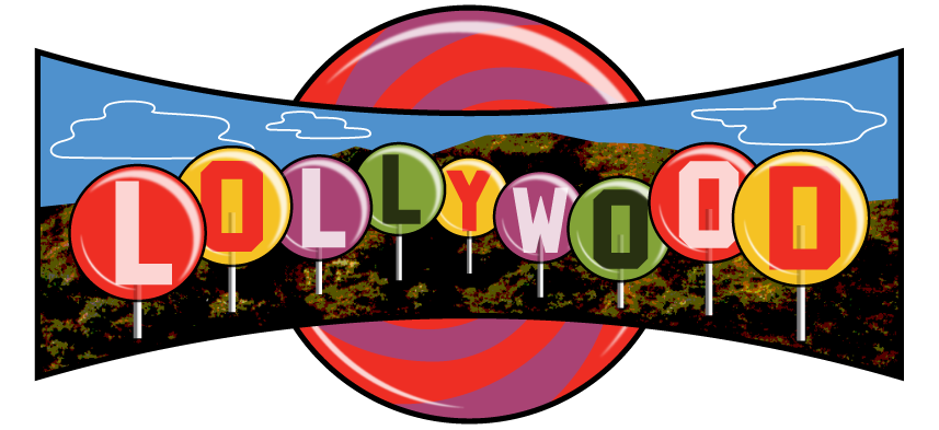
But with some further development, I still wasn’t thrilled. It didn’t seem colorful enough—in fact it was starting to feel a bit gloomy.
This is one thing that I love about working digitally—you can almost design “on the fly”. If the colors aren’t working the way you want, just keep shifting things around until you get to where you want to be.
Please check back here tomorrow, and I’ll post two more designs in Part 2: “Peace of Candy” + “AS IF / Shop for Spoiled Girls”.
8 Comments
RSS feed for comments on this post. TrackBack URI
Leave a comment
Powered by WordPress and Nifty Cube with Recetas theme design by Pablo Carnaghi.
Entries and comments feeds.
Valid XHTML and CSS.


Did you know that Lollywood is also the name of the film industry in Pakistan? It’s based in Lahore. In fact I came across this while researching on Lollywood- the film industry.
Comment by Ayesha — April 26, 2014 #
[…] “I ended up designing graphics for five of these shops—each completely different stylistically from the one before. My wife, illustrator Laura Smith also created a more illustrated logo for a sixth shop. Right here, over the next few days I’m going present a case study (one or two a day) of each of the graphics we worked on, and describe briefly the inventive fun that Gary has in mind for each shop.” read more, see more… […]
Pingback by bigger dot » Sweet! Logos | a print production company — March 21, 2013 #
Wow, this is super interesting! I work at Sweet and it’s fascinating to see the design process behind the signs I see every time I walk into work.
Comment by WonkaWorker — October 15, 2012 #
[…] “I ended up designing graphics for five of these shops—each completely different stylistically from the one before. My wife, illustrator Laura Smith also created a more illustrated logo for a sixth shop. Right here, over the next few days I’m going present a case study (one or two a day) of each of the graphics we worked on, and describe briefly the inventive fun that Gary has in mind for each shop.” read more, see more… […]
Pingback by daily dot | bigger dot's blog» Blog Archive » Sweet! Logos — October 15, 2012 #
[…] read Parts 1, 2, 3, and 4 of this series before […]
Pingback by Alphabet Soup Blog » Blog Archive » “Sweet!”/A Logo Project–Part 5 of 5: TINSELTOWN — October 11, 2012 #
[…] read Parts 1, 2, and 3 of this series before […]
Pingback by Alphabet Soup Blog » Blog Archive » “Sweet!”/A Logo Project–Part 4 of 5: YUCKY — October 10, 2012 #
[…] read Parts 1 and 2 of this series before […]
Pingback by Alphabet Soup Blog » Blog Archive » “Sweet!”/A Logo Project–Part 3 of 5: Route 66 / Candy Americana — October 9, 2012 #
[…] read Part 1 of this series before […]
Pingback by Alphabet Soup Blog » Blog Archive » “Sweet!”/A Logo Project–Part 2 of 5: Peace of Candy + AS IF — October 8, 2012 #