 |
|
Art Imitates Life…Imitates Art (Canter’s Truck #1 of 3)
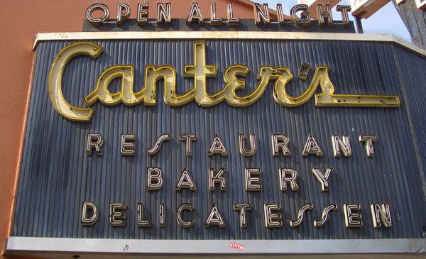
March 18, 2010 on 6:38 pm | By Michael | In Gigs, News | 2 CommentsRecently I had a strange (and kind of wonderful) confluence of circumstance—combined with a smattering of coincidence and random luck. It all started right here in this blog over a year ago when I started sharing my thoughts about creating my new font Deliscript. In the posting I mentioned how the design was “loosely inspired by one of the signs at Canter’s Deli,” a Los Angeles staple for almost 80 years:
At any rate my good fortune with Deliscript began about two months ago when I learned that it been selected by the Type Directors Club in NYC for inclusion in their annual show. About a month later I got a call from Bonnie Bloomgarden, the great-granddaughter of Ben Canter—one of the original Canter Bros. She and her sister Dena were trying to do a few things to gently update the Deli, while still respecting its heritage. One of their ideas was to create a “Canter’s Truck” and take advantage of the recent mobile gourmet food trucks craze. A lot of the newer trucks have been completely “wrapped” with colorful graphics using fairly new printing technology.
She told me that they had started looking for fonts to design the wrap for the truck themselves, but then realized it might be a little difficult for them without having a lot of graphic design experience. Then fortune smiled on Bonnie and Dena when they did a web search Googling “Deli” and “Font” and ran smack into Deliscript (probably because of the Canter’s mention in this blog) and then in turn found, and contacted me.
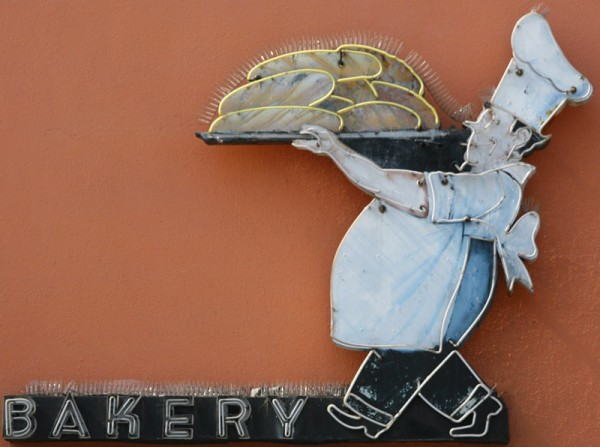
It has been a real pleasure working with Bonnie, a young person with good entrepreneurial instincts that are combined with a keen sense of what is worth keeping in the Canter’s visual vocabulary, and what perhaps should be let go. We both concurred that the truck identity should be based on that neon sign, and that I should use Deliscript as the starting point. I also suggested that we somehow should try to incorporate into the truck design their famous neon chef, who for years has been carrying that platter of freshly baked bread:
At first I tried to graphically recreate him pretty much as he was for the side of the truck. I soon realized that my rendition seemed far too literal for the look I was going for. Then, in an old matchbook catalog, I found a cut of a little round chef carrying a platter of turkey, and decided to use that as the basis for creating my updated baker (a little slimmed down) for the door of the truck:
In “Art Imitates Life…Imitates Art #2” I’ll discuss how we created the design for the truck.
Dynascript Makes Its 1953 Premiere… In the 21st Century
November 12, 2011 on 1:26 pm | By Michael | In Gigs, News | 13 Comments Several months ago I was contacted by David Klein, Vice President of Charles P. Rogers & Co. in NYC (bed manufacturing), about working together with him on a project. He described his company as “a small idiosyncratic company that has been making a quality product for over 150 years”. David had fallen in love with—and purchased—a 1953 Fageol Van that had been housed in The Golden Age of Trucking Museum which had recently closed its doors. The Fageols were beautiful vans that came in various sizes and configurations.
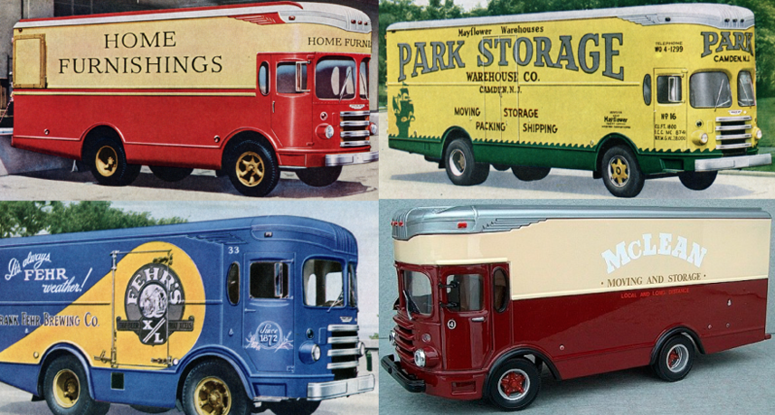
Physically the truck was in good condition, and David loved and wanted to keep the brilliant yellow color that it had been given by the Barrieau family—the van’s original owners. His vision was that this truck would become a moving billboard for CPR & Co, driving around New York, conveying “the Charles P. Rogers Beds message” in a manner that this van might have—had it been theirs back in the ’50s. Wanting to keep as much historical accuracy as I could, I asked about older graphics and logos from the CPR & Co archives but there was very little except for this monogram (which I kind of liked).
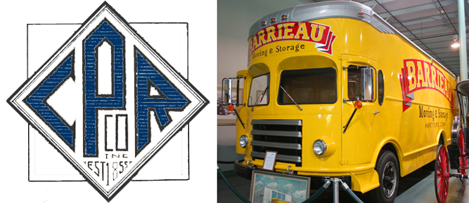 So, I needed to create graphics that felt appropriate for this 1953 van, and which helped evoke a simpler time. The only concrete thing that I had to work with from Rogers & Co. was the monogram, so I used that design as a basis to create a “medallion” that could be used on the front and sides of the truck. Just prior to the call from David I had begun development of a new font (which became Dynascript over the next few months), and decided that somehow it felt right to use it for the supporting graphics/slogans on the sides of the van.
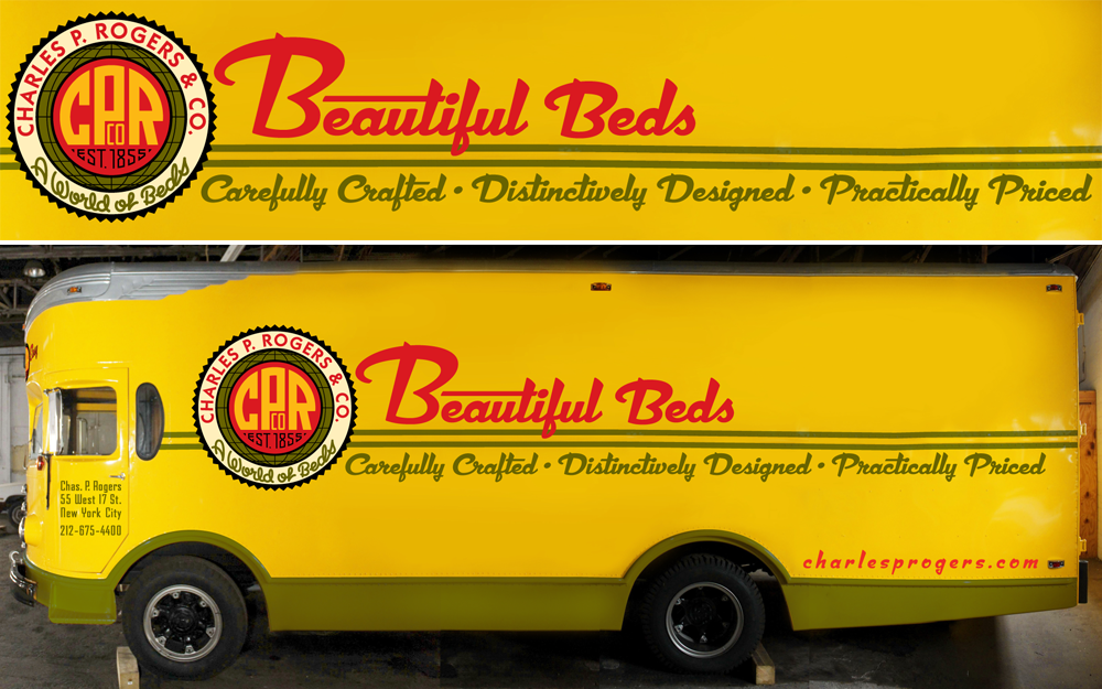
The van is currently in the process of having my graphics applied, so what you’re looking at is a Photoshop assembled composite of the truck with my design work superimposed. 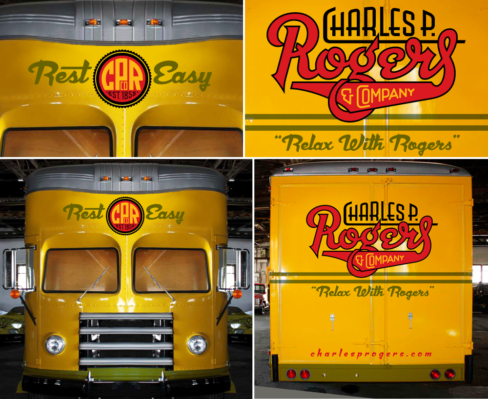
For the back of the van I created a logo in which I tried to evoke and encompass the over 150 year history of the company. Though it is a bit different from the mid-century vibe that Dynascript had helped give the front and side graphics, I felt it was appropriate and didn’t conflict with them. Also, it might be noteworthy to mention that I used the non-connecting italic version of Dynascript for the URLs on the back and sides of the van.
Not unlike my project with Deliscript and the Canter’s food truck, here was another instance of the influence that assignment work and font design had on each other. Even though they both started out as independent projects, they soon became inextricably entwined. Dynascript is probably a better font for it, because, with this project, I was trying to solve its design both from the point of view of a fontmaker, and from that of a font user.
Soon, when actual photos of the finished truck become available, I will post them here along with my development sketches and more detailed descriptions of the design process.
Graphic Artists Guild Talk – October 23rd
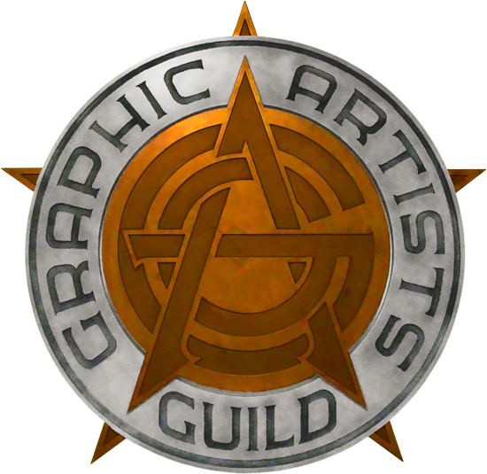
October 12, 2010 on 4:36 pm | By Michael | In News | 3 CommentsIf you missed my talk at TypeCon in July, you’re in luck! I’ll be giving another dog and pony show to the local Graphic Artists Guild chapter in downtown LA on the evening of October 23rd. I’ll be talking about what inspires me by discussing the creation of the Guild’s logo, the design of the new Canter’s Deli Food Truck, and Alphabet Soup Type Founders. All are welcome—Guild and Non-Guild members alike!
Check out the particulars on the Graphic Artists Guild /LA website.
Powered by WordPress and Nifty Cube with Recetas theme design by Pablo Carnaghi.
Entries and comments feeds.
Valid XHTML and CSS.
