|
|
|
“Deliscript” Font Preview: Followup
February 27, 2009 on 12:36 am | By Michael | In Notes | 10 CommentsA huge Thank You to those who took the time to take a look at my preliminary ideas for “Deliscript”. A few of you confirmed some thoughts that had already entered my mind about how to approach this font:

The biggest stumbling block for me was that with the large caps that I initially conceived this font as having, there was a problem if one chose not to set an underscore (such as when setting more than one word): the caps would then appear too large. José and Marcus both suggested reducing the cap size to align with the baseline. Initially I thought that might make the caps too small. But when I tried it out it seemed to work fine—admittedly it took some getting used to after seeing the cap so grandiose at the beginning of the word:

And it seems to work fine if one chooses not to set the underscore:

Or even without the extended crossbars on the “t”:

I think that doing it this way will give the font more flexibility. Perhaps I could still include a set of the larger caps as an extra for more dramatic effect. I haven’t yet figured out what I’ll do about the lighter weight. I’m not that crazy about it, so I was kinda surprised to see both Norman and Marcus commenting that they were partial to it. I’ll have to think on that, but any more comments on any of this would really be welcome!
“Deliscript” Font Preview: Your Feedback, Please!
February 6, 2009 on 8:37 pm | By Michael | In Notes | 12 CommentsI’m not the most prolific of font designers—perhaps I come up with one a year—but when I do one I try to do a design that’s not only uncompromising, but also one that is usable by people with a wide variety of tastes. For the last several months I’ve been working on a new design that was loosely inspired by one of the signs at Canter’s Deli here in Los Angeles. I’ve been vacillating on several points with regard to the design of this font, and also how many fonts should go into this package. So I thought I’d put it out there to you, my friends and fans, to take a look, read my remarks, and give me your considered opinions via the comments section below.

Above is my original concept for this font which I’m calling “Deliscript”. It started out as a straight up and down script, but then I decided to also include a variation that was italicized. In the same fashion as my highly successful Metroscript I thought that having underscore “tails” that would emanate from either certain cap letters or from the last letter of the word in lowercase would be a nice idea.

As you can see above, I immediately ran into a problem: if one choses not to set copy with an underscore (a very likely occurrence), then the caps end up looking much too large for the lowercase.

The solution, of course, was to reduce the size of the caps (above). But then the question arises, do I create two sets of fonts—one with larger caps and underscores (Deliscript Special and Deliscript Special Oblique), and another with smaller caps and no underscores (Deliscript and Deliscript Oblique)? Or do I eliminate the Deliscript Special fonts altogether and just have the more normal versions?

Another question that arises is whether or not it’s worth it to have features like the extensions on the “t”s. Part of me likes things like that, but another part says it may not be worth the trouble. It looks perfectly fine without (above). Opinions, anyone?

Finally, I had originally conceived this design as having a lighter weight as well, but I’m not sure it will be worth it. Aesthetically I much prefer the chunkier, heavier versions, and I don’t want to go to the trouble of doing this weight just to create a larger font family. So feedback on this question would also be appreciated! Comments?
Alphabet Soup Font Guides and Manuals – Free Downloads
January 5, 2013 on 7:16 pm | By Michael | In News, Notes | No Comments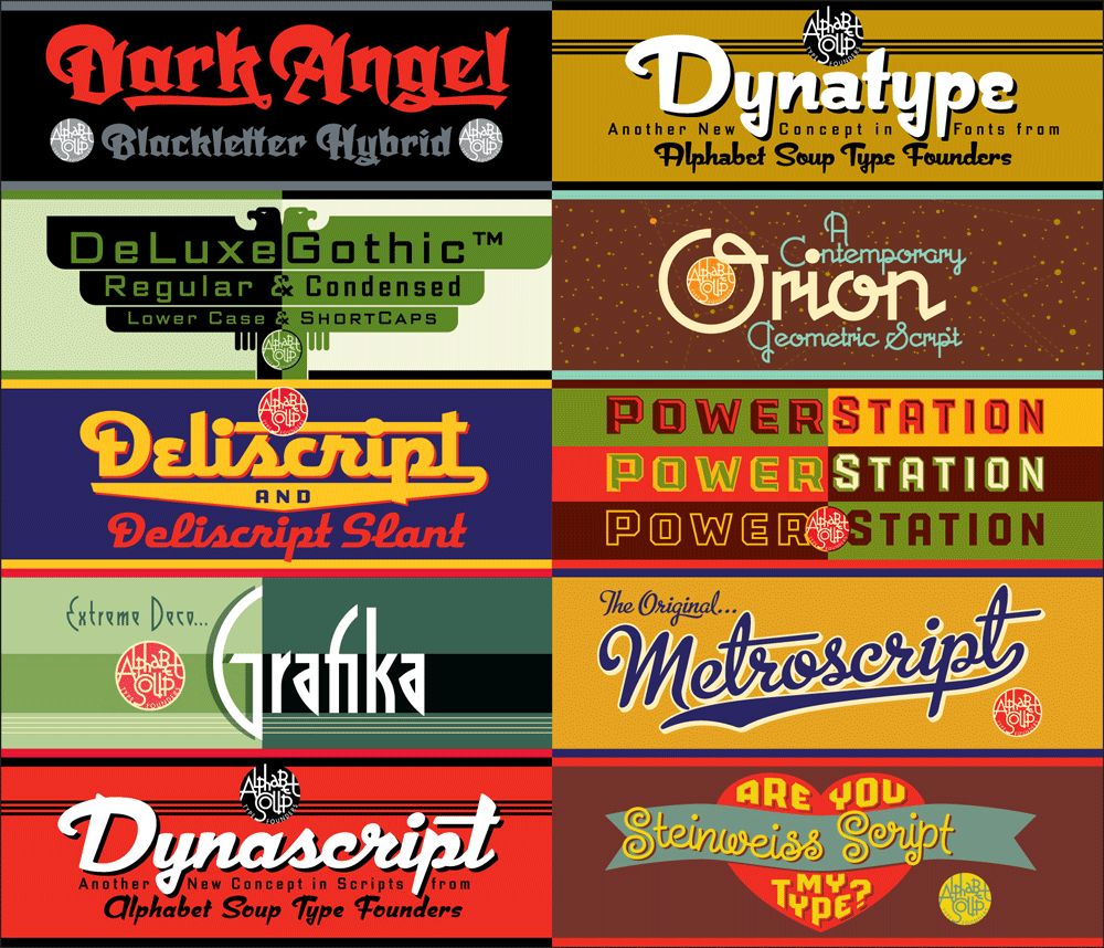
Many people have asked why I have only 10 fonts available for purchase. Part of the answer is that I’m sort of a perfectionist, and it takes me quite a long time to design, execute, and test a font to make sure it’s working properly. Also, all that work must be sandwiched in between design and lettering assignments—which must always take precedence. But there’s another reason why, at best, I can only turn out maybe one font design a year—and that is for me there’s a bit more to releasing a font than just having the font itself ready to go. There are a ton of supporting graphics that need to be created, and each font reseller has different requirements.
But more importantly, I decided early on that included with each font I would supply a full color PDF Guide or Manual (all 10 represented above). From these multi-page PDFs one can get a very good idea of what these fonts look like in use, and gain an understanding their special features and how to access them. For example, the PowerStation Manual explains how to set layered copy in 2 or three colors, and in the Deliscript Manual you’ll find out how to access the special “t-crossbar” feature (among others). You’ll also learn some important “Do’s” and “Don’ts” for each font and (if you’re interested) read about how these fonts came to be.
Originally these manuals were only intended to be included with the font download at purchase, but I realized that they should also be available for prospective buyers as well as others—they might help with a decision, or just serve as inspiration. I’ve put links for all 9 PDF downloads together on one page, together with several case studies of some of my design work. So feel free to go the DOWNLOAD page and click on 1, 2 or all 10 of them.

Powered by WordPress and Nifty Cube with Recetas theme design by Pablo Carnaghi.
Entries and comments feeds.
Valid XHTML and CSS.