 |
|
Fonts In Use: GQ Picks Steinweiss Script for their Comedy Issue
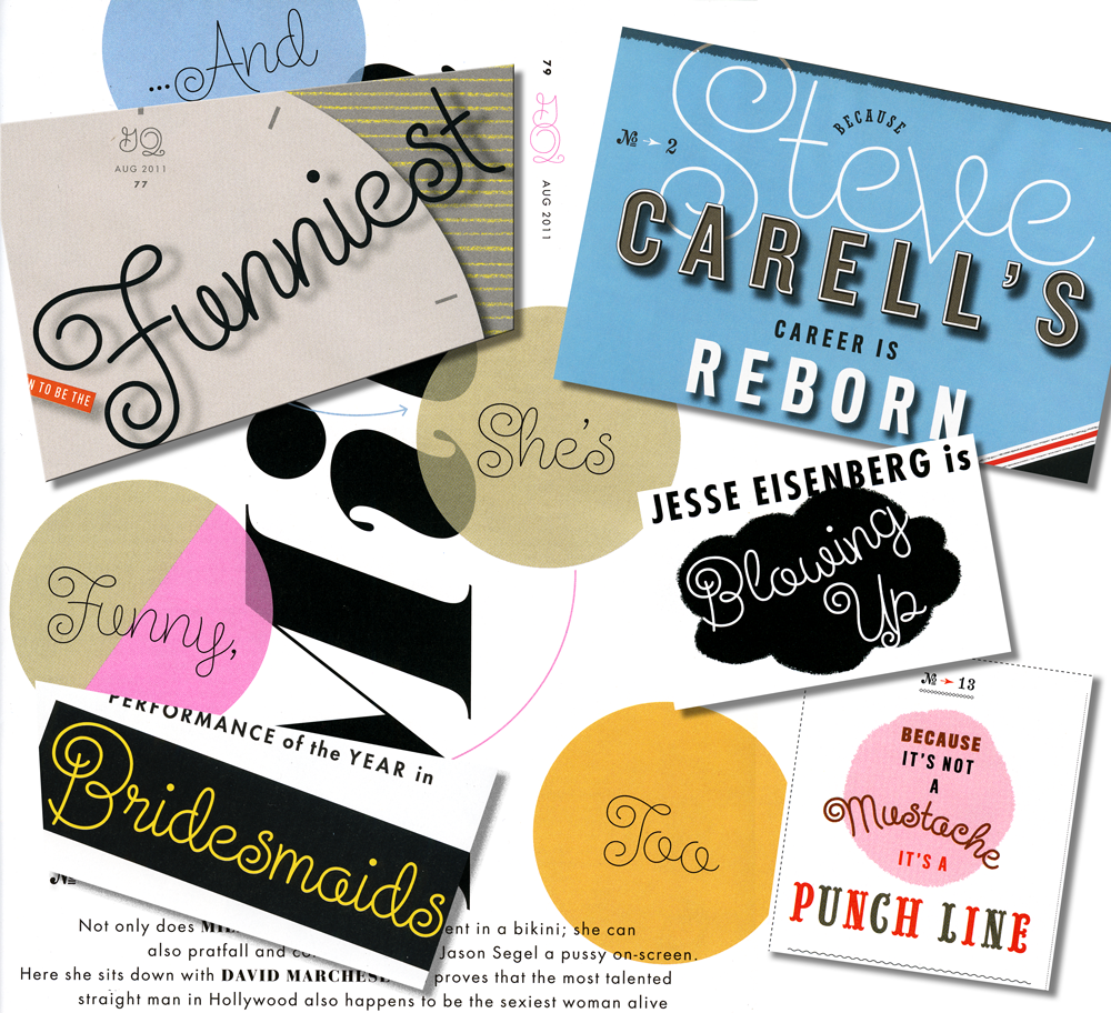
July 14, 2011 on 5:34 pm | By Michael | In News, Notes | 3 CommentsI just got a call from my pal Glenn Parsons of Astrolux Design who informed me that my last font release Steinweiss Script was all over the new issue of GQ Magazine. Kudos to GQ Design Director Fred Woodward for making such a smart choice!* Here’s a collage of a few of the pieces taken from different pages in the current issue. I think these demonstrate nicely some of the versatility of this font, such as the ability to set words on curved paths—and still have all letters connect properly.
You can purchase Steinweiss Script (as well as all my other fonts) on my Alphabet Soup website.
Fonts In Use: Steinweiss Script in Mexico
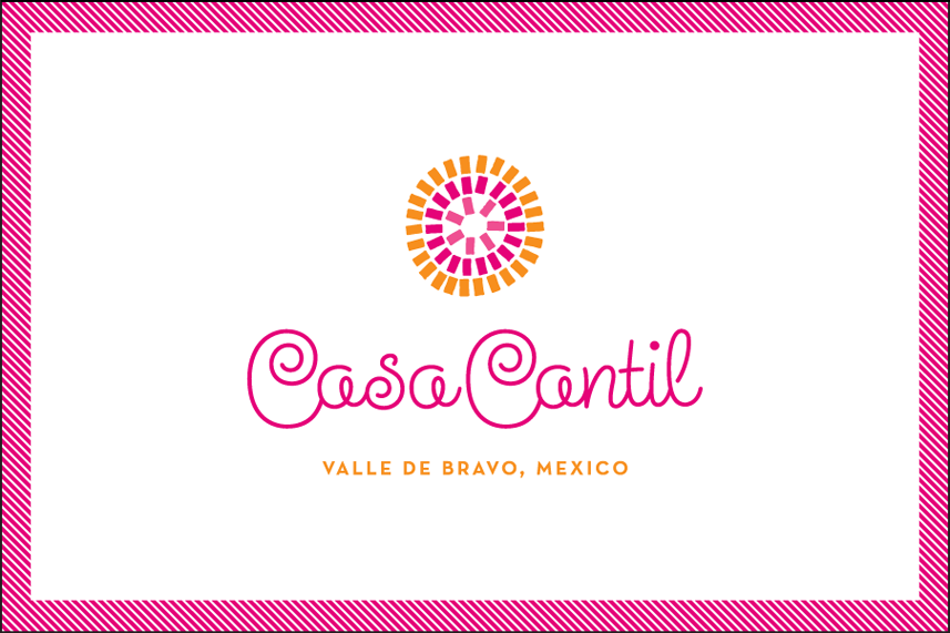
April 6, 2011 on 5:49 pm | By Michael | In News | No CommentsAnother in my series of Alphabet Soup “Fonts In Use” this post highlights Steinweiss Script. I just heard from graphic designer Eric Baker who used the font in a design project for the graphic identity of Casa Cantil, a beautiful villa just a couple of hours outside of Mexico City. Here’s his design in the context of a business card:

What strikes me is that in this context Steinweiss feels quite contemporary—not quite the “vintage” look that one might have expected from such a font. My intention was to create a font that would be kind of like a chameleon – in that it could feel appropriate in many different contexts. Here it seems perfect for the 1960s Mexicana feel I think Eric was going for.
If you’ve used an Alphabet Soup font in an interesting way, email me some images—I’d be happy to post them!
Fonts In Use: Grafika in Madrid
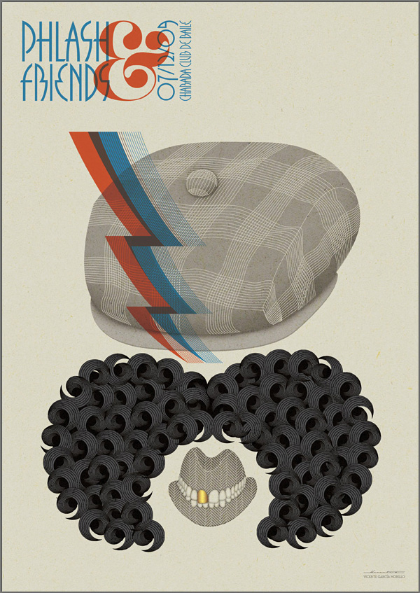
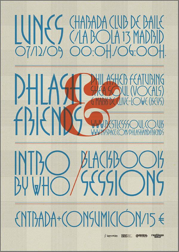
August 31, 2010 on 1:04 pm | By Michael | In News | 1 CommentMy good friend Mark Simonson recently alerted me to a very interesting use of my most recently released font Grafika. He found it Behance’s online portfolio for Spanish designer Vicente García Morillo. It was used to produce a flyer for Phil Asher, a UK DJ/Producer performing in Madrid under the guise of “Phlash”.
What piqued my interest about this particular usage was the fact that Mr. Morillo used Grafika in ALL CAPS—something I had never anticipated. I usually recommend that this font be set in upper and lowercase. But I have to admit that seeing this flyer has changed my mind.
Powered by WordPress and Nifty Cube with Recetas theme design by Pablo Carnaghi.
Entries and comments feeds.
Valid XHTML and CSS.


