 |
|
Author Archive
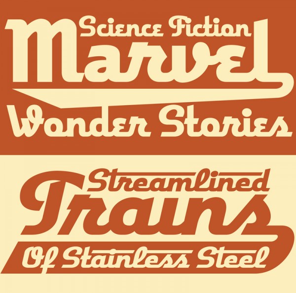
Deliscript Critique on FontFeed
April 2, 2010 on 8:57 pm | By Michael | In News, Notes | 2 CommentsBelgian designer and writer Yves Peters has been posting his comments and critiques about the winners of the TDC² 2010 Typeface Design Competition, and has finally reached the Display Type category—the one in which Deliscript was selected. While Yves’ comments are considered and thoughtful—and with regard to Deliscript were for the most part on target—I feel as if I would like to comment on a couple of his remarks.
Yves mentioned the “Word Logos” I have thrown in, and mentions that they’re only in English and that there aren’t that many. I agree with this. I probably shouldn’t have put them in at all. I had literally been working for months on Deliscript, and really wanted to get it out for release, so I guess I rushed through their creation, thinking of them as just a small extra feature to include. They probably don’t add that much to the font, and I should have thought of the European market as well. The next time I do a feature like that I’ll definitely try to do it in a much more expansive manner.
Yves also mentions that he is “unsure about the finer details in the character shapes”, citing that “some curves and joins seem rather stiff, and the weight distribution and contrast in the character strokes appear a little off in some parts”. I’m not sure, but I think this perception on his part may stem from cultural differences that we share, and from a possible misunderstanding of what I’m referencing. What I’m going for is not really in the lexicon of classical font design—rather it is from the American pop culture vernacular—from all the (traditionally) untrained eyes that created all the wonderful signage and ephemera that I grew up with.
Coming to font design from that background, I can totally understand how what I’m trying to do can seem foreign to those who are trained to look at fonts from a traditional perspective. While I’m sure we all share some of the same font heroes (such as Morris Fuller Benton) I also celebrate those whose work joyously displayed a flagrant lack of regard for what some would consider to be “the formal rules of design”. It is to these designers whose names we’ll probably never know—and to their typographic “mistakes” and flourishes that I find so engaging—that I try to pay homage to in my lettering and font design work.
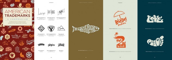
American Trademarks: A Compendium
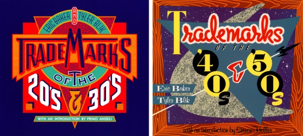
March 24, 2010 on 12:46 am | By Michael | In News | 1 CommentWhile they were in print, the three volumes of Eric Baker and Tyler Blik’s classic Trademarks series (which together sold 60,000 copies) were the authoritative books of logo design by decade. I had the distinct privilege of designing the covers for the first two. Many is the time that people have mentioned to me that they have those books, and had no idea that I had done the covers!
This definitive collection is now available from Chronicle Books in an expanded single volume with essays and samples of the work of 17 contemporary graphic designers (including myself), and with an introduction by Steven Heller. Over 1,000 iconic trademarks are packed into this extra-chunky paperback. While the original books have long enjoyed cult status, this attractive, updated edition will win legions of new fans among today’s ever-increasingly design-savvy public. So run don’t walk to your nearest purveyor of fine books, and snatch a copy before they’re all gone.
Art Imitates Life…Imitates Art (Canter’s Truck #2 of 3)
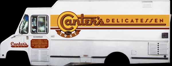
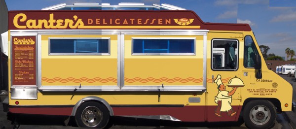
March 21, 2010 on 9:05 pm | By Michael | In Gigs, News | 3 CommentsAlthough most of the food trucks are similar in appearance, many contain details that slightly alter some of their proportions. So it became necessary for me to visit the Road Stoves truck depot and to take pictures of the truck that would be closest to the one that Bonnie would be getting, and to use those photos as templates for my design—I’d also have to Photoshop out the existing graphics, making the truck as clean as I could to act as a blank canvas for my new design:
I set about to create the elements for the truck wrap, basing the graphics on the look of the Canter’s neon sign and my font Deliscript. I felt I needed to modify Deliscript a bit to make this a strong graphic statement—kind of like a logo for the truck. So I began by creating a large, circular initial “C” in Canter’s—and that became the basis for the look:
I also settled on a palette of colors that I felt would be attractive and reflect what I thought of as a Deli aesthetic. The unique double “SS” in “DELICATESSEN” was borrowed from the neon sign—one of many small details that I felt would help keep continuity between the restaurant and the truck. I added some other elements such as “Since 1931” that Bonnie wanted. In my first iteration for the truck my feeling was that I’d try it as a white truck—a good clean look— and adjust the graphics accordingly.
I might’ve had the Good Humor truck from my youth in Brooklyn in mind:
Nevertheless, a white truck wasn’t exactly what Bonnie had planned on. I have to admit that I’m glad she pushed me to do a more colorful truck. Even though the truck was to be treated as a “vehicle wrap” by SignQuest, a process that is being more and more widely used, I decided to treat the truck as if I was designing a paint job in order to give it a look that was more in keeping with its mid-century heritage. Keeping the color palette that I had first come up with I created some mock ups that I thought would work even better for Canter’s than my all white version:
We also decided that it would be a good idea to have a slogan and, after much deliberation, settled on “…home of the Kibitz Room”. The Kibitz Room is the dive bar/cocktail lounge that’s off in a corner of Canter’s Deli. Like Canter’s, it’s an LA institution that just seems to keep going and going.
I had envisioned that we would somehow use my very graphic take on the neon baker sign on the service side of the truck. So I put him on the door and let the steam from his platter trail back along the length of the truck towards the menu. Along the top of the truck yet another version of the Deliscript/Canter’s logo:
In “Art Imitates Life…Imitates Art #3″ I’ll post photos of the actual truck wrapping, and also of the finished truck.
Powered by WordPress and Nifty Cube with Recetas theme design by Pablo Carnaghi.
Entries and comments feeds.
Valid XHTML and CSS.
